- My Forums
- Tiger Rant
- LSU Recruiting
- SEC Rant
- Saints Talk
- Pelicans Talk
- More Sports Board
- Fantasy Sports
- Golf Board
- Soccer Board
- O-T Lounge
- Tech Board
- Home/Garden Board
- Outdoor Board
- Health/Fitness Board
- Movie/TV Board
- Book Board
- Music Board
- Political Talk
- Money Talk
- Fark Board
- Gaming Board
- Travel Board
- Food/Drink Board
- Ticket Exchange
- TD Help Board
Customize My Forums- View All Forums
- Show Left Links
- Topic Sort Options
- Trending Topics
- Recent Topics
- Active Topics
Started By
Message
re: Logos that didn’t need to change
Posted on 5/11/26 at 11:04 pm to Warheel
Posted on 5/11/26 at 11:04 pm to Warheel
Losing the Bullets, Indians, Redskins suck. But it’s the Oilers I probably miss the most. There has never been a more safe soulless generic team name as the Houston Texans. I can’t give a shite about that team. Change it back to the Oilers and I’ll be their biggest fan. Yes I know the Oilers name is locked up and unavailable. Sucks.
 1
1

Posted on 5/12/26 at 1:19 am to Snoop Dawg
Plenty of support in OKC unlike Seattle. The move was necessary to establish a winning tradition. Put some respect on the reigning and soon to be back-to-back World Champions!!!
Posted on 5/12/26 at 6:41 am to SaintlyTiger88
A lot of these are still around but always loved the sailor hats. One guy was responsible for these, and funny how some schools wanted friendly vs. mean.

Posted on 5/12/26 at 6:58 am to SaintlyTiger88

To

Posted on 5/12/26 at 7:00 am to UKWildcats
quote:
To this horseshite two birds fricking logo Nike is pushing on us:
I couldn't see it, then I saw it. Now I can't unsee it...
Posted on 5/12/26 at 7:13 am to Cowboyfan89
Rockets are a good one. So clean and a unique color scheme.

Posted on 5/12/26 at 7:14 am to UKWildcats
Yeah that one’s done for me
I’ll never see it and not laugh now
I’ll never see it and not laugh now
Posted on 5/12/26 at 7:16 am to dallastiger55
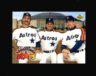
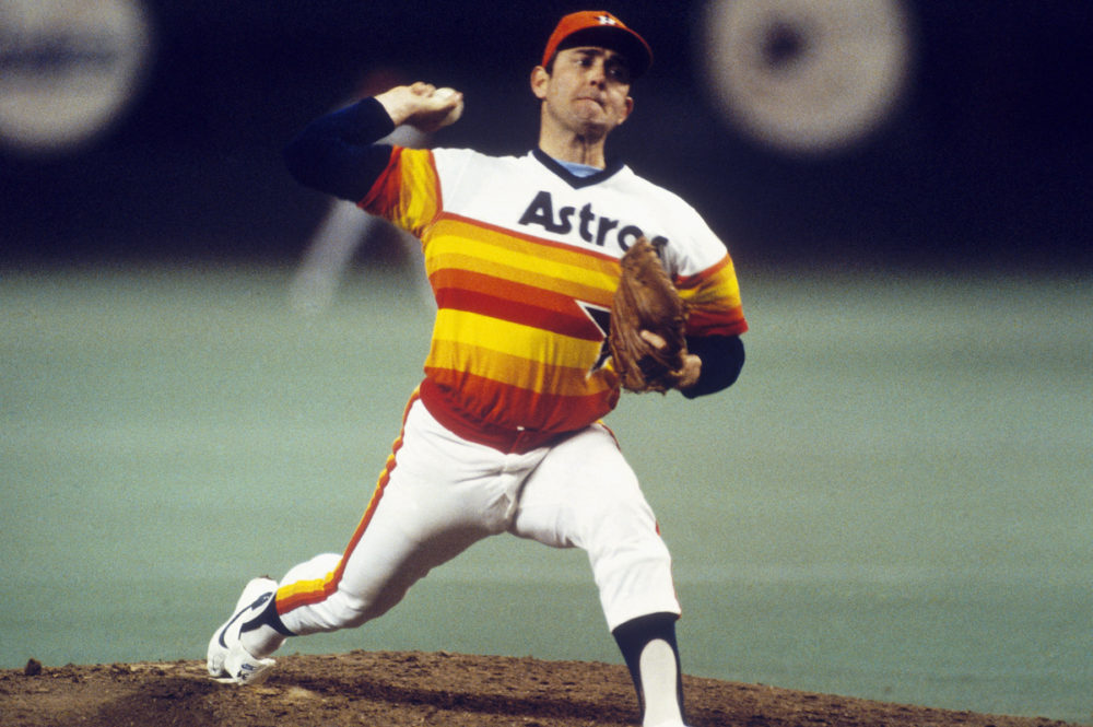
I know the Astros uniforms were controversial but thats what made them great. So fire and everyone knew them
Posted on 5/12/26 at 7:39 am to Snoop Dawg
quote:
OKC shouldn’t have a team. Too small, not enough corporate support. DEAD LAST in attendance just two seasons ago.
Citing a single year is a silly metric.
They’re middle third in average attendance over the last 10 years. Ahead of Houston who has a population 3x the size of OKC.
Posted on 5/12/26 at 7:52 am to LSUbasketballfan
Guess I'm the only one that likes that era of logos. I used to play the college football games on playstation 2 and these are the types of logos a lot of the teams had on there back then, probably why I have nostalgia for them.

Posted on 5/12/26 at 8:22 am to tigerfan84
I frickin love this one

Posted on 5/12/26 at 8:32 am to dallastiger55
quote:
I know the Astros uniforms were controversial but thats what made them great. So fire and everyone knew them
at least the Astros are back to the color scheme
The aggie era uniforms of the Berkmen years were the worst.
90s were ok as far as 90s jersey changes go
They need to bring these back once a year at least

This post was edited on 5/12/26 at 8:35 am

Posted on 5/12/26 at 9:55 am to TejasHorn
Whoa I didn't realize LSU and Auburn used same damn logo lol.
Posted on 5/12/26 at 11:31 am to Dire Wolf
They’ll never bring those back bc of the revolver image. It’s hard to even find the revolver on any merch bc it’s a scary gun. I have a Colt 45 hat with that logo that I love. People often compliment it. Makes me feel tingly.

Posted on 5/12/26 at 11:41 am to biglego
Up until 2002 was the best.
Posted on 5/12/26 at 11:43 am to Cosmo
Long Live The Chief!

Posted on 5/12/26 at 11:44 am to dallastiger55
Goat astros uniform. Clean AF


Posted on 5/12/26 at 12:35 pm to SaintlyTiger88
Raptors need to bring back the dribbling Dino!
Posted on 5/12/26 at 1:16 pm to Obi-Wan Tiger
This might get me some downvotes, but I think the pre-90s Rockets logo is also bad. Am I missing something that is a slight nod to being the Rockets? Are the two, red "crescents" around the ball supposed to be something? I really hope someone points out something that I have completely missed all these years. As I see it now, it is an extremely generic logo that could be used for any basketball team; just replace the team name in the middle.
Having said that, the original color scheme is awesome. Also, the red, white, and blue change they made were much worse. I just think the original logo isn't some outstanding logo.
Having said that, the original color scheme is awesome. Also, the red, white, and blue change they made were much worse. I just think the original logo isn't some outstanding logo.
This post was edited on 5/12/26 at 1:18 pm

Posted on 5/12/26 at 1:20 pm to okietiger
quote:
Whoa I didn't realize LSU and Auburn used same damn logo lol.
Mizzou also had the same one, I believe Clemson and Pacific did as well
This post was edited on 5/12/26 at 1:20 pm

 Page 3 of 6

Popular
Back to top