- My Forums
- Tiger Rant
- LSU Recruiting
- SEC Rant
- Saints Talk
- Pelicans Talk
- More Sports Board
- Fantasy Sports
- Golf Board
- Soccer Board
- O-T Lounge
- Tech Board
- Home/Garden Board
- Outdoor Board
- Health/Fitness Board
- Movie/TV Board
- Book Board
- Music Board
- Political Talk
- Money Talk
- Fark Board
- Gaming Board
- Travel Board
- Food/Drink Board
- Ticket Exchange
- TD Help Board
Customize My Forums- View All Forums
- Show Left Links
- Topic Sort Options
- Trending Topics
- Recent Topics
- Active Topics
Started By
Message
Logos that didn’t need to change
Posted on 5/11/26 at 6:57 pm
Posted on 5/11/26 at 6:57 pm
What team logos do you feel USED to be great, but then for one reason or another changed and kinda sucked afterwards? I think most of us agree that the Redskins to Commanders logo was a big downgrade, and of course the Cleveland Indians to Guardians logo was even worse.
My example is the Rams logo. The 2000s/2010’s logo was cool, it was aggressive. Since they’ve been in L.A., it’s been just… generic and boring. They went from this…

To this:

Yeah, very disappointing. What examples do you think are worth mentioning?
My example is the Rams logo. The 2000s/2010’s logo was cool, it was aggressive. Since they’ve been in L.A., it’s been just… generic and boring. They went from this…
To this:
Yeah, very disappointing. What examples do you think are worth mentioning?
This post was edited on 5/11/26 at 7:00 pm
 26
26


Posted on 5/11/26 at 7:00 pm to SaintlyTiger88
Miami sports teams apparently
This post was edited on 5/11/26 at 7:03 pm
Posted on 5/11/26 at 7:00 pm to SaintlyTiger88
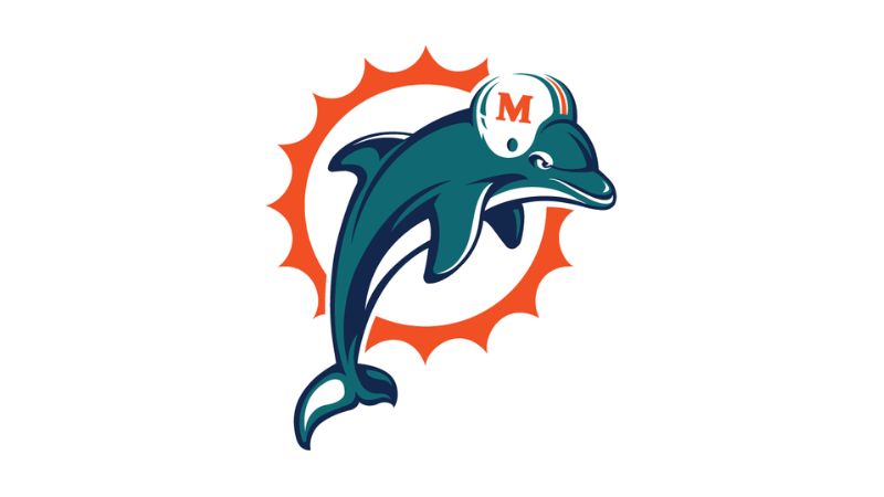
To this
Damn! Beat me to it.
This post was edited on 5/11/26 at 7:01 pm
Posted on 5/11/26 at 7:05 pm to SaintlyTiger88
quote:
My example is the Rams logo.
Agreed.


Posted on 5/11/26 at 7:09 pm to Jizzy08
You guys are absolutely right, the ownership in Miami should have left that logo alone! The Dolphins ownership and the Marlins.
Posted on 5/11/26 at 7:15 pm to SaintlyTiger88
I agree. The angry ram logo was badass. What they have now is a big downgrade.
I saw this on a bunch of apparel growing up. But now I never see it anymore.
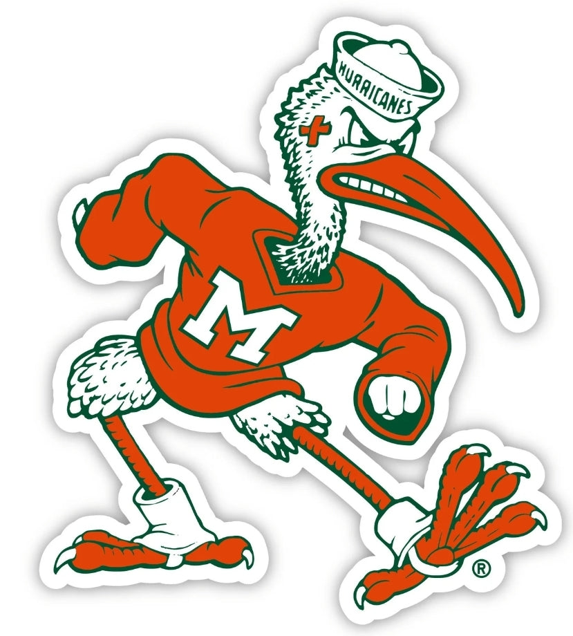
I saw this on a bunch of apparel growing up. But now I never see it anymore.
This post was edited on 5/11/26 at 7:31 pm

Posted on 5/11/26 at 7:25 pm to CRDNLSCHMCPSN11
Never understood why the Blue Jays went to this:


Posted on 5/11/26 at 7:37 pm to Jizzy08
quote:
Damn! Beat me to it.
They should have never changed the 80s/90s Marino era logo.

Posted on 5/11/26 at 7:38 pm to SaintlyTiger88
Posted on 5/11/26 at 7:49 pm to SaintlyTiger88
I see one thing in common with all of these botched logos, the country went soft and ghey

Obligatory
Obligatory

Posted on 5/11/26 at 7:49 pm to Major Dutch Schaefer

Posted on 5/11/26 at 7:50 pm to SaintlyTiger88

Posted on 5/11/26 at 7:51 pm to SaintlyTiger88
1982-2015 versions were fine.
The current one is even worse than the one it replaced.
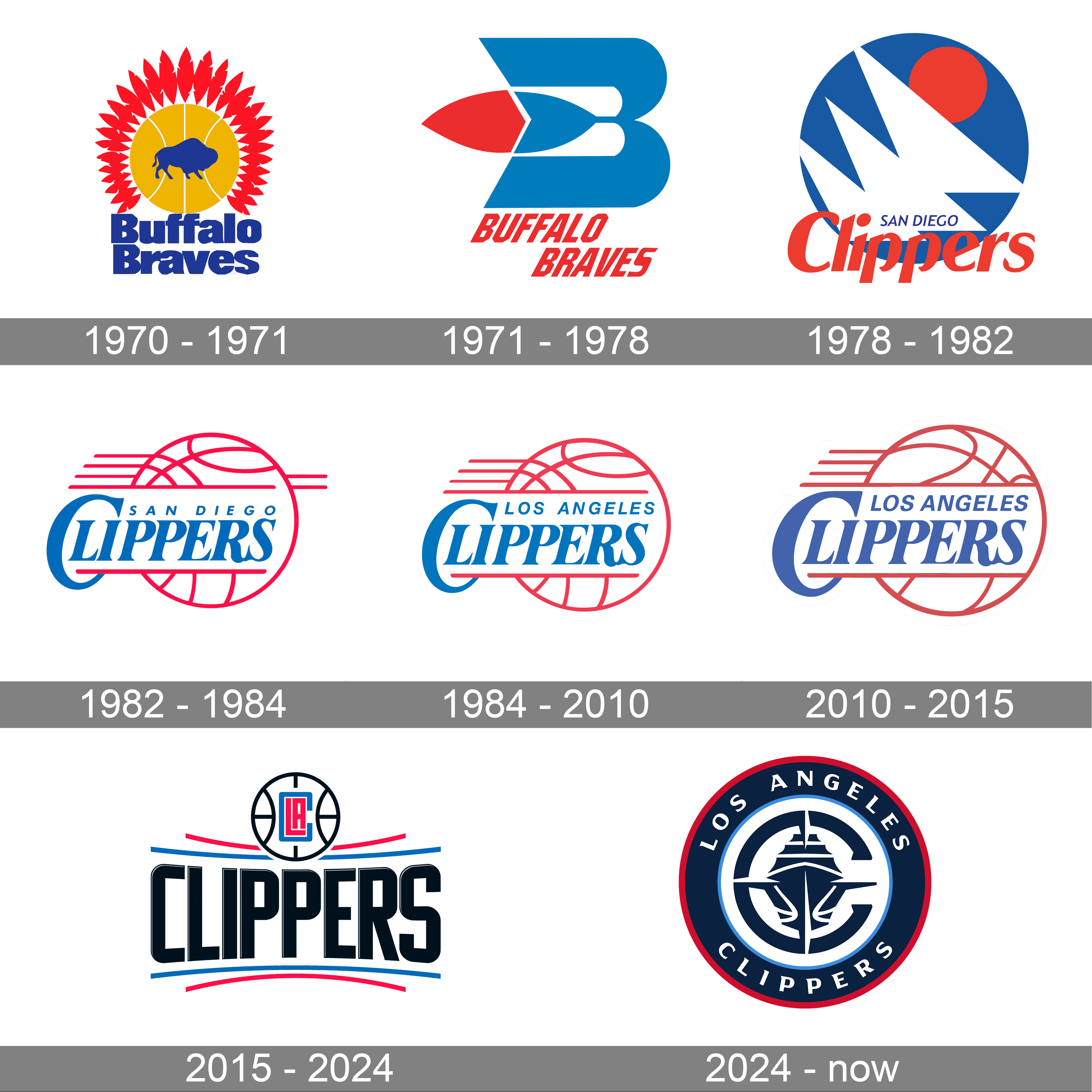
The current one is even worse than the one it replaced.

Posted on 5/11/26 at 8:08 pm to Murph4HOF
what they've done to nba logos, uniforms, and courts is absolutely criminal
Posted on 5/11/26 at 8:09 pm to UnluckyTiger
Someday, somehow, I will own a wicked Logo Athletic sharktooth hat.
Posted on 5/11/26 at 8:17 pm to Jizzy08
Steven Ross is an idiot

Posted on 5/11/26 at 8:24 pm to Cosmo
Posted on 5/11/26 at 8:24 pm to SaintlyTiger88
Posted on 5/11/26 at 8:27 pm to GentleJackJones
Posted on 5/11/26 at 8:28 pm to GentleJackJones

at least it is purple now, but damn that all black logo with generic all-cap name had to be up there as worst logo of all-time.

 Page 1 of 6

Popular
Back to top