- My Forums
- Tiger Rant
- LSU Recruiting
- SEC Rant
- Saints Talk
- Pelicans Talk
- More Sports Board
- Fantasy Sports
- Golf Board
- Soccer Board
- O-T Lounge
- Tech Board
- Home/Garden Board
- Outdoor Board
- Health/Fitness Board
- Movie/TV Board
- Book Board
- Music Board
- Political Talk
- Money Talk
- Fark Board
- Gaming Board
- Travel Board
- Food/Drink Board
- Ticket Exchange
- TD Help Board
Customize My Forums- View All Forums
- Show Left Links
- Topic Sort Options
- Trending Topics
- Recent Topics
- Active Topics
Started By
Message
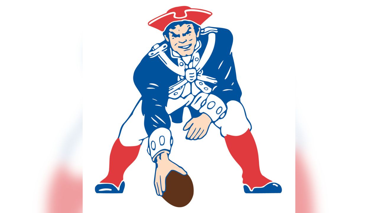
re: Logos that didn’t need to change
Posted on 5/12/26 at 2:02 pm to tigerfan84
Posted on 5/12/26 at 2:02 pm to tigerfan84
to

 0
0

Posted on 5/12/26 at 2:41 pm to Snoop Dawg
We get it, you are from PNW. OKC won the title and may go back to back. They're doing just fine. Don't be the crazy ex.
Posted on 5/12/26 at 3:11 pm to SaintlyTiger88
The 90's and early 2000's were the worst because it was the first time computers were really used to generate graphics rather than actual artist. The led to numerous dildos who couldn't draw and had no artistic creativity becoming "graphic designers." They created the crap logos no one likes and many have moved on from. Yet, people/companies had to justify their existence, which led to the bad uniforms/logos of that era.
Posted on 5/12/26 at 3:20 pm to Murph4HOF
quote:
1982-2015 versions were fine.
Nah, they weren't. They were blatant rip-offs of the classic Lakers Logo:

Posted on 5/12/26 at 3:22 pm to saintsfan92612

Look how much cooler these were. So much more color and personality
Posted on 5/12/26 at 3:30 pm to Carson123987
I had those logos on my bedsheets
IMO of the 90s NBA logos, the only ones that are better now are:
Warriors
Cavs
Pistons
Jazz (the classic basketball musical note w purple)
IMO of the 90s NBA logos, the only ones that are better now are:
Warriors
Cavs
Pistons
Jazz (the classic basketball musical note w purple)
Posted on 5/12/26 at 3:38 pm to UKWildcats
No penis tongue, no care

Posted on 5/12/26 at 3:42 pm to bgtiger
"My Old Kentucky Penis Tongue"


Posted on 5/12/26 at 4:06 pm to SaintlyTiger88
Agreed.
I always said they should have kept the St. Louis logo but changed the gold to yellow to match the classic LA color scheme and it would be fresh. What they conceived instead was generic and without character.
I always said they should have kept the St. Louis logo but changed the gold to yellow to match the classic LA color scheme and it would be fresh. What they conceived instead was generic and without character.
This post was edited on 5/12/26 at 4:07 pm
Posted on 5/12/26 at 4:09 pm to Marciano1
quote:Yea. Might as well be Creighton. Lame
Never understood why the Blue Jays went to this:
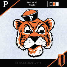
Posted on 5/12/26 at 4:28 pm to Gnash
Princeton too

Posted on 5/12/26 at 4:33 pm to BranchDawg
quote:
I actually really like the current logo, but I only like it because I know it’s claw marks from a velociraptor playing basketball. If you never saw the raptor, how would you know?
Posted on 5/12/26 at 4:35 pm to metallica81788
quote:
Pistons
frick right off. I want the horse on fire
This post was edited on 5/12/26 at 4:36 pm
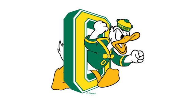
Posted on 5/12/26 at 4:36 pm to TejasHorn
All he did for Oregon was write Oregon on Donald Duck's hat and colored it yellow and green. 
Posted on 5/12/26 at 4:37 pm to TigerintheNO
Perfect effort for a Mickey Mouse school.
Posted on 5/12/26 at 4:48 pm to Murph4HOF
quote:I was well into adulthood before I interpreted the Hawks logo correctly. In my mind I always focused on the right side and it looked like a weird messed up Pac-Man to me. I had no idea what it was supposed to mean until I saw it in one of the recent rebrands.
The NBA logos have definitely suffered the most.
The Hawks are moving in the right direction though.

Posted on 5/12/26 at 4:55 pm to Oilfieldbiology


Posted on 5/12/26 at 5:21 pm to SaintlyTiger88
Fitting for a vapid city and owner.
Posted on 5/12/26 at 7:17 pm to crimsoncoded94
quote:
Posted on 5/12/26 at 9:32 pm to biglego
Adams is long gone. So his daughter could easily sell the name back to Houston unless he put it in the will not to.

 Page 4 of 6

Popular
Back to top