- My Forums
- Tiger Rant
- LSU Recruiting
- SEC Rant
- Saints Talk
- Pelicans Talk
- More Sports Board
- Fantasy Sports
- Golf Board
- Soccer Board
- O-T Lounge
- Tech Board
- Home/Garden Board
- Outdoor Board
- Health/Fitness Board
- Movie/TV Board
- Book Board
- Music Board
- Political Talk
- Money Talk
- Fark Board
- Gaming Board
- Travel Board
- Food/Drink Board
- Ticket Exchange
- TD Help Board
Customize My Forums- View All Forums
- Show Left Links
- Topic Sort Options
- Trending Topics
- Recent Topics
- Active Topics
Started By
Message

Worst logo in college sports: I present to you Jackson State University
Posted on 3/17/22 at 2:16 pm

Posted on 3/17/22 at 2:16 pm
This beauty came about in 2006. I hope they paid a 3rd grader $5 for this design.
This was their old logo: Can someone tell me why they had to go away from this?

 15
15

Posted on 3/17/22 at 2:18 pm to LSUGrad9295
I agree that new one is as bad as the Wake Forest Microsoft Word 97 football helmet

Posted on 3/17/22 at 2:19 pm to LSUGrad9295
They should replace it with Deion's toe
Posted on 3/17/22 at 2:19 pm to LSUGrad9295
That's pretty bad. I just thought of this one:

Posted on 3/17/22 at 2:21 pm to Upshift Downshift
quote:
That's pretty bad. I just thought of this one:

Posted on 3/17/22 at 2:22 pm to LSUGrad9295
Still better than Toonces
Posted on 3/17/22 at 2:23 pm to LSUGrad9295
The old logo is good. The new one isn’t terrible but very generic, and they’re a team with a mascot you can do lots of work with.
But surely there are worse logos out there.
But surely there are worse logos out there.
Posted on 3/17/22 at 2:24 pm to Keys Open Doors
quote:like the beveled block A&M
But surely there are worse logos out there.
Posted on 3/17/22 at 2:25 pm to LSUGrad9295
quote:
Can someone tell me why they had to go away from this?
One color is cheaper to print than two. That’s all I got

Posted on 3/17/22 at 2:28 pm to LSUGrad9295
quote:
Worst logo in college sports:
I mean...
I had this leaked to me back in 2002 (I think) a day or so before it was released and we ran with it on Tiger Roar...and it got ripped to shreds. they started defending it in the AD's office before it even came out.
Posted on 3/17/22 at 2:28 pm to Keys Open Doors
quote:
The new one isn’t terrible but very generic
That is just the thing...it is too generic. Letters in a rectangle? I do not have an artistic bone in my body and am very left-brain and that logo looks exactly like something I would design. That is how I know it sucks
This post was edited on 3/17/22 at 2:29 pm
Posted on 3/17/22 at 2:30 pm to GeauxTigerTM
quote:
I had this leaked to me back in 2002
I don't see what is so awful with it. But at least it isn't a rectangle with 3 letters in it. There is some semblance of design there.
Posted on 3/17/22 at 2:42 pm to WestCoastAg
quote:
like the beveled block A&M
I just looked this up. Your school is a friggin' cult.

https://nobevel.com/

Posted on 3/17/22 at 2:46 pm to Upshift Downshift

Posted on 3/17/22 at 3:04 pm to LSUGrad9295
Looks like a law firm office logo
Posted on 3/17/22 at 3:09 pm to LSUGrad9295
quote:
I don't see what is so awful with it.
1- Cross eyed
2- Short arms at bad angle
3- Unnecessary bullshite behind Mike
4- Wildly unnecessary outlines and drop shadows for the text
They then altered it to try and make it "better."
Then lost the body.
then they finally gave up and reworked the old circle Tiger head and presented something better.

Posted on 3/17/22 at 3:10 pm to LSUGrad9295
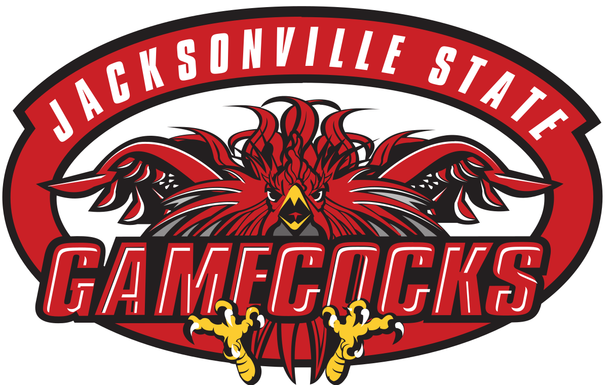
I see your Jackson State and I raise you Jacksonville State.

Posted on 3/17/22 at 3:37 pm to LSU Grad Alabama Fan
Anything with a black drop shadow is usually a good place to start on the list of bad logos. Also not a big fan of bevels.
This post was edited on 3/17/22 at 3:38 pm
Posted on 3/17/22 at 4:40 pm to LSUGrad9295
Yea, I always thought J State had one of the worst logos ever at any level in any sport.

Posted on 3/17/22 at 5:05 pm to Upshift Downshift
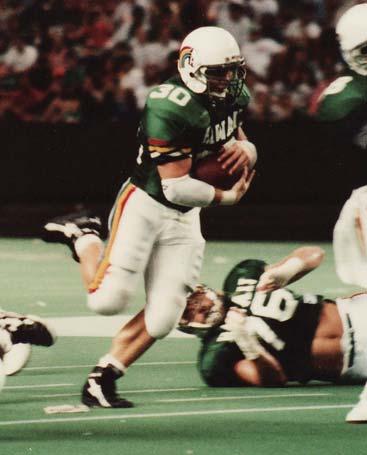
I thought they were unique to Hawaii and really liked them.

 Page 1 of 2

Popular
Back to top