- My Forums
- Tiger Rant
- LSU Recruiting
- SEC Rant
- Saints Talk
- Pelicans Talk
- More Sports Board
- Fantasy Sports
- Golf Board
- Soccer Board
- O-T Lounge
- Tech Board
- Home/Garden Board
- Outdoor Board
- Health/Fitness Board
- Movie/TV Board
- Book Board
- Music Board
- Political Talk
- Money Talk
- Fark Board
- Gaming Board
- Travel Board
- Food/Drink Board
- Ticket Exchange
- TD Help Board
Customize My Forums- View All Forums
- Show Left Links
- Topic Sort Options
- Trending Topics
- Recent Topics
- Active Topics
Started By
Message


 2
2


Posted on 11/27/22 at 6:18 pm to GeauxHouston
I always thought the Titans logo was terrible. A flaming shield. Peak 2001
Posted on 11/27/22 at 6:34 pm to ItSawGood

Always thought the 96-01 pistons logo was the best.

Posted on 11/27/22 at 8:04 pm to GeauxHouston
Always loved the old Orlando Magic logo

Posted on 11/27/22 at 8:14 pm to bikerack
quote:
I get that the 90s logo was awful, but is this one really better? Maybe this is one of those things that I can't see until someone explains it to me, but this logo never made sense. What are they going for with the logo not being a perfect circle? The only logo more generic is the Pistons, and that's because it has more basic colors and is a perfect circle.
Also, the font always bothered me. Why is every letter capitalized in Rockets except the e and t?
This post was edited on 11/27/22 at 8:17 pm
Posted on 11/27/22 at 8:30 pm to 3deadtrolls
UCONN went from this:

To this:
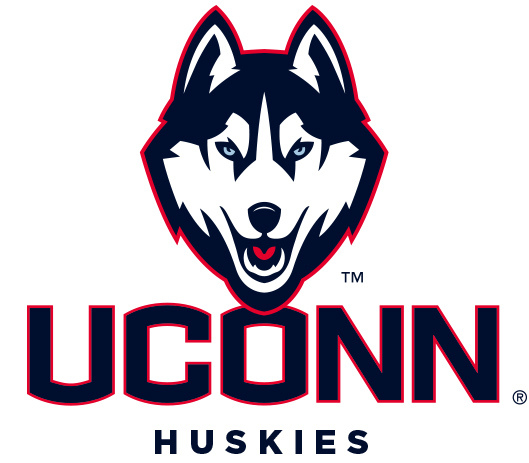
To this:

Posted on 11/27/22 at 8:35 pm to SirWinston
quote:
These are so good - I don't get how people don't like them
The blue isn't dark enough, and the numbers look like clip art

Posted on 11/27/22 at 8:47 pm to Sun God
You know what I'm gonna go head and say it. I actually like the Toonces logo.
Posted on 11/27/22 at 9:38 pm to GeauxHouston
Grizzlies Memphis Rebrand. The Teal colors they had in Vancouver were Awesome.
Mississippi St’s walking bulldog. GOAT logo
Mississippi St’s walking bulldog. GOAT logo
Posted on 11/27/22 at 9:39 pm to GeauxHouston
Redskins

Posted on 11/27/22 at 10:11 pm to ChanceOfRainIsNever
Looks like the UConn one got better. The old one doesn't even look like a husky

Posted on 11/27/22 at 10:18 pm to DestrehanTiger
Sun, Earth, basketball

Posted on 11/27/22 at 10:19 pm to Powerman

Sad this one has been scrapped
Posted on 11/27/22 at 10:43 pm to 3deadtrolls
quote:
Col Tillou went from a Confederate soldier to a Nazi.
That's straight Soviet
Posted on 11/27/22 at 10:44 pm to Scoob
Logo looks like a downvote
Posted on 11/27/22 at 11:15 pm to Powerman
Posted on 11/27/22 at 11:41 pm to GeauxHouston
Don’t even understand their current logo
Posted on 11/28/22 at 2:10 am to TigerEyez
I think it’s both a D and a duck foot
Posted on 11/28/22 at 10:22 am to tiggerthetooth
quote:
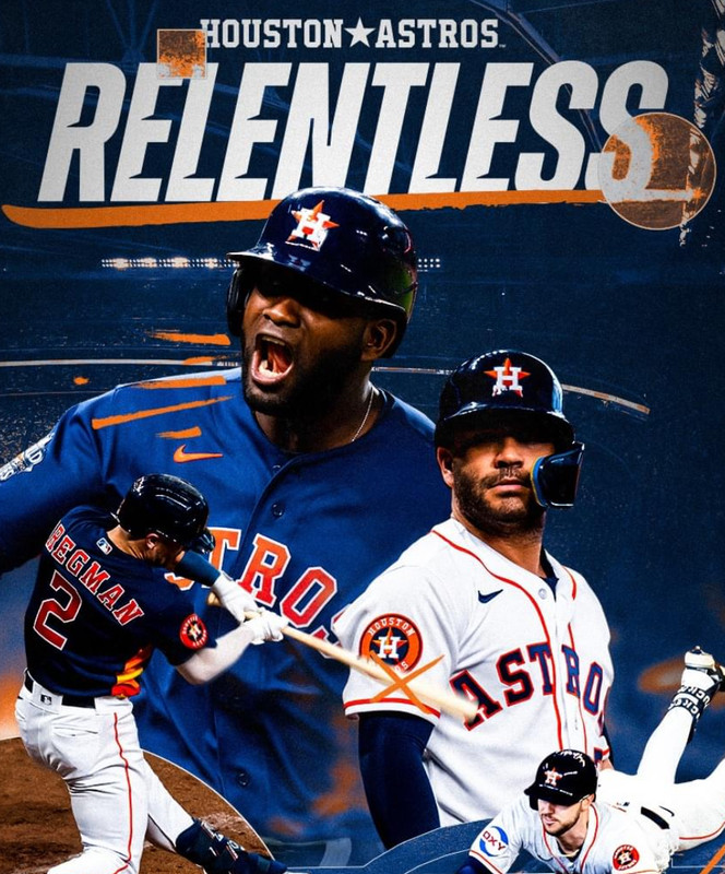
The gold and navy wasn't that bad, a downgrade but not a bad change. I'm surprised you bring up that logo instead of the actual worst logo the Astros have evet had, which is the 2000-2012 brick red junction jack years logo.
It was awful from 1994 to 2012. None of those actually look like the Astros.
The brick red and pinstripes was the worst.
Posted on 11/28/22 at 10:24 am to Cliff Booth
quote:
but I can’t help but have a soft spot for the navy and gold. Those were my formative years, didn’t know any better.
There are a lot of y'all that didn't know better. It doesn't make it good. They were awful.

 Page 6 of 8

Popular
Back to top