- My Forums
- Tiger Rant
- LSU Recruiting
- SEC Rant
- Saints Talk
- Pelicans Talk
- More Sports Board
- Fantasy Sports
- Golf Board
- Soccer Board
- O-T Lounge
- Tech Board
- Home/Garden Board
- Outdoor Board
- Health/Fitness Board
- Movie/TV Board
- Book Board
- Music Board
- Political Talk
- Money Talk
- Fark Board
- Gaming Board
- Travel Board
- Food/Drink Board
- Ticket Exchange
- TD Help Board
Customize My Forums- View All Forums
- Show Left Links
- Topic Sort Options
- Trending Topics
- Recent Topics
- Active Topics
Started By
Message
re: Worst Logo Changes in Sports History
Posted on 11/28/22 at 2:30 pm to LaLadyinTx
Posted on 11/28/22 at 2:30 pm to LaLadyinTx


 1
1

Posted on 11/29/22 at 1:14 pm to Mufassa


Posted on 11/29/22 at 1:31 pm to SirWinston
quote:
If they had kept the same colours and classic uniforms the logo wouldn't be that bad. It's the gay looking unis that are the problem.
I don't mind the colors of the uni's. Most of the time it's all white.
18-20 years ago, Fins were coming up with these horrible orange or blue home jerseys. Thank goodness it did not last.
Posted on 11/29/22 at 3:16 pm to Diseasefreeforall
Freaking GOAT. But can’t have a white man as a mascot anymore.
Posted on 11/29/22 at 3:22 pm to HangmanPage1
quote:
love the 1990 logo.
It screams “Jefferson Pilot Sports.”
Posted on 11/29/22 at 4:03 pm to Mufassa
quote:
YouTube vid
Great video explaining the trend
I spent a lot of time in the field of "brand design" and have watched trends come and go. The push to "flat" design has been driven directly by two things. First like they state in the video, mobile first, better yet, mobile native design. You need a brand mark to be clearly legible on what are truly small spaces. Also, additional color and design can be detrimental to page download times, especially when you're considering mobile data trasfer.
Second is flexibility and reuse. How current CMSs (content management systems) work is that you upload one SVG file and the backend of the CMS deploys the logo for mobile, desktop, tablet and everything in between. So that one cached image populates across your site in various sizes and places. So that means the more simple and flexible your logo is, the better it will be for wide use across digital properties. That's where 90+% of the places where your brand is viewed.
I personally like the more refined look of the corporate logos today. Sports logos on the hand should be reserved to have character and unique styles.
That said, the trend shifts every five years or so. Since things have turned so sterile, I imagine that some handcrafted type elements will start making their way back into brand design.
Posted on 11/30/22 at 7:08 am to RolltidePA
Posted on 11/30/22 at 12:14 pm to foosball
I don't know why Cleveland gets a pass on their logo change while Washington is getting crushed. Cleveland went from iconic to moronic


Posted on 11/30/22 at 1:06 pm to Tigeralum2008
The Indians brand being killed makes me sadder than the redskins

Posted on 11/30/22 at 1:48 pm to SirWinston
quote:
If they had kept the same colours and classic uniforms the logo wouldn't be that bad
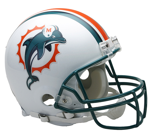
I'm going to be honest, I will never understand why Miami is always mentioned as having such a bad rebrand. Of all the NFL franchises who have rebranded the past 15-20 years, Miami had probably the most minor of changes. So they use a brighter shade of green, changed the font of the numbers, and took the helmet off the dolphin in their logo. What else am I missing?
To me, it's just a modernized version of what they've always worn. They didn't reinvent the wheel with their rebrand


/cdn.vox-cdn.com/uploads/chorus_asset/file/23886244/1240878555.jpg)
This post was edited on 11/30/22 at 1:50 pm
Posted on 11/30/22 at 3:14 pm to lsufball19
quote:
So they use a brighter shade of green, changed the font of the numbers, and took the helmet off the dolphin in their logo.
Individually, those changes may not be much. Altogether, I think they were all downgrades. No need to fix something that isn’t broken.
Posted on 11/30/22 at 3:43 pm to TigerEyez
The Washington Capitals when from the screaming eagle

To this:

Then back to their original logo before the screaming eagle

To this:
Then back to their original logo before the screaming eagle

Posted on 11/30/22 at 4:22 pm to lsufball19
The current “dolphin” on the helmet looks like a whale
Posted on 11/30/22 at 6:38 pm to thejuiceisloose
quote:
The current “dolphin” on the helmet looks like a whale
Dolphins, in reality, look a lot like whales. Probably because they’re both in the same family of aquatic mammals. That said, the new logo looks like a dolphin unless you’re looking for a reason to say it doesn’t
Posted on 11/30/22 at 6:52 pm to lsufball19
I'm old but Oregon used to be a team I loved to follow when they used the Green and Yellow color scheme every week. Then Nike and Phil Knight decided to use them as a public test for their awful ideas.
Posted on 11/30/22 at 6:54 pm to Stealth Matrix
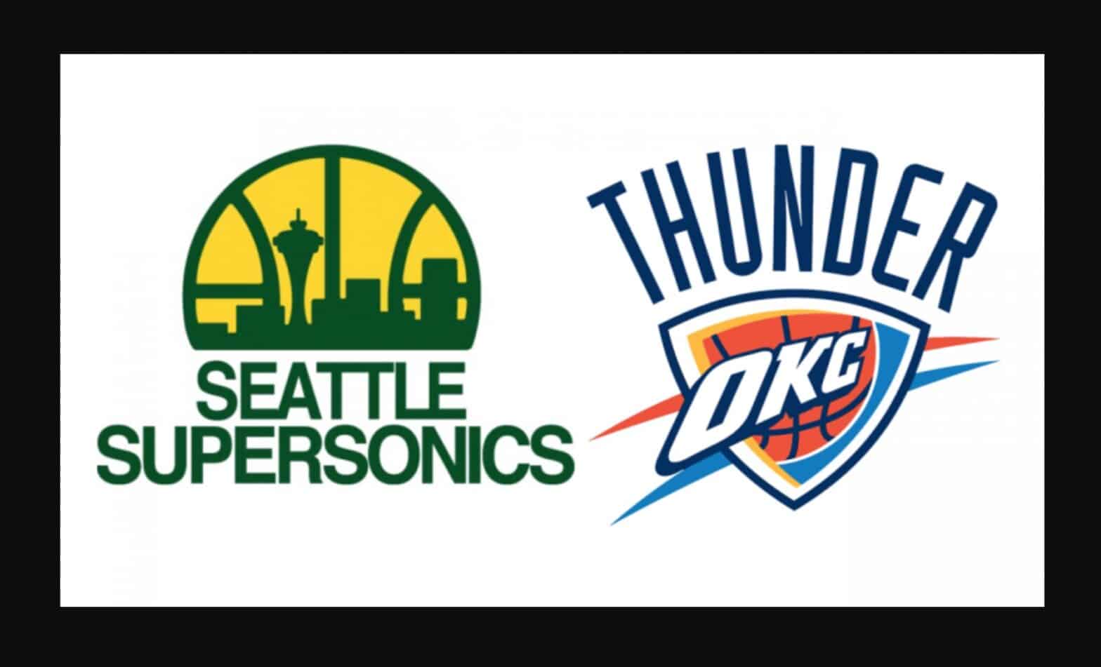
Always reminds me of Elias (WWE) rolling the ever living shite out Seattle Sonic fans about the team leaving for OKC (1:20 mark).
Elias trolls Seattle
This post was edited on 11/30/22 at 6:56 pm

Posted on 12/1/22 at 10:58 am to Rhino5
Chicago Fire (MLS) management went completely stupid in 2019 when they dropped their iconic Maltese Cross-inspired crest to something my 7-year old would be embarrassed to claim. Then they went with the completely generic crest they have today.

Posted on 12/1/22 at 4:44 pm to GeauxHouston
What I've gathered from this thread is that the 90's were fricking sick. I know was in my teens then. Everything is so shitty and watered down now 
Posted on 12/1/22 at 5:51 pm to GreatLakesTiger24
For some reason I think the 1980 logo looks cool.

Also found this "mascot logo" that was apparently in use 1958-1966
LINK to sportslogos.net

Also found this "mascot logo" that was apparently in use 1958-1966
LINK to sportslogos.net

 Page 7 of 8

Popular
Back to top