- My Forums
- Tiger Rant
- LSU Recruiting
- SEC Rant
- Saints Talk
- Pelicans Talk
- More Sports Board
- Fantasy Sports
- Golf Board
- Soccer Board
- O-T Lounge
- Tech Board
- Home/Garden Board
- Outdoor Board
- Health/Fitness Board
- Movie/TV Board
- Book Board
- Music Board
- Political Talk
- Money Talk
- Fark Board
- Gaming Board
- Travel Board
- Food/Drink Board
- Ticket Exchange
- TD Help Board
Customize My Forums- View All Forums
- Show Left Links
- Topic Sort Options
- Trending Topics
- Recent Topics
- Active Topics
Started By
Message
re: Worst Logo Changes in Sports History
Posted on 11/25/22 at 7:13 pm to GeauxHouston
Posted on 11/25/22 at 7:13 pm to GeauxHouston
Padres getting out of the Brown/Gold into the bland navy blue. 
 0
0

Posted on 11/25/22 at 7:13 pm to lsutigers1992
quote:
Nb4 Politard hijack with Indian mascots.
Pearl clitching aside, some of these logos are/were the best in sports and did nothing but celebrate Native Americans. It's a shame some franchises got swept up into Faux Twitter outrage.
The Redskins and Blackhawks come to mind. The redskins pissed away one of the most iconic names and logos to appease folks who couldn't give a vegan crap about the NFL. I'm.holding out hope they bring it back one day.
Posted on 11/25/22 at 7:15 pm to evil cockroach
Those old Rams jerseys are a thing of beauty. The Dickerson era with the blue face masks and the more updated lines are fantastic too. The ones they now have match the team and their “fans” perfectly. A crappy generic stadium with crappy generic fans and uniforms that have grooved numbers!

Posted on 11/25/22 at 7:17 pm to SammyTiger
quote:How do you figure? Liverpool’s logo is more or less an iteration of their past logos:
Liverpool and Man City are other victims

And Man City did an updated version of their old logos:
Posted on 11/25/22 at 7:23 pm to Boodis Man
quote:
the logo is popular in the LGBTQ+ community because the guy is bending over with a grimace on his face
Boodis Man. We see what you did there.

Posted on 11/25/22 at 7:53 pm to GeauxHouston
From this classic:
To this 90's disaster:

To this 90's disaster:
Posted on 11/25/22 at 8:47 pm to Loungefly85
quote:
They should have never given in…
They did not need to. People would have continued to go to the stadium and watch on TV in the same numbers. They actually lost fans due to this inane nonsense. More importantly, all the geezer guys in the Southeast to whom as kids the REDSKINS were the NFL on TV (no Saints, no Dolphins, no Falcons back then), would still feel some loyalty to Washington. Hail to the Redskins!
This post was edited on 11/26/22 at 10:43 am

Posted on 11/25/22 at 8:48 pm to GeauxHouston
From this (1997-2001) 
To this (2002-Present)

Helmets went from this:
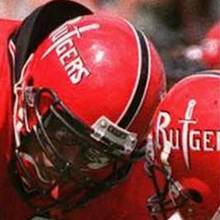
To this:
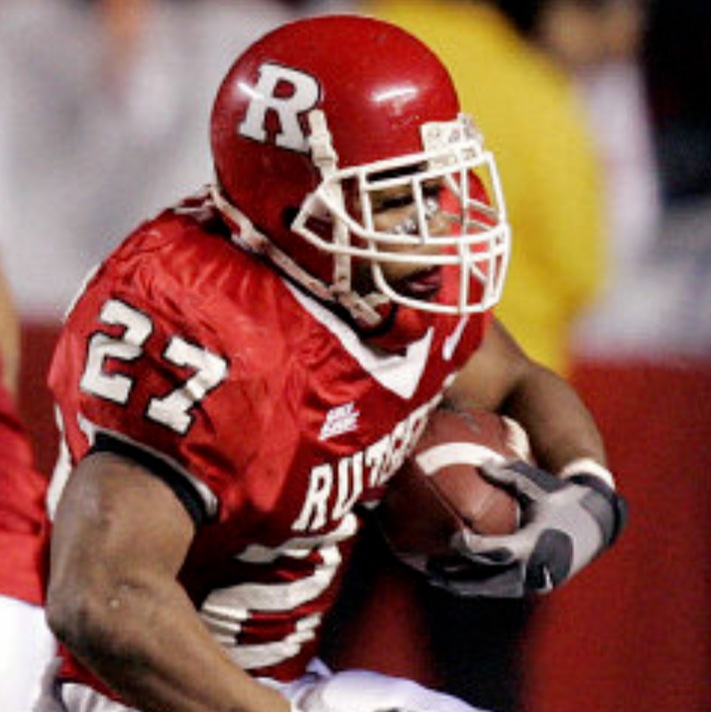
The sword “t” was badass. Never understood why they did away with it.
To this (2002-Present)
Helmets went from this:
To this:
The sword “t” was badass. Never understood why they did away with it.
This post was edited on 11/25/22 at 8:54 pm

Posted on 11/25/22 at 8:48 pm to TheTideMustRoll
Most schools had some shitty logos in the 90s and 2000s
Posted on 11/25/22 at 8:53 pm to GreatLakesTiger24
The Cleveland Indians to Cleveland guardians
Terrible name and logo.
Chief Wahoo was an icon
Terrible name and logo.
Chief Wahoo was an icon
This post was edited on 11/25/22 at 8:54 pm

Posted on 11/25/22 at 10:08 pm to GeauxHouston
For the original Miami logo with dolphin wearing a helmet, I always thought that on that little helmet, it should have a dolphin wearing a helmet (instead of the M). Then on that really little dolphin's helmet, it should have a dolphin wearing a helmet. Keep going until it was physically impossible to make the dolphin wearing a helmet so small.
Posted on 11/26/22 at 12:36 am to Basura Blanco
I got Dave Elmendorf and Jack Youngblood spottings. 

Posted on 11/26/22 at 1:09 am to Methuselah

Posted on 11/26/22 at 3:32 am to GreatLakesTiger24
quote:Somehow we managed to get shittier
Most schools had some shitty logos in the 90s and 2000s
90s Kentucky tGOAT logo

Present day Kentucky two birds fricking logo


Posted on 11/26/22 at 4:19 am to UKWildcats
quote:
two birds fricking
This took me a second.
Posted on 11/26/22 at 6:18 am to TheGasMan
quote:
This took me a second
And now can’t be unseen
Posted on 11/26/22 at 6:30 am to evil cockroach
quote:
Islanders went to a character from Deadliest Catch for a while.
Nah. That’s the Gorton’s fisherman.

Posted on 11/26/22 at 6:59 am to GeauxHouston

Posted on 11/26/22 at 7:22 am to Jason9782003
I noticed a lot of these logos have become more “clip arty”. What is it about the digital age that has taken the style out of the the designs?
Posted on 11/26/22 at 7:42 am to alajones
quote:
I noticed a lot of these logos have become more “clip arty”. What is it about the digital age that has taken the style out of the the designs?
I’ve noticed that too. Especially with the new Georgia one. I believe back then the logos were actually hand drawn. The new ones you see are done entirely by computer graphics.
And probably paid someone a shite ton of money to do it.

 Page 4 of 8

Popular
Back to top