- My Forums
- Tiger Rant
- LSU Recruiting
- SEC Rant
- Saints Talk
- Pelicans Talk
- More Sports Board
- Fantasy Sports
- Golf Board
- Soccer Board
- O-T Lounge
- Tech Board
- Home/Garden Board
- Outdoor Board
- Health/Fitness Board
- Movie/TV Board
- Book Board
- Music Board
- Political Talk
- Money Talk
- Fark Board
- Gaming Board
- Travel Board
- Food/Drink Board
- Ticket Exchange
- TD Help Board
Customize My Forums- View All Forums
- Show Left Links
- Topic Sort Options
- Trending Topics
- Recent Topics
- Active Topics
Started By
Message

Worst Logo Changes in Sports History
Posted on 11/25/22 at 9:18 am
Posted on 11/25/22 at 9:18 am
Had a discussion with some buddies about the worst logo changes in history….
Some we came up with.
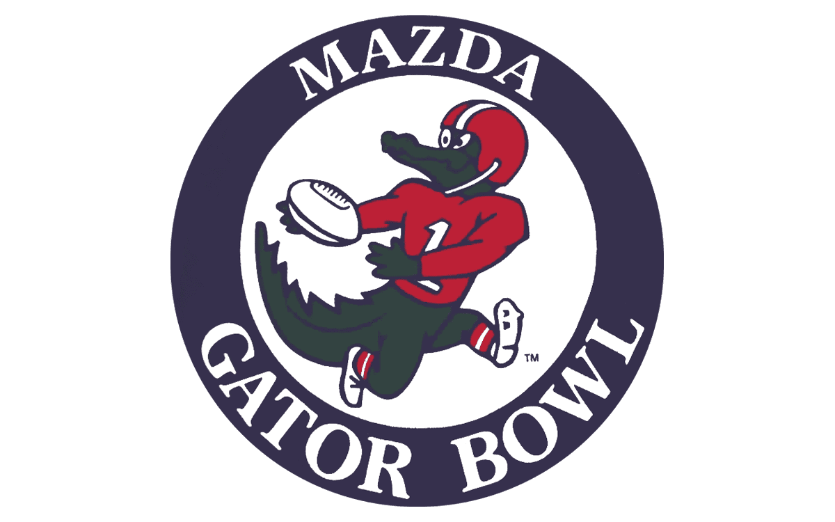
The Gator Bowl went from these

To this POS.

Also frequently bought up was…

This movement to lifeless, minimalistic branding is horrible.
What are y’all’s least favorite logo changes?
Some we came up with.
The Gator Bowl went from these
To this POS.
Also frequently bought up was…
This movement to lifeless, minimalistic branding is horrible.
What are y’all’s least favorite logo changes?
This post was edited on 11/25/22 at 9:20 am
 33
33

Posted on 11/25/22 at 9:23 am to GeauxHouston
Miami really downgraded on the logo
Posted on 11/25/22 at 9:24 am to GeauxHouston
A Gator Bowl with no gator mascot in the logo is no Gator Bowl at all.
The second logo was very good.
The second logo was very good.
Posted on 11/25/22 at 9:28 am to GeauxHouston
The Rams new logo and uniforms are amazing. Best job I've ever seen of modernizing classics.
NO voluntarily going from the iconic Hornets brand and colours to yet another tired "fierce bird" with navy and red is def one of the worst branding decisions in recent American history (regardless of industry).
NO voluntarily going from the iconic Hornets brand and colours to yet another tired "fierce bird" with navy and red is def one of the worst branding decisions in recent American history (regardless of industry).
Posted on 11/25/22 at 9:29 am to GeauxHouston
Those new rams uniforms look like uniforms that would be used for a generic football team in a Walmart advertisement to sell soda and chips during football season.
Posted on 11/25/22 at 9:29 am to thebigmuffaletta
quote:
Miami really downgraded on the logo
If they had kept the same colours and classic uniforms the logo wouldn't be that bad. It's the gay looking unis that are the problem.
Posted on 11/25/22 at 9:31 am to Loungefly85
These are so good - I don't get how people don't like them


Posted on 11/25/22 at 9:33 am to SirWinston
The Astros going from the 1977-93 logo to the 1994-99 crap.
Rebranding in 2013 was great though.

Rebranding in 2013 was great though.
Posted on 11/25/22 at 9:37 am to LSUBoo

Posted on 11/25/22 at 9:43 am to GeauxHouston
Nb4 Politard hijack with Indian mascots.
Posted on 11/25/22 at 9:49 am to LSUBoo
quote:
The Astros going from the 1977-93 logo to the 1994-99 crap.
The gold and navy wasn't that bad, a downgrade but not a bad change. I'm surprised you bring up that logo instead of the actual worst logo the Astros have evet had, which is the 2000-2012 brick red junction jack years logo.
The blue collar appeal for a team called "the Astros" was an odd match. I get why they wanted a blue collar appeal for a blue collar city, but it never really fit for me.
Posted on 11/25/22 at 9:50 am to GeauxHouston
quote:
This movement to lifeless, minimalistic branding is horrible.
Apparently it’s hit soccer badges particularly bad.
I dont Mind cleaning up an old logo but you’re see a lot of character get dropped and too many teams moving to a lame arias word script.
Posted on 11/25/22 at 9:51 am to lsutigers1992
quote:
Nb4 Politard hijack with Indian mascots
Christ, people. Can you keep this vile Politard shite off the MSB just one freaking time?
Remember that time you hated Gus Johnson as an announcer because he’s back?
Posted on 11/25/22 at 9:53 am to SirWinston
The jerseys look good.
But if you have an animal mascot, it needs to be used in your logo.
You can go in any of these three directions. Teams have been successful with each of these, but you need an animal mascot.
1. Natural looking (Chicago Cubs, old school Detroit Tigers, original Jacksonville Jaguars)
2. Fearsome (Memphis Grizzlies, the non-toonces LSU logo)
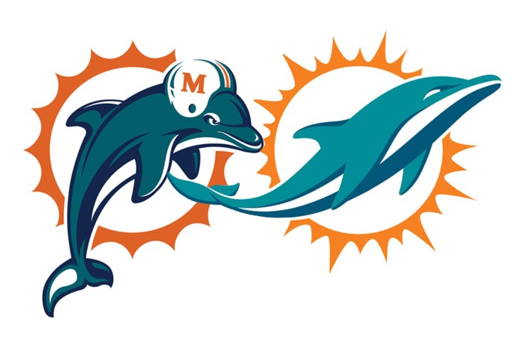
3. Cute/playful and preferably playing the sport (Milwaukee Bucks, old Miami Dolphins)
Any of these three can work although 3 has the most room for error.
But if you have an animal mascot, it needs to be used in your logo.
You can go in any of these three directions. Teams have been successful with each of these, but you need an animal mascot.
1. Natural looking (Chicago Cubs, old school Detroit Tigers, original Jacksonville Jaguars)
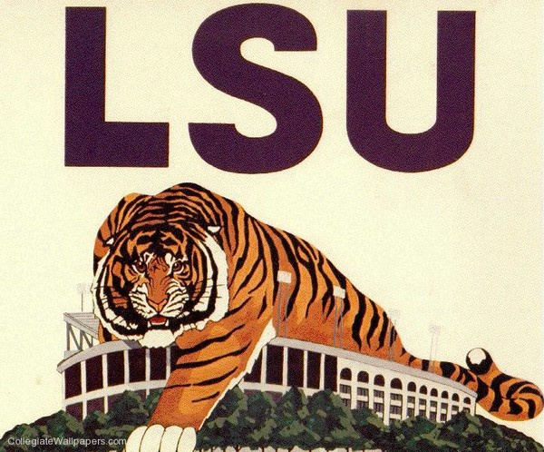
2. Fearsome (Memphis Grizzlies, the non-toonces LSU logo)
3. Cute/playful and preferably playing the sport (Milwaukee Bucks, old Miami Dolphins)
Any of these three can work although 3 has the most room for error.
Posted on 11/25/22 at 9:56 am to lsutigers1992
Nb4 95% of indigenous tribes never really gave a shite!

Posted on 11/25/22 at 10:09 am to LSUBoo
I agree that it was idiotic to ever take orange out of the color scheme, but I can’t help but have a soft spot for the navy and gold. Those were my formative years, didn’t know any better.
The 2013 reboot worked out perfectly though.
The 2013 reboot worked out perfectly though.
Posted on 11/25/22 at 10:12 am to GeauxHouston
The traditional Rams unis and color scheme is one of the best. Way better than their St. Louis days.
But there is something off about the quality. They look like they’re off the Walmart rack and the numbers are about to peel off.
But there is something off about the quality. They look like they’re off the Walmart rack and the numbers are about to peel off.
Posted on 11/25/22 at 10:14 am to lsutigers1992
quote:
Nb4 Politard hijack with Indian mascots.
Why don’t you do it? It’s obviously on your mind.

Posted on 11/25/22 at 10:21 am to GeauxHouston
Psychotic Mike the tiger to toonces was real bad
Posted on 11/25/22 at 10:21 am to GeauxHouston
Super Bowl logos going from customized art based on locations to


 Page 1 of 8

Popular
Back to top