- My Forums
- Tiger Rant
- LSU Recruiting
- SEC Rant
- Saints Talk
- Pelicans Talk
- More Sports Board
- Fantasy Sports
- Golf Board
- Soccer Board
- O-T Lounge
- Tech Board
- Home/Garden Board
- Outdoor Board
- Health/Fitness Board
- Movie/TV Board
- Book Board
- Music Board
- Political Talk
- Money Talk
- Fark Board
- Gaming Board
- Travel Board
- Food/Drink Board
- Ticket Exchange
- TD Help Board
Customize My Forums- View All Forums
- Show Left Links
- Topic Sort Options
- Trending Topics
- Recent Topics
- Active Topics
Started By
Message
re: The top 5 worst logos in American sports are as follows:
Posted on 10/23/25 at 2:33 pm to JerryTheKingBawler
Posted on 10/23/25 at 2:33 pm to JerryTheKingBawler
quote:
The Clippers put a badass warship in the middle of theirs, so they get a small pass.
I think its a clipper
 0
0


Posted on 10/23/25 at 2:34 pm to JerryTheKingBawler
quote:
Buffalo Sabres
They have a nice logo imo
Posted on 10/23/25 at 2:35 pm to DestrehanTiger
Buffalo Sabres logo, which is their original, old school logo, is freaking awesome. Huge fail by OP on that one.
Posted on 10/23/25 at 2:36 pm to DestrehanTiger
quote:
Agreed. I was sure I must've read the OP wrong. Their current logo is both classic and not boring.
It's also original. The 90s cartoon logo was the imposter.
Posted on 10/23/25 at 2:36 pm to SoDakHawk
I've never noticed the diagonal line going through the back of the buffalo. What is that about?
Posted on 10/23/25 at 2:37 pm to JerryTheKingBawler
Sabers is better than - lot of teams
I feel like Guardians get hate because it’s a “woke” rebrand and in that sense anything would get hate. If you ask the biggest hater what the name should have been they will almost always say “the Indians” but I like it if those statues are actually called the Guardian of Traffic and that’s a well known thing in Cleveland. if it’s like an obscure bit of trivia then it’s really lame.
but those statutes are awesome and iconic. One of them is the opening shot of Major League
This post was edited on 10/23/25 at 2:38 pm
Posted on 10/23/25 at 2:40 pm to DestrehanTiger
I think it's just a way to show he's in motion, i.e. charging.
Posted on 10/23/25 at 2:41 pm to JerryTheKingBawler
I've always thought The Thunder was the worst.
Posted on 10/23/25 at 2:43 pm to iwyLSUiwy
He said logos but go ahead and change it to uniforms since you can’t stay on subject.
Posted on 10/23/25 at 2:48 pm to JerryTheKingBawler
No Toonces?
Posted on 10/23/25 at 2:50 pm to red sox fan 13
quote:
Washington Commanders. Not even trying to make a political statement, a yellow W is just a shitty logo and I don’t like the font at all.
I wonder what marketing firm was paid millions of dollars to come up with that Jr. High Yearbook Stencil W?

Posted on 10/23/25 at 2:52 pm to mizzoubuckeyeiowa
I've always found this to be an embarrassing "panther" logo.
Posted on 10/23/25 at 2:53 pm to JerryTheKingBawler
Flying Elvis is the worst logo in major sports. It looks like Elvis plastered on North Carolina for some reason.

Posted on 10/23/25 at 2:53 pm to Marciano1
quote:
I've always found this to be an embarrassing "panther" logo.
60% of the time, it works every time.

Posted on 10/23/25 at 3:11 pm to iwyLSUiwy
quote:
But just logos, it has to be the Rams. This is as bad as it gets.

On its own, I would say that's a pretty sweet modern corporate logo for a tech company. "We are LA RAM, we sell the fastest and cheapest DDR5 DIMM and SODIMM modules!" For the NFL, I think modern-looking logos just don't work. I think trotting out the throwbacks is the right mentality, emphasizing history and tradition.
If you want to see a real joke, I was reminded of the 49ers' truly disastrous attempt to introduce a "modern" logo in 1991.

espn.com/nfl/story/_/id/14836923/uni-watch-friday-flashback-why-san-francisco-49ers-1991-helmet-redesign-was-historic-failure
Posted on 10/23/25 at 3:26 pm to JerryTheKingBawler
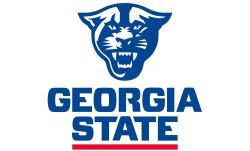
Probably not the worst but I can’t stand logos that abbreviate the name of the mascot instead of the geographical team name


The exception being this beauty
The exception being this beauty
Posted on 10/23/25 at 3:27 pm to JerryTheKingBawler
8/10 for the thread idea
-2/10 for not including pics for a thread that needs to be visualized
Do better son
-2/10 for not including pics for a thread that needs to be visualized
Do better son
Posted on 10/23/25 at 3:34 pm to TheRouxGuru
I can't see the K State logo without seeing the laughing dude.

Posted on 10/23/25 at 3:36 pm to Diseasefreeforall
At first I was wondering WTF you were talking about
But now you’ve ruined that logo for me
But now you’ve ruined that logo for me
Posted on 10/23/25 at 4:08 pm to DestrehanTiger
I love Pat Patriot and their latest uniforms are far better than what Tom Brady wore, but I agree they should rock these pilgrim throwbacks sometimes

 Page 2 of 5

Popular
Back to top