




 0
0








- My Forums
- Tiger Rant
- LSU Recruiting
- SEC Rant
- Saints Talk
- Pelicans Talk
- More Sports Board
- Fantasy Sports
- Golf Board
- Soccer Board
- O-T Lounge
- Tech Board
- Home/Garden Board
- Outdoor Board
- Health/Fitness Board
- Movie/TV Board
- Book Board
- Music Board
- Political Talk
- Money Talk
- Fark Board
- Gaming Board
- Travel Board
- Food/Drink Board
- Ticket Exchange
- TD Help Board
Customize My Forums- View All Forums
- Show Left Links
- Topic Sort Options
- Trending Topics
- Recent Topics
- Active Topics
Started By
Message
Posted on 8/14/26 at 11:29 am to BilJ
This topic has been beaten to death. Downvote.
Posted on 8/14/26 at 11:37 am to nclsutiger
Hate it.
And honestly I dint like the Geaux Font logo.
It’s lacks and character. it’s just a random dated looking font.
And honestly I dint like the Geaux Font logo.
It’s lacks and character. it’s just a random dated looking font.
Posted on 8/14/26 at 11:51 am to BilJ
1990 to 2001 was the logo when I was at LSU. It's okay. I am partial to logos that have a tiger on them. You would think a consistent tiger logo would be easy to maintain.
I like Sailor Mike because it is the most unique, but something like 1980 to 1989 is better. I like 1972 to 1980, but the tiger head is too round.
I like Sailor Mike because it is the most unique, but something like 1980 to 1989 is better. I like 1972 to 1980, but the tiger head is too round.
Posted on 8/14/26 at 11:53 am to BilJ
I like the 72-80 but I wish there was more merch available with the 67-72 logo. that's not used nearly enough.
Posted on 8/14/26 at 11:54 am to BilJ
72-80
I get updating the logo but they should have left the football helmets how they were with that logo.
I get updating the logo but they should have left the football helmets how they were with that logo.
Posted on 8/14/26 at 11:55 am to BilJ
07-13. It's when I got into LSU and college football.
Posted on 8/14/26 at 11:56 am to BilJ
none of those
the simple baseball logo is my favorite LSU logo.
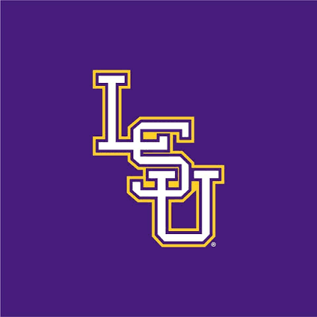
the simple baseball logo is my favorite LSU logo.
Posted on 8/14/26 at 12:00 pm to SammyTiger
quote:
And honestly I dont like the Geaux Font logo.
same
As someone else pointed out, the baseball logo is the best and it's not really close
Posted on 8/14/26 at 12:00 pm to BilJ
The best? Not sure. But the worst in college sport is 1990-2001 with a script "Tigers."
Posted on 8/14/26 at 12:17 pm to HurricaneCamille
quote:Not sure what to make of someone that doesn’t think Toonces is the worst.
The best? Not sure. But the worst in college sport is 1990-2001 with a script "Tigers."
Posted on 8/14/26 at 12:20 pm to BilJ
I like the sailor Mike, 72-80 Mike and the 1990 to 01 logo
Posted on 8/14/26 at 12:20 pm to BilJ
current is the best...it is most recognizable, especially when shrunk to a small size...
1990-2001 also strong
2002-2013 is so bad...
1990-2001 also strong
2002-2013 is so bad...
Posted on 8/14/26 at 12:26 pm to Big4SALTbro
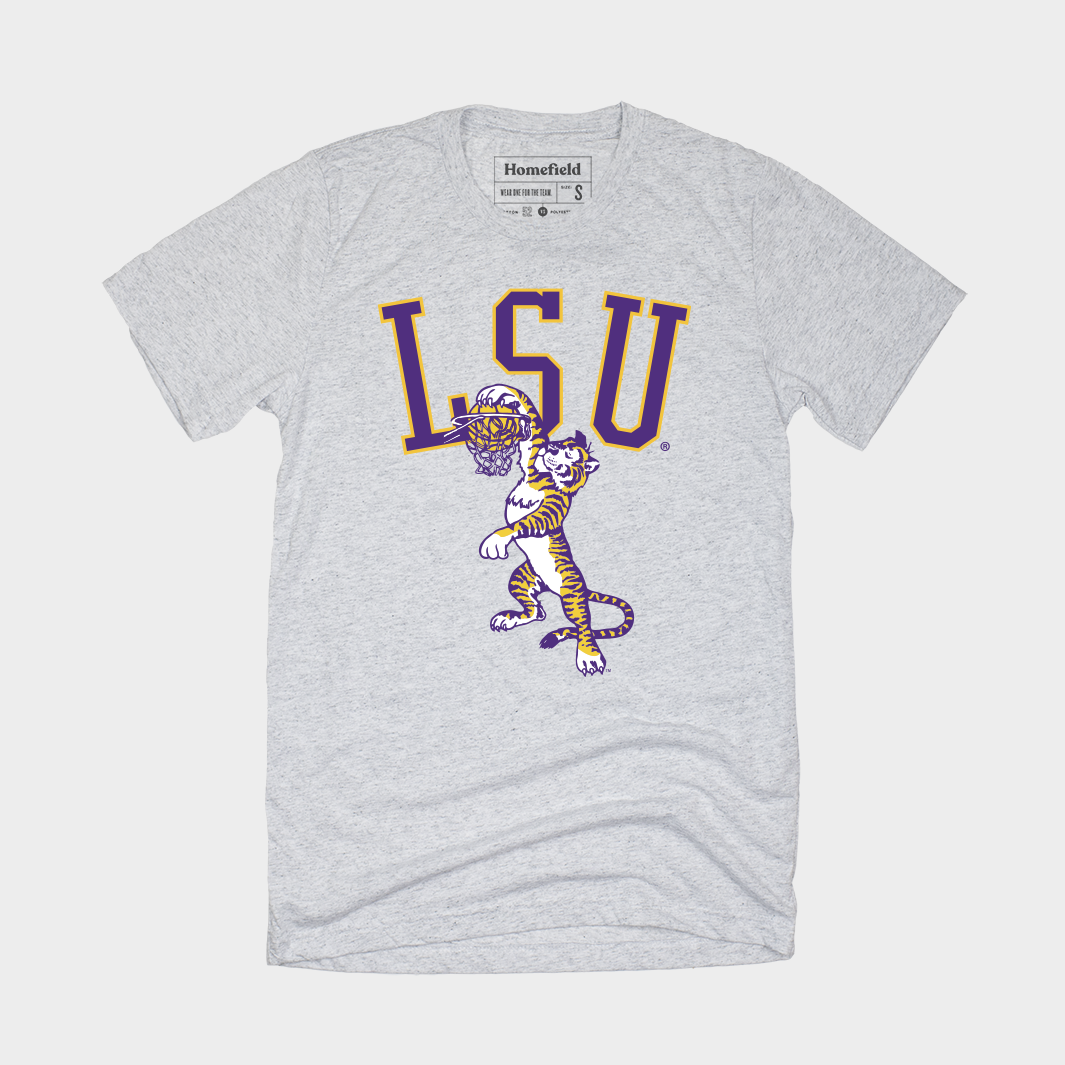
quote:Same, although the Dunking Tiger should be the official LSU logo.
I like the sailor Mike, 72-80 Mike and the 1990 to 01 logo
Posted on 8/14/26 at 12:49 pm to saint tiger225
quote:
Sailor Mike is so clean. It's great for shirts, hoodies and things like that. The issue with sailor Mike is other schools used it as well, so it's not unique in that sense. That'd be my choice if it was unique to LSU.
quote:
Would be nice if they used the staircase LSU logo on things other than baseball hats. That's a good one that doesn't get enough love.
I like how Blake Baker wears the staircase logo hat and Sailor Mike shirt on the sideline. Dude has good taste.
Posted on 8/14/26 at 12:51 pm to Sir Fury
quote:
Sailor Mike
Most unique, without being douchey
Posted on 8/14/26 at 12:52 pm to BilJ
Posted on 8/14/26 at 1:00 pm to BilJ
Posted on 8/14/26 at 1:12 pm to SPEEDY
The dunking tiger is even better with the Louisiana State script
Posted on 8/14/26 at 1:15 pm to BilJ
Sailor mike

 Page 2 of 5

Popular
Back to top
 Follow TigerDroppings for LSU Football News