




 53
53








- My Forums
- Tiger Rant
- LSU Recruiting
- SEC Rant
- Saints Talk
- Pelicans Talk
- More Sports Board
- Fantasy Sports
- Golf Board
- Soccer Board
- O-T Lounge
- Tech Board
- Home/Garden Board
- Outdoor Board
- Health/Fitness Board
- Movie/TV Board
- Book Board
- Music Board
- Political Talk
- Money Talk
- Fark Board
- Gaming Board
- Travel Board
- Food/Drink Board
- Ticket Exchange
- TD Help Board
Customize My Forums- View All Forums
- Show Left Links
- Topic Sort Options
- Trending Topics
- Recent Topics
- Active Topics
Started By
Message
What's your favorite LSU logo?
Posted on 8/14/26 at 10:57 am
Posted on 8/14/26 at 10:57 am
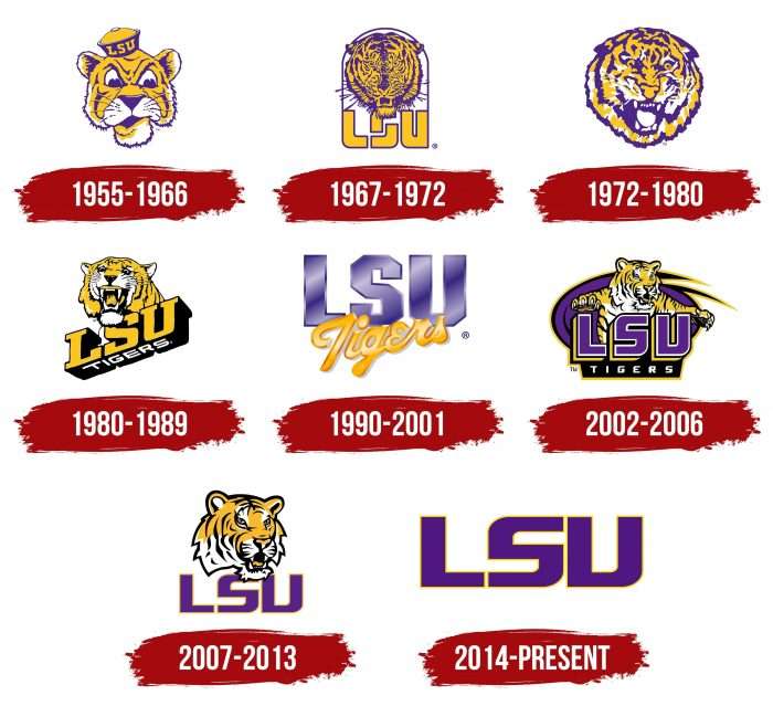
The 1990-2001 is mine, followed by sailor mike.
It's still unbelievable we paid someone to design toonces, just awful
Posted on 8/14/26 at 10:58 am to BilJ
'72-'80
Posted on 8/14/26 at 10:59 am to BilJ
Can’t believe we had that god awful toonces logo for over a decade
Posted on 8/14/26 at 11:00 am to BilJ
72-80 and not an option here but stair stepped baseball logo
Posted on 8/14/26 at 11:01 am to BilJ
1990-2001
Posted on 8/14/26 at 11:01 am to BilJ
72-80 is my favorite.
I really like 90-01
But really all of them are good, excluding the 2 making the period of 02-13.
I really like 90-01
But really all of them are good, excluding the 2 making the period of 02-13.
Posted on 8/14/26 at 11:02 am to BilJ
Toonces is iconic
Posted on 8/14/26 at 11:02 am to BilJ
I’m kind of partial to the updated version of the classic tiger head.
Posted on 8/14/26 at 11:02 am to BilJ
The baseball logo and it’s not particularly close

Posted on 8/14/26 at 11:03 am to CBandits82
good pick
the old school single L is also nice, trying to find it
the old school single L is also nice, trying to find it
Posted on 8/14/26 at 11:03 am to BilJ

This logo brings back memories
Posted on 8/14/26 at 11:04 am to BilJ
Current, followed by Sailor Mike.
Posted on 8/14/26 at 11:05 am to BilJ
of the ones in the OP: 1990-2001 is great on a polo
and 72-80
overall it’s the baseball logo
and 72-80
overall it’s the baseball logo
This post was edited on 8/14/26 at 11:06 am
Posted on 8/14/26 at 11:05 am to The Boat

90s kid mandatory hat
Posted on 8/14/26 at 11:06 am to LouisianaLonghorn
i like the updated mike logo too. I feel like it is cleaner but still recognizable as the old helmet tiger drawing
Posted on 8/14/26 at 11:07 am to SammyTiger
2002-2013 was the dark ages of logos, absolutely horrendous cartoonish wimpy tiger
Posted on 8/14/26 at 11:11 am to BilJ
The one that isn't posted. The symmetrical tiger head. 72-80 was great, cleaning it up with a simple update made it my favorite.
Posted on 8/14/26 at 11:12 am to BilJ
Sailor Mike is so clean. It's great for shirts, hoodies and things like that. The issue with sailor Mike is other schools used it as well, so it's not unique in that sense. That'd be my choice if it was unique to LSU.
The '90-'01 is probably my choice after sailor Mike. The '72-'80 has a lot of potential, but it kind of looks like a crackhead tiger.
Would be nice if they used the staircase LSU logo on things other than baseball hats. That's a good one that doesn't get enough love.
This may be an unpopular opinion, but I don't really care for the current logo. The "geaux" font one has gotten stale and I never really liked it to begin with. It feels kind of cheap. That said, when it came out, it was a huge upgrade over Toonces. Though to be fair, anything would've been considered an upgrade over that God awful logo. Can't believe they used it for so long. Truly a dark period for the LSU logo.
The '90-'01 is probably my choice after sailor Mike. The '72-'80 has a lot of potential, but it kind of looks like a crackhead tiger.
Would be nice if they used the staircase LSU logo on things other than baseball hats. That's a good one that doesn't get enough love.
This may be an unpopular opinion, but I don't really care for the current logo. The "geaux" font one has gotten stale and I never really liked it to begin with. It feels kind of cheap. That said, when it came out, it was a huge upgrade over Toonces. Though to be fair, anything would've been considered an upgrade over that God awful logo. Can't believe they used it for so long. Truly a dark period for the LSU logo.
Posted on 8/14/26 at 11:16 am to BringBackTheToonces
quote:
Toonces is iconic
quote:
by BringBackTheToonces

Posted on 8/14/26 at 11:20 am to BilJ
That 2002 logo is an abomination. Hard to believe that thing was ever greenlighted.

 Page 1 of 5

Popular
Back to top
 Follow TigerDroppings for LSU Football News