- My Forums
- Tiger Rant
- LSU Recruiting
- SEC Rant
- Saints Talk
- Pelicans Talk
- More Sports Board
- Coaching Changes
- Fantasy Sports
- Golf Board
- Soccer Board
- O-T Lounge
- Tech Board
- Home/Garden Board
- Outdoor Board
- Health/Fitness Board
- Movie/TV Board
- Book Board
- Music Board
- Political Talk
- Money Talk
- Fark Board
- Gaming Board
- Travel Board
- Food/Drink Board
- Ticket Exchange
- TD Help Board
Customize My Forums- View All Forums
- Show Left Links
- Topic Sort Options
- Trending Topics
- Recent Topics
- Active Topics
Started By
Message
 1
1

Posted on 3/11/25 at 5:25 pm to Tiger Ryno
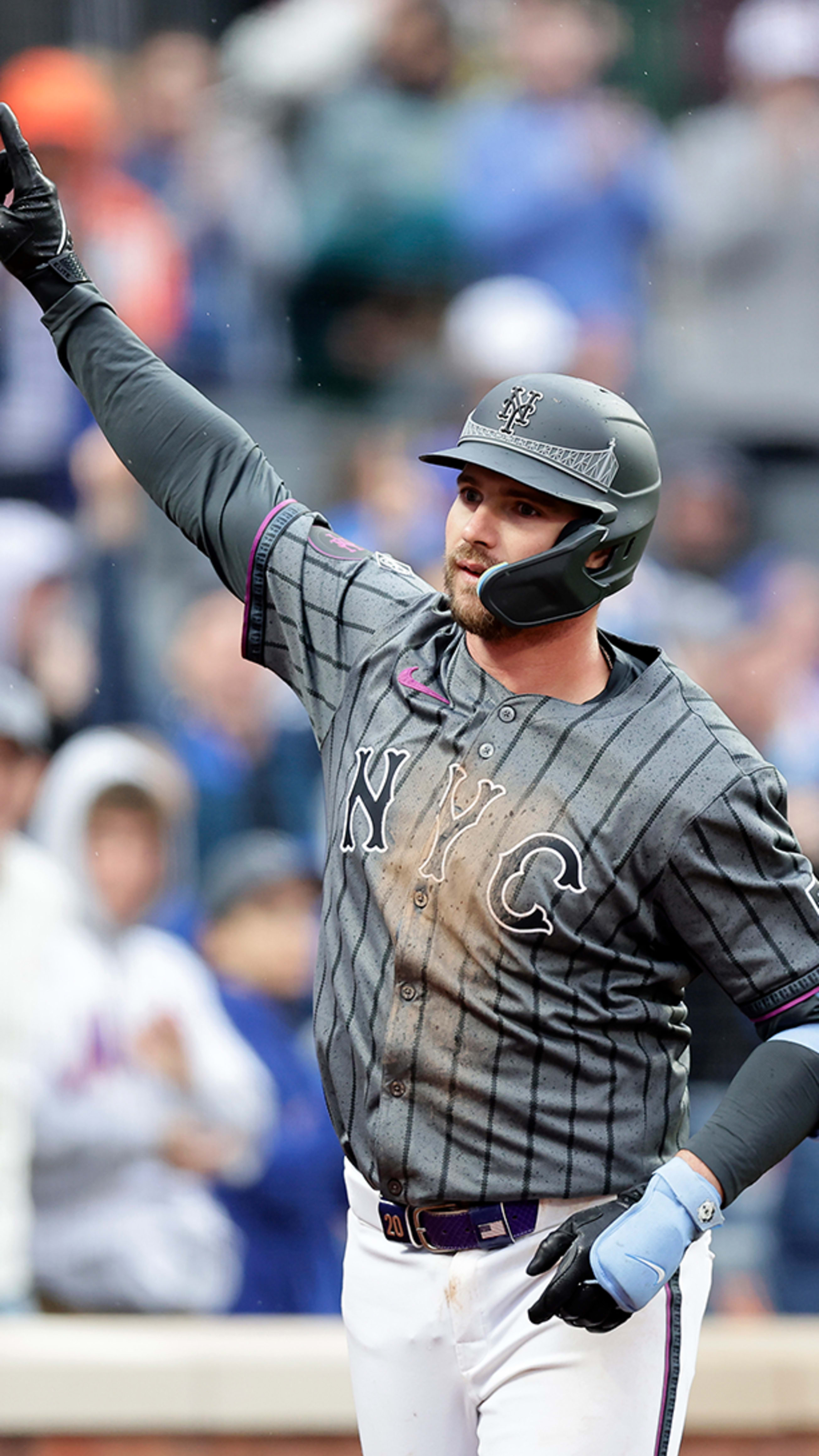
These NBA style city connects need to die in a fiery blaze
Posted on 3/11/25 at 7:46 pm to ShaneTheLegLechler
It really is incredible that they have zero clue about who buys merchandise
Posted on 3/11/25 at 9:38 pm to DalenSA
Posted on 3/11/25 at 9:43 pm to SWLA92
Just came here to post those pics. Not a fan at all. Hat looks cool tho
This post was edited on 3/11/25 at 9:46 pm
Posted on 3/11/25 at 10:26 pm to DalenSA
I Don't mind them. A bit plain but given some of the trash city connects have given us, I was expecting some hideous abomination.
/cdn.vox-cdn.com/uploads/chorus_image/image/73344253/ewscripps.brightspotcdn.5.png)


Count your blessings. It could have been do much worse.
Count your blessings. It could have been do much worse.

Posted on 3/11/25 at 10:51 pm to DalenSA

Posted on 3/12/25 at 6:17 am to Lsuhoohoo
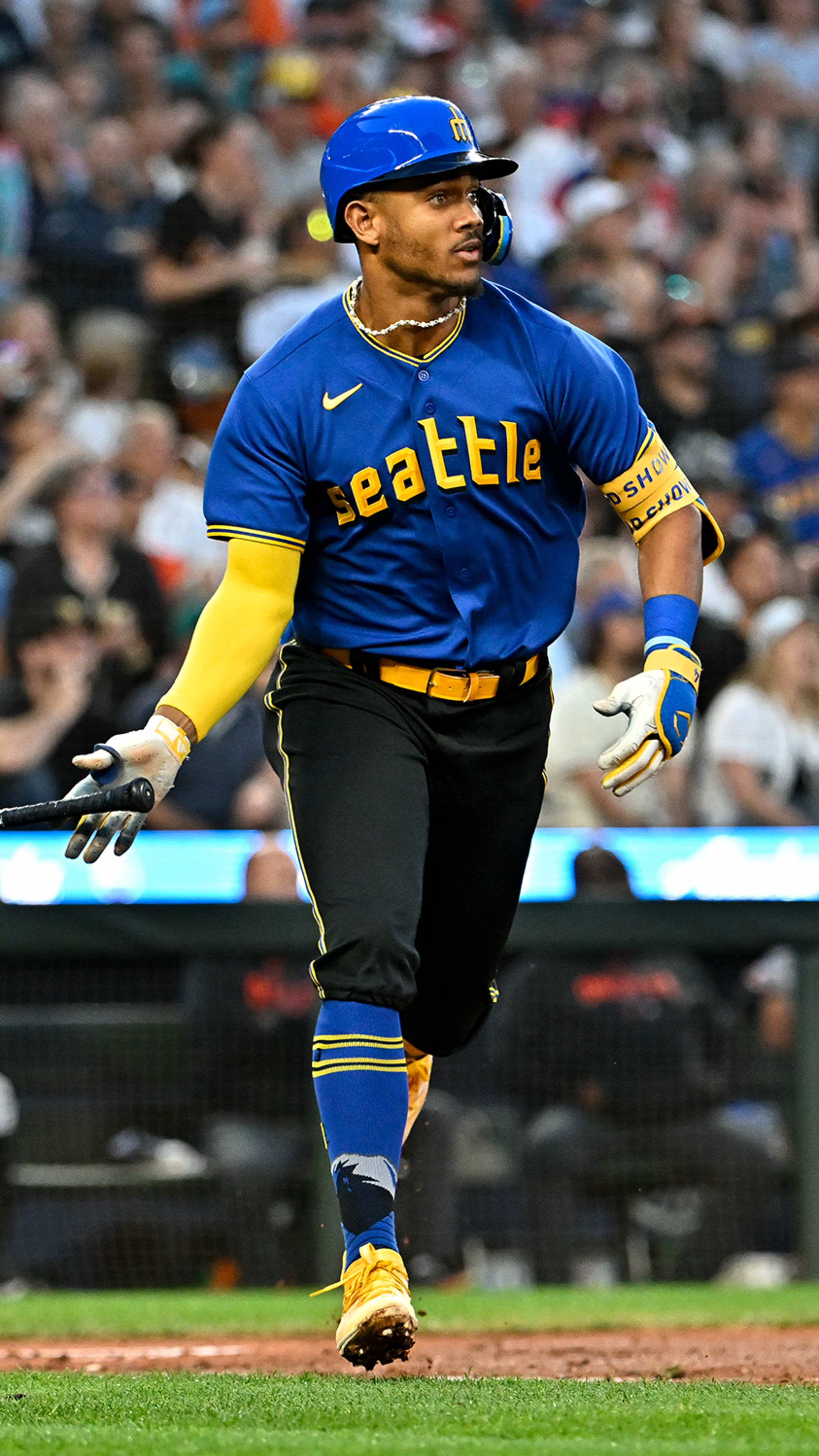
Seattle’s weren’t terrible, there’s at least history there.
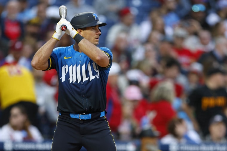
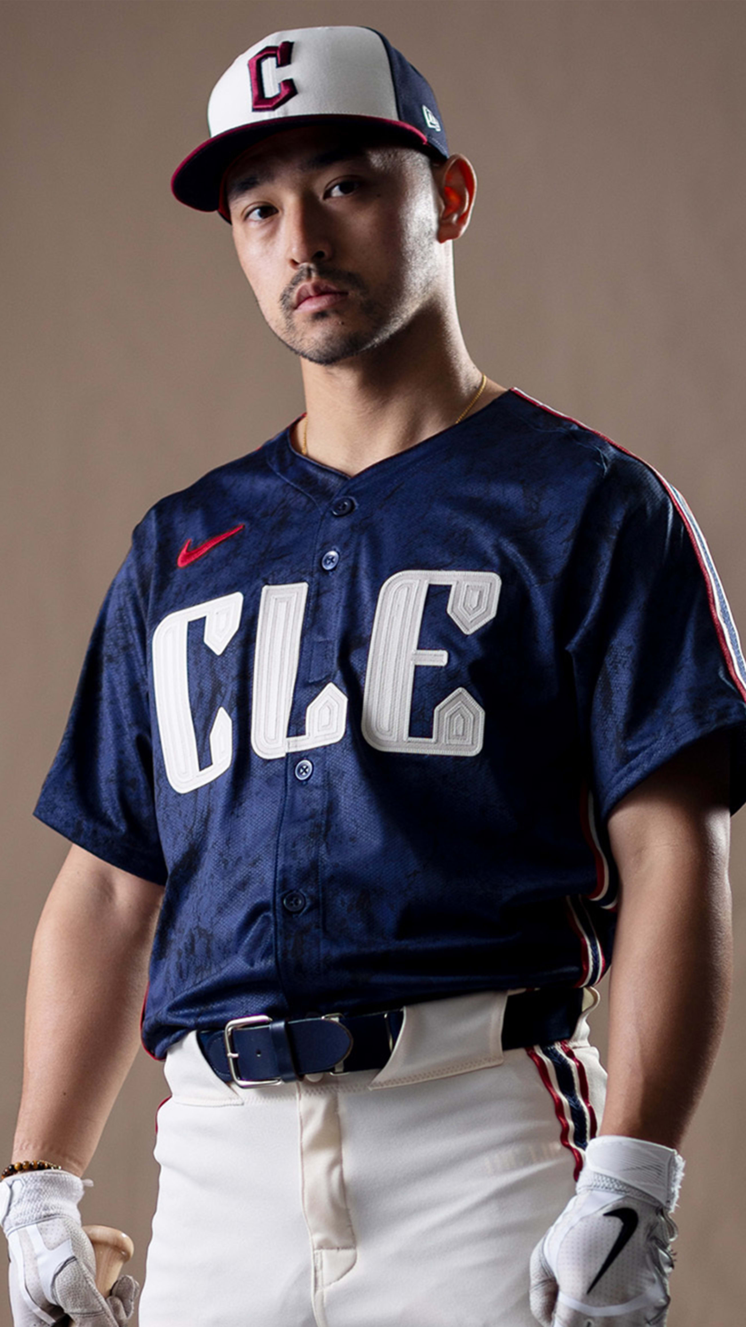
I don’t mind them. It’s workable. I didn’t like the Space City at first but it really grew on me. There’s some throwback with the colors and logo. Hate the socks. Hat looks cool.
I don’t mind them. It’s workable. I didn’t like the Space City at first but it really grew on me. There’s some throwback with the colors and logo. Hate the socks. Hat looks cool.
Posted on 3/12/25 at 6:25 am to elprez00
They don’t look as bad on person but the font is tiny and there is a ton of empty space

This post was edited on 3/12/25 at 6:28 am
Posted on 3/12/25 at 7:49 am to DalenSA
Closer look at the patch on the sleeve
Posted on 3/12/25 at 7:54 am to DalenSA
awful like every other city connect
Posted on 3/12/25 at 8:21 am to DalenSA
Meh they are fine to only wear 9 times a year. At least they are wearing white pants with it
This post was edited on 3/12/25 at 8:22 am

Posted on 3/12/25 at 9:18 am to TigerFan91
At least these don’t look like underoos from the 80s like the previous version.
And they don’t look like 50’s era penitentiary inmate uniforms (looking at you NYC).
And they don’t look like 50’s era penitentiary inmate uniforms (looking at you NYC).
Posted on 3/12/25 at 10:15 am to Floating Change Up
quote:
At least these don’t look like underoos from the 80s like the previous version.
I thought the jerseys and hats were great (and this is coming from an old school guy). Just think they’d have looked better with white pants.
Loved the NASA font. Looked like something from “Rollerball” (the James Caan version)
Posted on 3/12/25 at 11:31 am to Obi-Wan Tiger
I saw a new page come up on the thread this morning and all these replies, and it's uniform related 
C'mon, let's play ball
C'mon, let's play ball
Posted on 3/12/25 at 11:33 am to wahoocs
And if we have to do uniform talk, let's at least stay true to the DAT form and bitch and moan
Posted on 3/12/25 at 12:51 pm to wahoocs
Cam Smith will look good this year in that uniform.
Posted on 3/12/25 at 12:58 pm to Jwho77
quote:
Cam Smith will look good this year in that uniform.
You know they're going to send him down
His clock hasn't started yet and we need to start off 12 games under
Posted on 3/12/25 at 12:59 pm to wahoocs
I'm good with him coming up a little later as long as Dezenzo gets first crack at everyday RF.
Posted on 3/12/25 at 1:02 pm to Jwho77
If Smith makes the cut, our outfield could be cornered by 2 guys who've never played the position before.

 Page 72 of 82

Popular
Back to top