- My Forums
- Tiger Rant
- LSU Recruiting
- SEC Rant
- Saints Talk
- Pelicans Talk
- More Sports Board
- Fantasy Sports
- Golf Board
- Soccer Board
- O-T Lounge
- Tech Board
- Home/Garden Board
- Outdoor Board
- Health/Fitness Board
- Movie/TV Board
- Book Board
- Music Board
- Political Talk
- Money Talk
- Fark Board
- Gaming Board
- Travel Board
- Food/Drink Board
- Ticket Exchange
- TD Help Board
Customize My Forums- View All Forums
- Show Left Links
- Topic Sort Options
- Trending Topics
- Recent Topics
- Active Topics
Started By
Message
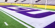
re: The LSU font needs to be enlarged in our endzones
Posted on 9/20/24 at 1:18 pm to SirWinston

Posted on 9/20/24 at 1:18 pm to SirWinston
quote:I saw endzones in the topic and immediately knew it was
endzones
quote:
SirWinston
 1
1


Posted on 9/20/24 at 1:32 pm to SirWinston
Posted on 9/20/24 at 1:32 pm to SirWinston
Won’t fit larger
Unless you put LSULSULSULSU
Unless you put LSULSULSULSU

Posted on 9/20/24 at 1:38 pm to SirWinston
Am I one of the very few people who doesn’t like geaux font
Posted on 9/20/24 at 1:40 pm to SirWinston
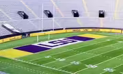
The endzone could be nicely filled out with "LSU Tigers" and have "Tigers" in script like on baseball uniforms sometimes. I always liked the script "Tigers" logo.
Posted on 9/20/24 at 1:42 pm to WhoDatNC
That would be way better too, fellow Tiger
Posted on 9/20/24 at 1:45 pm to SirWinston
No, it looks just fine. The Jets end zone doesn’t look that great.

Posted on 9/20/24 at 1:59 pm to Lsuhoohoo
yes, big block letters in EZ. saban times.
Posted on 9/20/24 at 2:00 pm to SirWinston
Appreciate your pov here but the JETS wordmark is angled so it fits and looks good across the endzone space without unnaturral stretching whlist the LSU wordmark would not stretch/would not look good inherently because of its design (including kerning which is the natural spacing between letters)
Adding "TIGERS" in the current font would look absolutely atrocious - the "G" "E" and "R" really look horrible in the tigers wordmark
Not trolling but a football field isn't a Christmas tree you keep throwing tinsel on thinking it looks better. Given there's a giant Tiger eye spanning midfield AND 4 pockets of field space taken up by the SEC logo/wordmark and the anniversary of Tiger Stadium - don't you think that's enough?
Posted on 9/20/24 at 2:00 pm to drizztiger
quote:
quote:
endzones
I saw endzones in the topic and immediately knew it was
quote:
SirWinston
same
same shite on saints board along with uniforms
Posted on 9/20/24 at 2:04 pm to SirWinston
quote:
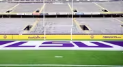
Easily the GEAUXT field design in the history of the sport, even if our own bbap didn't like it
Now I know what is wrong with the program! We have shrinkage!
Old Seinfeld viewers will understand…

Posted on 9/20/24 at 2:07 pm to SirWinston
quote:
It's seaux much more visually appealing that the current (tired) geaux font design that has been u

Posted on 9/20/24 at 2:22 pm to Ready2Geaux
I actually like the "TIGERS" wordmark in the geaux font but appreciate the knowledge you brought to this thread

Posted on 9/20/24 at 11:06 pm to hophead
GOAT

BTW, what happened to the Endzone Logo's from the Spring game? All that EMPTY SPACE on both sides of the LSU was covered with the 100th Anniversary logos and it looked much better.
THE ARMY GAME ENDZONES looked good as well.
BTW, what happened to the Endzone Logo's from the Spring game? All that EMPTY SPACE on both sides of the LSU was covered with the 100th Anniversary logos and it looked much better.
THE ARMY GAME ENDZONES looked good as well.
Posted on 9/21/24 at 12:07 am to SirWinston
I miss these endzones.
Edit: And with this being the 100 year anniversary of Tiger Stadium every game should be a different endzone that we have had in the past.
Edit: And with this being the 100 year anniversary of Tiger Stadium every game should be a different endzone that we have had in the past.
This post was edited on 9/21/24 at 12:13 am
Posted on 9/21/24 at 5:51 am to SirWinston
Thank you for your insightful analysis of paint.
Honest to God multi-paragraph insight on paint.
Honest to God multi-paragraph insight on paint.
This post was edited on 9/21/24 at 5:57 am
Posted on 9/21/24 at 6:16 am to SUB
quote:
The block letters get a lot of love here. Why?
Because it looks better
Posted on 9/21/24 at 6:33 am to SirWinston

Posted on 9/22/24 at 9:02 am to SirWinston
GOAT was the 80’s diamonds

 Page 2 of 2


Popular
Back to top