- My Forums
- Tiger Rant
- LSU Recruiting
- SEC Rant
- Saints Talk
- Pelicans Talk
- More Sports Board
- Fantasy Sports
- Golf Board
- Soccer Board
- O-T Lounge
- Tech Board
- Home/Garden Board
- Outdoor Board
- Health/Fitness Board
- Movie/TV Board
- Book Board
- Music Board
- Political Talk
- Money Talk
- Fark Board
- Gaming Board
- Travel Board
- Food/Drink Board
- Ticket Exchange
- TD Help Board
Customize My Forums- View All Forums
- Show Left Links
- Topic Sort Options
- Trending Topics
- Recent Topics
- Active Topics
Started By
Message
re: Is the Tiger eye the best midfield logo in sports?
Posted on 1/28/26 at 12:54 pm to GetmorewithLes
Posted on 1/28/26 at 12:54 pm to GetmorewithLes
quote:agreed. Similar to helmet Mike - it doesn't translate well to clothing - too busy. They cleaned up Helmet Mike a number of years ago, and it's a little better, but still busy.
I think the field logo is great but I absolutely hate the version they use for shirts and hats. Comes out looking like an ink blot.
 0
0

Posted on 1/28/26 at 1:09 pm to paulb52
quote:
With regard to baseball they should clean up outfield fence by getting rid of all those tacky playground type advertising sign eyesores.
They cleaned that up considerably last year when they went with the much cleaner all white logos. Looks 1000% better than all the full color ads.
Posted on 1/28/26 at 1:25 pm to boweswi05
There’s zero question if LSU has the best midfield logo. I have friends that graduated from Bama, A&M, UGA, etc, and they all collectively agree that LSU’s is the best in the NCAA
Posted on 1/28/26 at 1:29 pm to Alt26
quote:
like the interlocking "LSU" mark used for baseball
Posted on 1/28/26 at 1:41 pm to boweswi05
No
Purple and gold glasses again lol
Purple and gold glasses again lol
Posted on 1/28/26 at 1:42 pm to CalRipkenJr
It has to have the yard line. If you look at the Tiger eye, it does as well
I do admit ours is much lighter, and agree if Florida did the same it would be much better looking.!
I do admit ours is much lighter, and agree if Florida did the same it would be much better looking.!
This post was edited on 1/28/26 at 1:43 pm
Posted on 1/28/26 at 1:57 pm to boweswi05
Runner up to Loyola in Shreveport

This post was edited on 1/28/26 at 2:00 pm

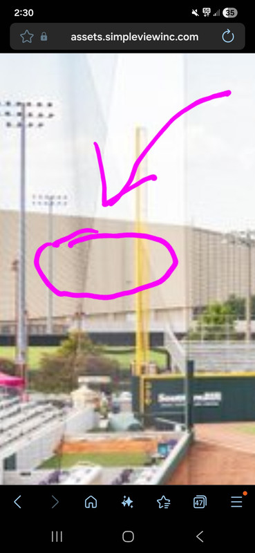
Posted on 1/28/26 at 2:28 pm to nicholastiger
quote:
should LSU add it to CF at the Box
HECK NO! LEAVE THAT ON SOFTBALL FIELDS.
Posted on 1/28/26 at 2:30 pm to CalRipkenJr
quote:
Agreed, it looks fine for softball but it's a no from me as far as baseball.
There are certain things like this, black pants, organized dugout cheers, and face masks that are okay for softball but don't belong in baseball.
When Cal Ripken, Jr speaks, baseball fans should listen

Posted on 1/28/26 at 2:33 pm to boweswi05

Posted on 1/28/26 at 2:36 pm to boweswi05
IT ABSOLUTELY IS, but the current version doesn't look as good as the original version from the 80's. (There a subtle differences that most on here wouldn't notice)
Posted on 1/28/26 at 2:42 pm to boweswi05
I've always liked it. It's different and fun. But I think I would enjoy the Helmet Tiger better.

Posted on 1/28/26 at 3:21 pm to boweswi05
I love it as the midfield logo but for some reason don’t like it on merch.

Posted on 1/28/26 at 3:22 pm to boweswi05
It gets my vote.

Posted on 1/28/26 at 3:27 pm to boweswi05

Posted on 1/28/26 at 3:30 pm to boweswi05
It is 

Posted on 1/28/26 at 4:13 pm to Purple N Gold Blood

Posted on 1/28/26 at 4:24 pm to Strike3
quote:
There should never be any logo painted in a baseball OF...That looks tacky and dumb.
I agree..
Instead, in the not-too-distant future, LSU baseball can purchase a next-generation, AI-powered robotic lawn mower and have a portion of center field cut into the tiger eye logo.
Posted on 1/28/26 at 4:37 pm to nicholastiger
quote:
should LSU add it to CF at the Box
Absolutely not. Centerfield logos look terrible.

 Page 2 of 3

Popular
Back to top