- My Forums
- Tiger Rant
- LSU Recruiting
- SEC Rant
- Saints Talk
- Pelicans Talk
- More Sports Board
- Fantasy Sports
- Golf Board
- Soccer Board
- O-T Lounge
- Tech Board
- Home/Garden Board
- Outdoor Board
- Health/Fitness Board
- Movie/TV Board
- Book Board
- Music Board
- Political Talk
- Money Talk
- Fark Board
- Gaming Board
- Travel Board
- Food/Drink Board
- Ticket Exchange
- TD Help Board
Customize My Forums- View All Forums
- Show Left Links
- Topic Sort Options
- Trending Topics
- Recent Topics
- Active Topics
Started By
Message
 0
0

Posted on 1/22/23 at 6:41 pm to PsychTiger
Just a hack job of a photoshop image is an improvement
Posted on 1/22/23 at 6:51 pm to RedFoxx
Albert don’t call me Joey belle
Posted on 1/22/23 at 7:06 pm to GeorgeWest
quote:
Only have LSU or Tigers on our uniforms. NEVER have Louisiana State.
Why?
Posted on 1/22/23 at 7:07 pm to Weaver
All the uniforms need piping, period.
That said, I prefer this on the whites over the staircase LSU. It did not look good on the plain whites.
Now sell a replica pinstripe jersey, darn it!
That said, I prefer this on the whites over the staircase LSU. It did not look good on the plain whites.
Now sell a replica pinstripe jersey, darn it!
Posted on 1/22/23 at 7:13 pm to LSUMJ
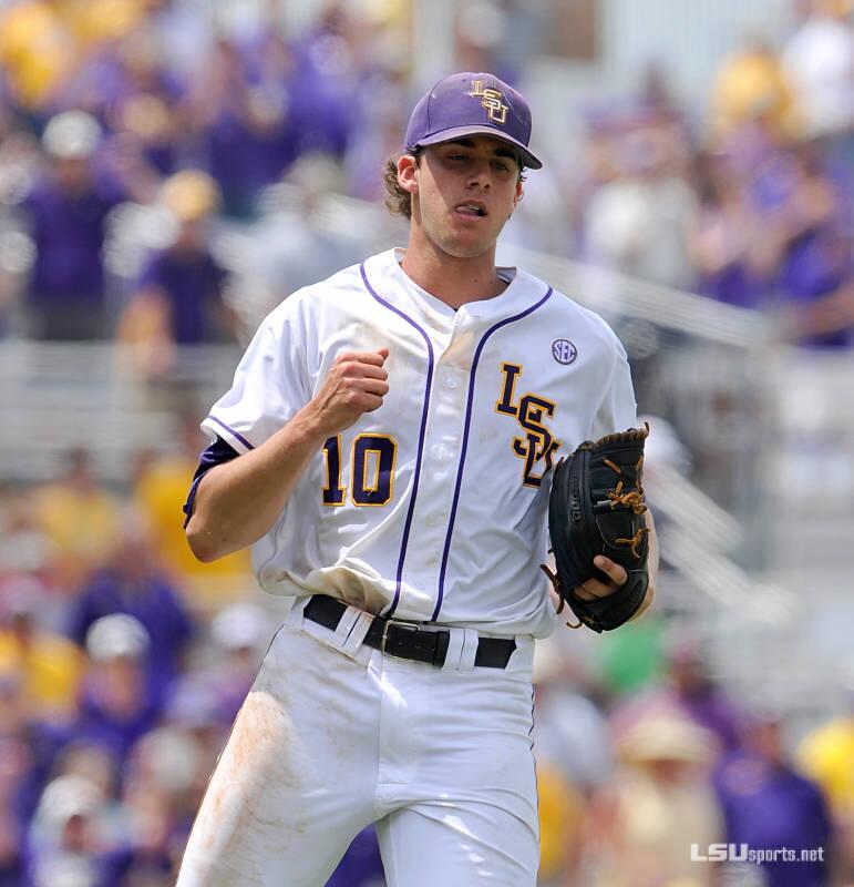
Retro style has come & gone. These are sharp & new
Posted on 1/22/23 at 7:38 pm to mightynine
Goated
Posted on 1/22/23 at 7:42 pm to LSBoosie
Variations of LSU Logos for Baseball are tough to frick up if you just put em' on button downs!
They're not fricking high end softball uni's from the 80's!
They're not fricking high end softball uni's from the 80's!
Posted on 1/22/23 at 7:51 pm to LSBoosie
See, I’m looking at them, and I would not know they aren’t the ones we’ve been wearing for years.

Posted on 1/22/23 at 8:46 pm to LSBoosie
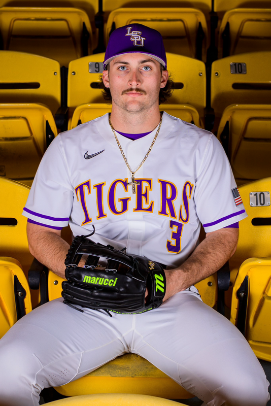
Horrible font.
Same font used on the gold jersey's.
Just bush-league looking.
The font on the purple jersey is much better.
As a graphic designer, I work with fonts all the time, so I am sensitive/aware of the fonts and how they look.
That's just poor on so many levels.
Same font used on the gold jersey's.
Just bush-league looking.
The font on the purple jersey is much better.
As a graphic designer, I work with fonts all the time, so I am sensitive/aware of the fonts and how they look.
That's just poor on so many levels.
This post was edited on 1/22/23 at 8:50 pm
Posted on 1/22/23 at 9:05 pm to LSBoosie
Meh…but at least they added a stripe to the plants. All white boring pants look cheap and boring

Posted on 1/22/23 at 9:12 pm to LSBoosie
Not a fan, add piping, and id love it more
This post was edited on 1/22/23 at 9:18 pm
Posted on 1/22/23 at 9:12 pm to OchoDedos
quote:
Where are the pin stripes? Those uni's are just generic Nike junk.
We have pinstriped uniforms they’re all over all our promotional stuff

By far my favorite. When a bengals and Bandits started selling the white jerseys last year I asked About the pinstripes. They said Nike added them to the Spring 2023 collection and they should be available in March.
Posted on 1/22/23 at 9:14 pm to SammyTiger
We need gold jerseys with the purple lettering back
Posted on 1/22/23 at 9:19 pm to josh336
Light letters on a light jersey is odd but I dont Think we’re changing those up anytime soon.

Posted on 1/22/23 at 9:35 pm to LSBoosie
Not terrible but nothing special. That is just two of them. Where are the rest?

Posted on 1/22/23 at 9:40 pm to geauxpurple
quote:
Where are the rest?
I'll save you the suspense.
White with Tigers across the chest
Purple with Tigers across the chest
Gold with Tigers across the chest
White pinstripes with Tigers in script across the chest
Gray with interlocking LSU logo on left breast
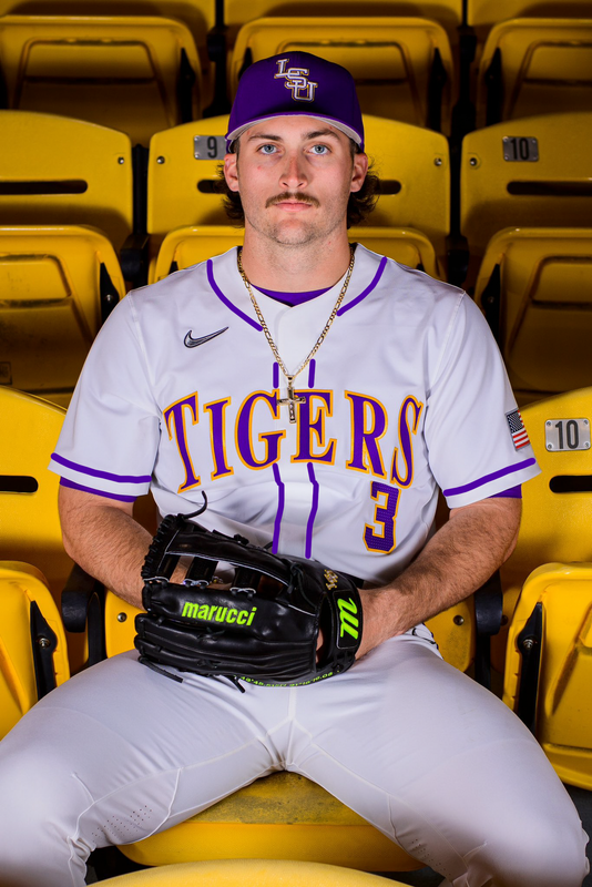
Posted on 1/22/23 at 10:39 pm to geauxpurple
quote:
Not terrible but nothing special. That is just two of them. Where are the rest?
The rest are the same.
Only the White one is different and he posted the purple one to show off Tre’s cool new glove not the uniform

Posted on 1/22/23 at 10:42 pm to mikedatyger
quote:
Same font used on the gold jersey's. Just bush-league looking. The font on the purple jersey is much better.
I’m gonna let you in on a secret. They’re all the same font
Posted on 1/22/23 at 11:35 pm to lsufball19
The letters on the purple unies look slight thicker,
At the very least there is a cap between the white letters and the yellow outline where as in the white unies the yellow outline touched the purple letters (which is probably why they look thinner.)
Either way it’s the all same font.
At the very least there is a cap between the white letters and the yellow outline where as in the white unies the yellow outline touched the purple letters (which is probably why they look thinner.)
Either way it’s the all same font.

 Page 3 of 5

Back to top