- My Forums
- Tiger Rant
- LSU Recruiting
- SEC Rant
- Saints Talk
- Pelicans Talk
- More Sports Board
- Fantasy Sports
- Golf Board
- Soccer Board
- O-T Lounge
- Tech Board
- Home/Garden Board
- Outdoor Board
- Health/Fitness Board
- Movie/TV Board
- Book Board
- Music Board
- Political Talk
- Money Talk
- Fark Board
- Gaming Board
- Travel Board
- Food/Drink Board
- Ticket Exchange
- TD Help Board
Customize My Forums- View All Forums
- Show Left Links
- Topic Sort Options
- Trending Topics
- Recent Topics
- Active Topics
Started By
Message

 1
1


Posted on 9/13/22 at 4:15 pm to Broski
quote:
I’m still holding out hope that they have pulled a major hoax with the leaks.
We all are regardless of how futile it may be.
Posted on 9/15/22 at 7:58 am to Wait For It...

Posted on 9/15/22 at 8:27 am to Wait For It...
Awful

Posted on 9/15/22 at 8:39 am to Wait For It...
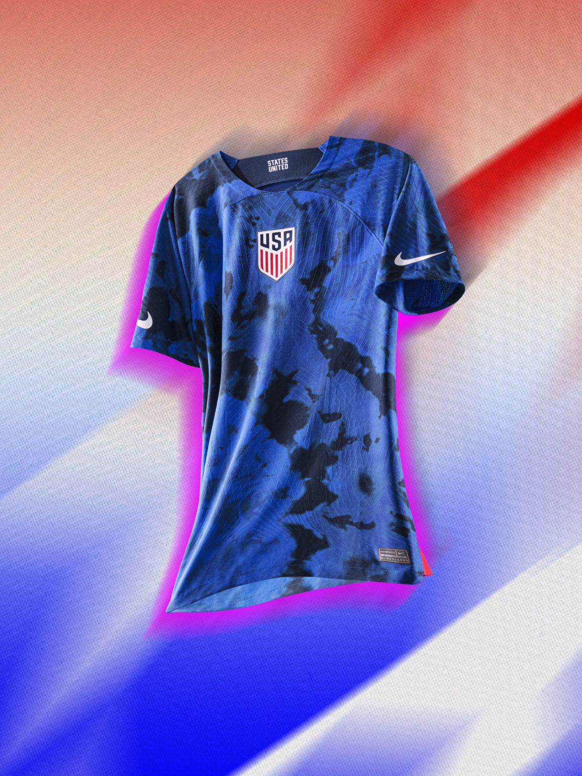
Those are some decent training tops. Can’t wait for the actual jersey announcement.


Posted on 9/15/22 at 9:15 am to Wait For It...
quote:
Nike came to the team years ago to fill out forms and surveys on everything the players are into; the music they’re listening to, the clothes they’re wearing, to cater to the styles of the people who are going to wear the jerseys on the pitch
quote:
Inspired by the talks with the athletes Berhalter described, the timeless, iconic red, white, and blue color scheme actually takes influences from sports across the American landscape. That includes:
Nike designers going to FIFA and asking what the biggest crest size it can use on a jersey and shifting it to the center of the USMNT kits, paying homage to basketball jerseys.
Red, white, and blue stripes and sleeves along with the Nike swoosh on the sleeves rather than on the chest is a nod to American football tradition.
The cut-and-sew construction and pattern on the shoulders and sleeves mimic what’s found on hockey jerseys.
“States United” is found on the inner back of both home and away shirts, signifying unity and togetherness, and signifying the USMNT’s one nation, one team ethos
And apparently the blues are inspired by "ice drying" is that a tik tok fad?
This post was edited on 9/15/22 at 9:16 am

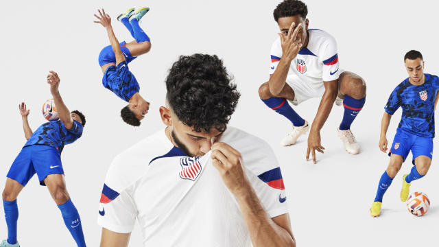
Posted on 9/15/22 at 9:30 am to elposter
Honestly the whites would be great if not for the crest placement and neck stripes
This post was edited on 9/15/22 at 9:36 am
Posted on 9/15/22 at 9:31 am to BCLA
That's a big word salad to try to say this is what the players wanted when they are vocal about how much these kits suck 
Posted on 9/15/22 at 9:59 am to elposter
Nike is absolutely pathetic, and with all the word salad about what the colors mean. frick me.
How about the colors simply being the colors that our nation chose for its flag nearly 250 years ago. That's certainly good enough.
The bomb pops were ok, the last really good kit Nike did for USA was 2010 with the sash, 2013 with the centenary kit, and 1995.
How about the colors simply being the colors that our nation chose for its flag nearly 250 years ago. That's certainly good enough.
The bomb pops were ok, the last really good kit Nike did for USA was 2010 with the sash, 2013 with the centenary kit, and 1995.
Posted on 9/15/22 at 10:01 am to Glorious
quote:
Honestly the whites would be great if not for the crest placement and neck stripes
Agreed. The thing around the neck is so off-putting and doesn't flow at all. That pic above of I think Rose (or one of the non attention seeking uswnt players) wearing it looks like it's choking her.
I dig the swoosh on the sleeves too.
This post was edited on 9/15/22 at 10:02 am
Posted on 9/15/22 at 10:04 am to RedPop4
quote:
The bomb pops were ok, the last really good kit Nike did for USA was 2010 with the sash, 2013 with the centenary kit, and 1995.
The polos in 2014 were great. And the current whites with the stripes down the inseam are fire. Shame they're done now.
Posted on 9/15/22 at 10:51 am to BCLA
Saw this on Twitter


Posted on 9/15/22 at 10:53 am to BCLA
quote:
The polos in 2014 were great.
It was a plain white shirt with plain white shorts.
You have a great color scheme. Use it.
Posted on 9/15/22 at 11:07 am to elposter
Looks like it's just a re-tread of the Arsenal trainers from 04/05. But "diversity"

Posted on 9/15/22 at 11:11 am to etm512
I actually like the stripes on the arms, but Jesus that neck thing absolutely ruins it. Don't like the center badge either, but I could live with that if not for the neck thing.
This post was edited on 9/15/22 at 11:12 am
Posted on 9/15/22 at 11:52 am to Broski
quote:
It was a plain white shirt with plain white shorts.
You have a great color scheme. Use it.
Ya that's kinda why it was great. It was simple, with some small color accents on the edges. I wore the shite out of it to the office as well which is was a huge bonus. Got my money's worth
Posted on 9/15/22 at 7:12 pm to BCLA
So basically Australia has the same kit designs as us minus the stripes on the sleeves. Nike is so full of shite
goal.com article with all teams announced kits
goal.com article with all teams announced kits

Posted on 9/15/22 at 7:26 pm to BCLA
At least yall don’t have Argentina’s away kit. Purple for gender equality 
Posted on 9/15/22 at 8:23 pm to SabiDojo
quote:
Mexico – Away kit
Adidas pay tribute to the ancient civilisations rooted in Mexican history to summon the team's fighting spirit for the away shirt. Five special symbols make up the intricate graphic all-over print in red, which pops up nicely against the white shirt.The inside of the collar features Quetzalcoat's serpent body, which is a representation of humankind's physical abilities.

Posted on 9/15/22 at 9:39 pm to Glorious
Kill me. Absolutely awful

 Page 4 of 5

Popular
Back to top