- My Forums
- Tiger Rant
- LSU Recruiting
- SEC Rant
- Saints Talk
- Pelicans Talk
- More Sports Board
- Fantasy Sports
- Golf Board
- Soccer Board
- O-T Lounge
- Tech Board
- Home/Garden Board
- Outdoor Board
- Health/Fitness Board
- Movie/TV Board
- Book Board
- Music Board
- Political Talk
- Money Talk
- Fark Board
- Gaming Board
- Travel Board
- Food/Drink Board
- Ticket Exchange
- TD Help Board
Customize My Forums- View All Forums
- Show Left Links
- Topic Sort Options
- Trending Topics
- Recent Topics
- Active Topics
Started By
Message
 1
1

Posted on 10/25/22 at 8:51 pm to KingRanch
Always looked like she was spreading her legs
Posted on 10/25/22 at 8:53 pm to jamiegla1
quote:
That’s the only thing I saw in the Expos logo
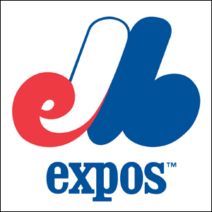
That logo (and name) has always been and will always be a major fail.
It's supposed to be a stylized "M" with a lower case "e" on the left and a lower case "b" on the right, ostensibly for expos baseball Montreal.
But it's so badly rendered that people couldn't figure it out.
Plus if you break the lines down with a ruler, it's not properly balanced, lines that should be parallel are not, and spacing is uneven.
Finally, who the heck names a team for a world's fair they held a few years prior? Apparently French-speaking Candians do. They later named an NASL soccer team the Montreal Olympique, since they were going to hold the Olympics there in 1976:

That team folded before the 1976 Olympics ever occurred.

Posted on 10/25/22 at 8:54 pm to Ric Flair
It not just US based companies that make bad marketing choices. Locum is a Swedish property management company.

Posted on 10/25/22 at 8:55 pm to KingRanch

I always thought the Patriots logo was Elvis
Posted on 10/25/22 at 8:57 pm to Sev09
It’s still a running joke with my family at 50 that I also thought the KFC logo was his whole body. I called him the little fried chicken man.
Glad it wasn’t just me.
Glad it wasn’t just me.
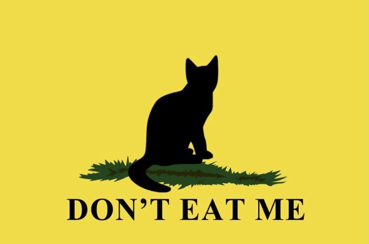
Posted on 10/25/22 at 9:03 pm to Herschal
That's because she is (well her tail).
Posted on 10/25/22 at 9:15 pm to BRich
quote:
That logo (and name) has always been and will always be a major fail
I always kind of liked it in a weird way

Posted on 10/25/22 at 9:26 pm to Sev09
Late night chuckle -
Posted on 10/25/22 at 9:49 pm to ChineseBandit58
As a kid I wondered what the connection between Purina and chess/checkers was.


Posted on 10/25/22 at 10:37 pm to HarveyBanger
quote:
I always thought the Patriots logo was Elvis
As a kid I didn't even see the face. I just thought it was an eagle.
Posted on 10/25/22 at 11:32 pm to Wraytex
I don’t get it. What is that logo?
Posted on 10/25/22 at 11:45 pm to CatfishJohn
Purina is a pet/animal feed mill outfit. Mill in Gonzales (Tx) had the checkerboard logo on the side of it.
Posted on 10/26/22 at 12:32 am to KingRanch
Kind of similar to the Col. Sanders stick figure body, my daughter admitted on our last road trip that she always thought the Buc-ee's beaver was his whole body, like the little flaps under his head were his feet!
Now I can't see it any other way, and it's a weird fricking monster now to me. Thanks daughter!
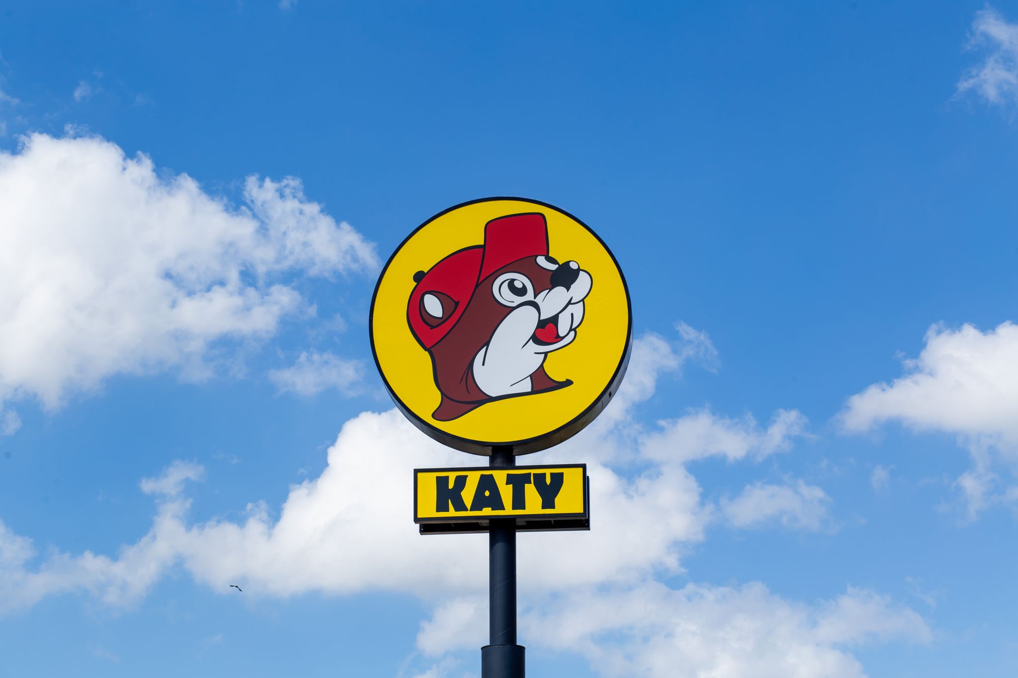
Now I can't see it any other way, and it's a weird fricking monster now to me. Thanks daughter!
Posted on 10/26/22 at 5:42 am to KingRanch
Red Dog can upside down was Satan eating someone out
Posted on 10/26/22 at 5:51 am to KingRanch
When I was growing up it was said the Red Dog Beer logo upside down always had an ‘easter egg’ of spider-man feasting between the hedges

This post was edited on 10/26/22 at 5:52 am
Posted on 10/26/22 at 7:08 am to KingRanch
Mine are both sports related
The old red white and blue “M” Montreal Expos logo said “elb”
Also the Atlanta Hawks logo I didn’t see it as a hawk with a circle around it, I saw it as kind of like a deformed Pac-Man with a little misshapen dot by the top of it
The old red white and blue “M” Montreal Expos logo said “elb”
Also the Atlanta Hawks logo I didn’t see it as a hawk with a circle around it, I saw it as kind of like a deformed Pac-Man with a little misshapen dot by the top of it

Posted on 10/26/22 at 7:08 am to highcotton2
quote:
Locum is a Swedish property management company.
Lulz
Posted on 10/26/22 at 7:10 am to Herschal
She is I thought

 Page 3 of 4

Popular
Back to top