- My Forums
- Tiger Rant
- LSU Recruiting
- SEC Rant
- Saints Talk
- Pelicans Talk
- More Sports Board
- Fantasy Sports
- Golf Board
- Soccer Board
- O-T Lounge
- Tech Board
- Home/Garden Board
- Outdoor Board
- Health/Fitness Board
- Movie/TV Board
- Book Board
- Music Board
- Political Talk
- Money Talk
- Fark Board
- Gaming Board
- Travel Board
- Food/Drink Board
- Ticket Exchange
- TD Help Board
Customize My Forums- View All Forums
- Show Left Links
- Topic Sort Options
- Trending Topics
- Recent Topics
- Active Topics
Started By
Message

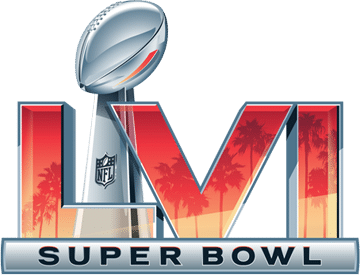
Super Bowl LVII logo revealed
Posted on 2/16/22 at 1:38 pm
Posted on 2/16/22 at 1:38 pm

I'm glad the logos are slowly getting more unique again. The logos for 45-55 were very bland and corporate.
This post was edited on 2/16/22 at 1:43 pm
 14
14

Posted on 2/16/22 at 1:41 pm to red sox fan 13
This is old school looking! Really like it

Posted on 2/16/22 at 1:48 pm to red sox fan 13
Not bad meme
Posted on 2/16/22 at 1:49 pm to red sox fan 13
The Saints-Colts Super Bowl was the last cool looking one.
Posted on 2/16/22 at 2:00 pm to red sox fan 13
At least they've started allowing some creativity with the logo again, the last decade+ has been bland.
Posted on 2/16/22 at 2:00 pm to red sox fan 13
Makes me wonder what they will incorporate when it comes to New Orleans. LA had palm trees, Arizona get their rock formations and desert look. We gonna have mardi gras beads or going with a Grand Theft Auto look?

Posted on 2/16/22 at 2:03 pm to red sox fan 13
Super Bowl LVII belongs to the Kansas City Chiefs

Posted on 2/16/22 at 2:05 pm to RebelRye
quote:
Grand Theft Auto
Party scene from Don't Be a Menace

Posted on 2/16/22 at 2:11 pm to red sox fan 13
Great logo.
I'm glad because the last decade or so has been meh
I'm glad because the last decade or so has been meh

Posted on 2/16/22 at 2:18 pm to red sox fan 13
GOAT


Posted on 2/16/22 at 2:22 pm to red sox fan 13
It's trending in the right direction, but I wish they wouldn't confine themselves to the roman numerals.
This could look so much cooler if the logo itself incorporated deserts/canyons above and around the roman numerals.
This could look so much cooler if the logo itself incorporated deserts/canyons above and around the roman numerals.
Posted on 2/16/22 at 2:37 pm to red sox fan 13
Yep like you said, slowly getting back to those unique logos. Such a small detail but just looks way better.
Posted on 2/16/22 at 3:55 pm to GeauxHouston
SB XXVII had the best logo.

Posted on 2/16/22 at 4:07 pm to RebelRye
quote:
Makes me wonder what they will incorporate when it comes to New Orleans
Chocolate
Posted on 2/16/22 at 4:18 pm to RebelRye
quote:
Makes me wonder what they will incorporate when it comes to New Orleans.
There's really only one option:

This post was edited on 2/16/22 at 4:19 pm
Posted on 2/16/22 at 4:38 pm to red sox fan 13
It’s exactly the same as LVI in Los Angeles

This post was edited on 2/16/22 at 4:39 pm

Posted on 2/16/22 at 4:48 pm to red sox fan 13
always forget the replaced this one after 9/11


Posted on 2/16/22 at 4:50 pm to red sox fan 13
Whoever decided to make the Super Bowl logos bland, corporate-level branding needs to be thrown into a locker for the rest of their life.

Posted on 2/16/22 at 5:00 pm to red sox fan 13
Not sure why they ever went bland and uniform. A Big Grey LI means nothing to me. But put something relating to Houston on there and I might could recognize that it’s 28-3
Posted on 2/16/22 at 5:29 pm to Glorious
quote:
Not sure why they ever went bland and uniform. A Big Grey LI means nothing to me.
You can remember games just by the logo. I can picture the game in my mind just by looking at the logos from the 90s and early 2000s.
But once they went to the horrific generic logo for XLV I can't remember anything about the game.

 Page 1 of 2

Popular
Back to top