- My Forums
- Tiger Rant
- LSU Recruiting
- SEC Rant
- Saints Talk
- Pelicans Talk
- More Sports Board
- Fantasy Sports
- Golf Board
- Soccer Board
- O-T Lounge
- Tech Board
- Home/Garden Board
- Outdoor Board
- Health/Fitness Board
- Movie/TV Board
- Book Board
- Music Board
- Political Talk
- Money Talk
- Fark Board
- Gaming Board
- Travel Board
- Food/Drink Board
- Ticket Exchange
- TD Help Board
Customize My Forums- View All Forums
- Show Left Links
- Topic Sort Options
- Trending Topics
- Recent Topics
- Active Topics
Started By
Message

Best Logo Changes in Sports History
Posted on 11/29/22 at 9:26 am

Posted on 11/29/22 at 9:26 am


 24
24


Posted on 11/29/22 at 9:29 am to karmew32
LSU getting away from toonces was a good one.
Posted on 11/29/22 at 9:31 am to karmew32
Switching away from all of the 90s abominations in the NBA
Posted on 11/29/22 at 9:32 am to karmew32
I'm in the minority, but Arizona State emphasizing the Flaming Fork in conjunction with still using Sparky is up there. Added a simpler logo that already had connection to the program.

Posted on 11/29/22 at 9:32 am to karmew32

.
.
.
.
.
.
.
..
.
..
.
Posted on 11/29/22 at 9:38 am to karmew32
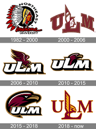
ULM’s most recent logo change was a pretty good one I think.
Someone needs to help me post pictures. I just can’t figure out how to do it. Nevermind, I just figured it out.
Someone needs to help me post pictures. I just can’t figure out how to do it. Nevermind, I just figured it out.
This post was edited on 11/29/22 at 9:40 am

Posted on 11/29/22 at 9:39 am to karmew32
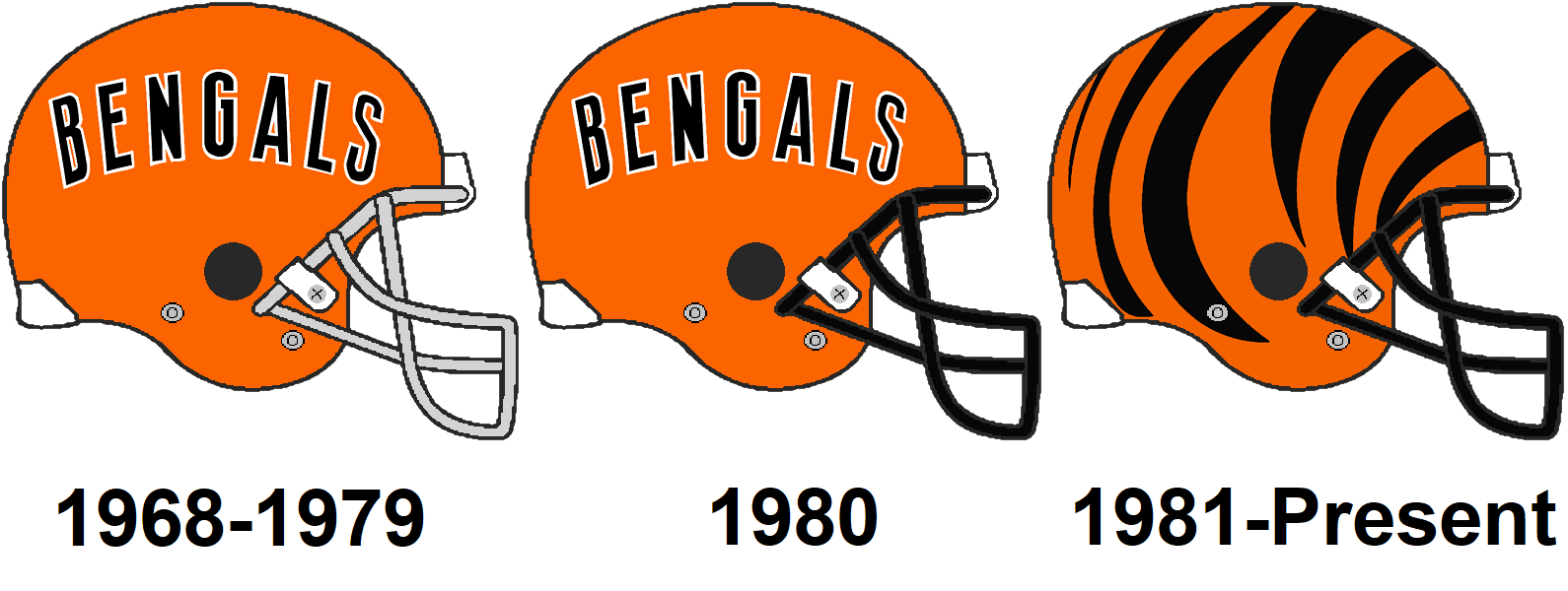
This was a pretty dramatic one from back in the day, that's sort of stood the test of time in my opinion. Although, I guess, it's not exactly a "logo change."

Posted on 11/29/22 at 9:56 am to karmew32
I know what the worst is
This post was edited on 11/29/22 at 9:57 am
Posted on 11/29/22 at 10:01 am to karmew32
Posted on 11/29/22 at 10:03 am to karmew32

But really pick any 90's or early 2000's abomination and those teams reverting back to cleaner versions of classic logos
Posted on 11/29/22 at 10:24 am to karmew32


Posted on 11/29/22 at 10:28 am to reggierayreb
I liked the bucs old logo and the creamsicle uniforms .
Posted on 11/29/22 at 10:28 am to reggierayreb
I liked the bucs old logo and the creamsicle uniforms .

Posted on 11/29/22 at 10:30 am to Tigre85
quote:
I liked the bucs old logo and the creamsicle uniforms .
It’s always been fascinating to me that the Bucs creamsicle uniforms were largely universally viewed as the ugliest uniforms in sports when they wore them…flash forward to the present and somehow that’s changed to most people thinking they’re among the best. People I guess have a weird thing with nostalgia
This post was edited on 11/29/22 at 10:31 am
Posted on 11/29/22 at 10:32 am to truthbetold
I loved pitts old look. New looks cheap.
Posted on 11/29/22 at 10:37 am to lsufball19
The Bucs old uniforms didn't get a fair shake bc back when they wore them the colors weren't widely embraced by sports fans - it was a cultural thing, those unis were well ahead of their time.
In an era today where 18 year old kids LOVED wearing Oregon's hot pink and black duds on the football field, America is fully ready to embrace a Bucs light orange update.
In an era today where 18 year old kids LOVED wearing Oregon's hot pink and black duds on the football field, America is fully ready to embrace a Bucs light orange update.
Posted on 11/29/22 at 10:41 am to sta4ever
quote:agreed. wish I had competed there with the new one. I liked the hawk head fine but the new blend is great.
ULM’s most recent logo change was a pretty good one I think.
also our track unis now are miles ahead of the look of our old ones.

Posted on 11/29/22 at 10:43 am to karmew32
I always thought the Bucks and Warriors upgraded their logos when the updated them recently
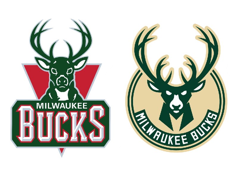

Both(especially the warriors) look much cleaner IMO. I think part of it with the Bucks is too I like the cream way better than the red.
Both(especially the warriors) look much cleaner IMO. I think part of it with the Bucks is too I like the cream way better than the red.
Posted on 11/29/22 at 10:43 am to SirWinston


 Page 1 of 4

Popular
Back to top