- My Forums
- Tiger Rant
- LSU Recruiting
- SEC Rant
- Saints Talk
- Pelicans Talk
- More Sports Board
- Fantasy Sports
- Golf Board
- Soccer Board
- O-T Lounge
- Tech Board
- Home/Garden Board
- Outdoor Board
- Health/Fitness Board
- Movie/TV Board
- Book Board
- Music Board
- Political Talk
- Money Talk
- Fark Board
- Gaming Board
- Travel Board
- Food/Drink Board
- Ticket Exchange
- TD Help Board
Customize My Forums- View All Forums
- Show Left Links
- Topic Sort Options
- Trending Topics
- Recent Topics
- Active Topics
Started By
Message


 1
1

Posted on 11/29/22 at 1:23 pm to TheTideMustRoll
Basically any of the 90s-2000s logos that featured computer generated art with shadows or a faux 3D look and had the name and mascot spelled out is pretty much universally hated. A few company’s ruined a lot of logos and made a lot of money when schools/teams went rebranding crazy.
Phoenix Design Works
Phoenix Design Works

Posted on 11/29/22 at 1:30 pm to T
quote:
Phoenix Design Works
pretty nuts have many programs that one company did rebranding for
Posted on 11/29/22 at 1:33 pm to lsufball19
There is one other company who did most everybody else’s rebranding that has pretty much the same templates, but I cannot remember the name.
I remembered phoenix design works because they did the disastrous LSU rebranding in 2002.
I remembered phoenix design works because they did the disastrous LSU rebranding in 2002.
This post was edited on 11/29/22 at 1:35 pm

Posted on 11/29/22 at 3:25 pm to lsufball19
quote:
quote:
Phoenix Design Works
pretty nuts have many programs that one company did rebranding for
I like how they are still proudly highlighting fricking Toonces.
What a brilliant freaking racket.
Posted on 11/29/22 at 3:29 pm to Y.A. Tittle
True story. I always thoughts the ATL hawks logo was a pac man until I was like 15 and wondered WTF the point of it was.
One of those visual things my brain legit never saw.
One of those visual things my brain legit never saw.
Posted on 11/29/22 at 3:51 pm to karmew32

is the GOAT. you went from a cringe/cartoonish mascot to an iconic superbowl associated professional logo.

Posted on 11/29/22 at 4:02 pm to Boodis Man
I like the most recent Patriot logo, even though most people don’t. I always say, imagine if the logos were reversed, and the flying Elvis was the original logo and the patriot hiking the football was unveiled as the new logo in 2022, people would be like WTF is this shite???
This post was edited on 11/29/22 at 4:04 pm
Posted on 11/29/22 at 4:04 pm to tigerfan84
Why the hate here? Everyone on this site acted like this was the greatest move ever when we went back to the angry wave
Posted on 11/29/22 at 4:06 pm to PrimeTime Money
quote:
I think the Patriots should go back to the retro style uniforms but keep their current logo.
What they wear now is honestly pretty similar (excluding the helmets obviously) except blue is the primary color instead of red
/cdn.vox-cdn.com/uploads/chorus_image/image/70224754/154839575.jpg.0.jpg)
This post was edited on 11/29/22 at 4:09 pm
Posted on 11/29/22 at 4:20 pm to Ostrich

Posted on 11/29/22 at 4:24 pm to PrimeTime Money
quote:
I like the most recent Patriot logo, even though most people don’t. I always say, imagine if the logos were reversed, and the flying Elvis was the original logo and the patriot hiking the football was unveiled as the new logo in 2022, people would be like WTF is this shite???
I agree, but I think they're both bad. I think their best helmet was the tricorner hat with the number underneath.
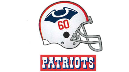
Posted on 11/29/22 at 4:24 pm to Boodis Man


Posted on 11/29/22 at 5:17 pm to karmew32

TO

Posted on 11/29/22 at 5:32 pm to Pedro
I just wish they would update the new logo and put it on the football field already lol. Nothing aggravates me more than having the wrong logo on the field and in the stadiums.
Posted on 11/29/22 at 6:06 pm to JohnnyFins
I think their new look IS basically the old look
Posted on 11/29/22 at 7:08 pm to karmew32
Both of those are basically the brainchild of Hayden Fry at Iowa, and I believe Bill Snyder took that inspiration from his mentor when he became KStates coach. Similar designs, and yea, very good moves
Posted on 11/29/22 at 7:34 pm to Tigre85
quote:
I liked the bucs old logo and the creamsicle uniforms .
I liked them even back then. IMO the late 70's early 80's had the best era of NFL logos and uniforms.
Posted on 11/29/22 at 7:39 pm to karmew32
To
/cdn.vox-cdn.com/uploads/chorus_asset/file/20055609/Pirates_Alt_3.png)
Posted on 11/29/22 at 10:25 pm to karmew32
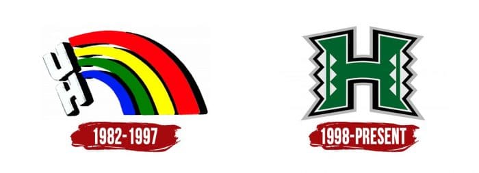
Thanks to cultural expropriation, looking at you gays, Hawaii was forced to a better standard.

 Page 3 of 4

Popular
Back to top