- My Forums
- Tiger Rant
- LSU Recruiting
- SEC Rant
- Saints Talk
- Pelicans Talk
- More Sports Board
- Fantasy Sports
- Golf Board
- Soccer Board
- O-T Lounge
- Tech Board
- Home/Garden Board
- Outdoor Board
- Health/Fitness Board
- Movie/TV Board
- Book Board
- Music Board
- Political Talk
- Money Talk
- Fark Board
- Gaming Board
- Travel Board
- Food/Drink Board
- Ticket Exchange
- TD Help Board
Customize My Forums- View All Forums
- Show Left Links
- Topic Sort Options
- Trending Topics
- Recent Topics
- Active Topics
Started By
Message
Falcons New Jersey
Posted on 4/8/20 at 8:51 am
Posted on 4/8/20 at 8:51 am
LINK
Can’t imagine the disappointment that goes into being a Falcons fan. These are straight out of the XFL.
Can’t imagine the disappointment that goes into being a Falcons fan. These are straight out of the XFL.
 19
19

Posted on 4/8/20 at 9:05 am to WorryAboutYourMeat
Black and whites are their best combo. That helmet is definitely the shite.
Posted on 4/8/20 at 9:05 am to WorryAboutYourMeat
Looks like an Arena football team Jersey just horrible
Posted on 4/8/20 at 9:07 am to WorryAboutYourMeat
I’m convinced they stole the all-black combo from “The Longest Yard.”
Posted on 4/8/20 at 9:23 am to WorryAboutYourMeat
ATL?????? We already know you are an AThLete. 
Why are you posting about the Falcons New Jersey on a SAINTS forum?
Why are you posting about the Falcons New Jersey on a SAINTS forum?
This post was edited on 4/8/20 at 9:25 am
Posted on 4/8/20 at 9:24 am to boudinman
quote:
ATL??????
My first thought as well.
Posted on 4/8/20 at 9:42 am to WorryAboutYourMeat
Copy cats.
Just had to have a all white too huh birds?
Just had to have a all white too huh birds?
Posted on 4/8/20 at 9:50 am to WorryAboutYourMeat
shite look like some knockoff FUBU jerseys.

Posted on 4/8/20 at 9:50 am to goatmilker
I thought the league learned their lesson about two tone jerseys in Jacksonville.
Posted on 4/8/20 at 9:54 am to WorryAboutYourMeat
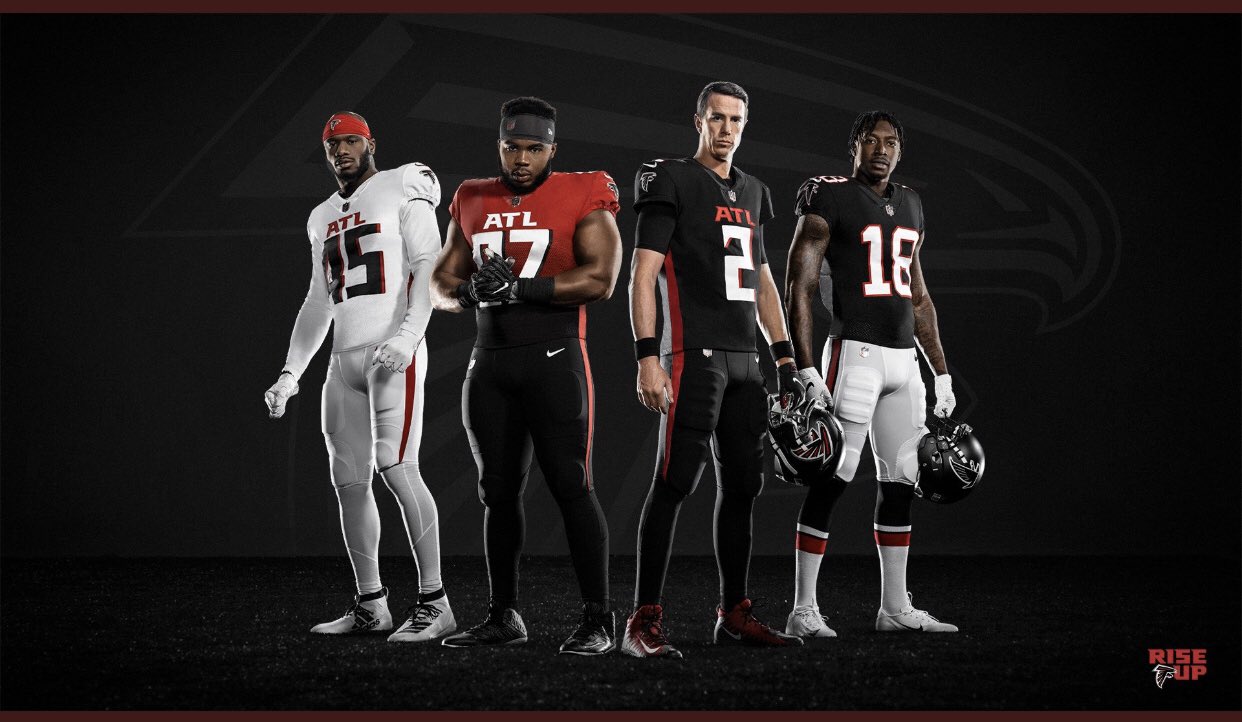
Love the Calvin Ridley combo. Rest are shite.
This post was edited on 4/8/20 at 9:57 am
Posted on 4/8/20 at 9:58 am to WorryAboutYourMeat
Theyre mostly just boring.
I like clean traditional looks, and these will again be dated in 7 years tops.
Shoulder stripes never go out of style. Normal numbers never go out of style.
One of the reason I think people like the Saints color rush is because even though its new and different, its still clean AF, and classic.
I like clean traditional looks, and these will again be dated in 7 years tops.
Shoulder stripes never go out of style. Normal numbers never go out of style.
One of the reason I think people like the Saints color rush is because even though its new and different, its still clean AF, and classic.
Posted on 4/8/20 at 10:06 am to NorthGwinnettTiger
This is such a piss poor, deplorable, boring as frick, and ugly arse franchise. Worst helmets in the league, god awful fans, and the city smells like absolute shite. These losers remain irrelevant
Posted on 4/8/20 at 10:10 am to NorthGwinnettTiger
The only one that looks good is the throwback. The rest are pretty terrible.
Posted on 4/8/20 at 10:51 am to WorryAboutYourMeat
Those are garbage. They look like the uniforms of some rinky-dink college team.
The Saints current uniforms are boring and mismatched (solid stripe on the pants; multi-stripe on the helmet), but at least they aren't comical. After seeing more of Nike's designs (Falcons, Jets, Dolphins, etc), I hope the Saints actually put some independent thought into any potential uniform change...particularly taking note on how well-liked the color rush uniforms are...and not just let the loser graphic designers at Nike sell the ownership on one of their shitty designs.
Revamping the Saints uniforms could be one of the easiest decisions in franchise history. Just take these:

and these...

Match the gold on the uniforms and helmets and make them the permanent uniforms!
The Saints current uniforms are boring and mismatched (solid stripe on the pants; multi-stripe on the helmet), but at least they aren't comical. After seeing more of Nike's designs (Falcons, Jets, Dolphins, etc), I hope the Saints actually put some independent thought into any potential uniform change...particularly taking note on how well-liked the color rush uniforms are...and not just let the loser graphic designers at Nike sell the ownership on one of their shitty designs.
Revamping the Saints uniforms could be one of the easiest decisions in franchise history. Just take these:
and these...
Match the gold on the uniforms and helmets and make them the permanent uniforms!
Posted on 4/8/20 at 10:52 am to WorryAboutYourMeat
Those new Falcons uniforms really blow.
This post was edited on 4/8/20 at 10:54 am
Posted on 4/8/20 at 11:09 am to NorthGwinnettTiger
Did they change which red color they use. The red jersey looks like the same red TB used a few years back. And, why make it look like a crop top instead of being all red?
The all white could look good with a few tweaks. Get rid of the ATL on the front and fix the number font and I think it could be salvageable.
All black looks like an arena league or mid level college uniform.
Throw back uniform looks good, but are they paring it with a new helmet or is that the old helmet too?

Posted on 4/8/20 at 11:13 am to WorryAboutYourMeat
The “ATL” looks like trash. Get rid of that and they aren’t bad.

Posted on 4/8/20 at 11:34 am to NorthGwinnettTiger

Posted on 4/8/20 at 11:54 am to WorryAboutYourMeat
I seriously don’t get the hate.. complete illogical
Those jerseys, even though they’re for ATL, are pretty clean looking
Those jerseys, even though they’re for ATL, are pretty clean looking
Posted on 4/8/20 at 12:06 pm to Mr. Hangover
just as long as... if we draw the Dirty Turds on Thanksgiving again this year... we get our color rush vs. their throwbacks
that's a beautiful uniform combo for a game
that's a beautiful uniform combo for a game

 Page 1 of 2

Popular
Back to top