- My Forums
- Tiger Rant
- LSU Recruiting
- SEC Rant
- Saints Talk
- Pelicans Talk
- More Sports Board
- Fantasy Sports
- Golf Board
- Soccer Board
- O-T Lounge
- Tech Board
- Home/Garden Board
- Outdoor Board
- Health/Fitness Board
- Movie/TV Board
- Book Board
- Music Board
- Political Talk
- Money Talk
- Fark Board
- Gaming Board
- Travel Board
- Food/Drink Board
- Ticket Exchange
- TD Help Board
Customize My Forums- View All Forums
- Show Left Links
- Topic Sort Options
- Trending Topics
- Recent Topics
- Active Topics
Started By
Message
 0
0


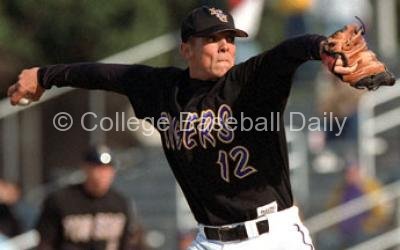
Posted on 1/22/23 at 1:22 pm to LSBoosie
Love them
Posted on 1/22/23 at 1:25 pm to LSBoosie
Very Russel Athletic looking cheapness
Posted on 1/22/23 at 1:36 pm to namvet6566
Classic! I like them.
At least it’s not these
At least it’s not these

Posted on 1/22/23 at 1:45 pm to LSBoosie
Good. Staircase LSU logo should be on the cap only.

Posted on 1/22/23 at 1:51 pm to LSBoosie
quote:
I liked the interlocking logo on the whites as well and was hoping they would add the piping to it. I'm sure I'll get used to these.
I hated the interlocking LSU without the piping.
These atleast look like there is more going on.
Posted on 1/22/23 at 1:59 pm to LSBoosie
These are sweet
Posted on 1/22/23 at 2:06 pm to LSBoosie
I love Then.
That’s a play on a classic LSU baseball uniform.
I like The interlocking LSU logo on the chest but I think The white unis with the logo were too plain.
I know People like the piping and id like it on the sleeve here but I dint Like it running through the letter.
I know We’ll never replace the purple unis but the interlocking letters logo looks great on purple jerseys.

Now what I really Wanted was a classic throwback white like these

That’s a play on a classic LSU baseball uniform.
I like The interlocking LSU logo on the chest but I think The white unis with the logo were too plain.
I know People like the piping and id like it on the sleeve here but I dint Like it running through the letter.
I know We’ll never replace the purple unis but the interlocking letters logo looks great on purple jerseys.
Now what I really Wanted was a classic throwback white like these
This post was edited on 1/22/23 at 2:14 pm
Posted on 1/22/23 at 2:27 pm to LSBoosie
Currently the WORST Font in LSU sports
Posted on 1/22/23 at 2:35 pm to Flablete
This font is better than th Geaux font.
boring early 2000 computer generated soulless font we have on everything now.
boring early 2000 computer generated soulless font we have on everything now.
Posted on 1/22/23 at 2:52 pm to 225Tyga
quote:
225Tyga
Sour puss
Posted on 1/22/23 at 2:55 pm to 225Tyga
No they don’t lol
Posted on 1/22/23 at 3:19 pm to chadr07
I like the Tigers across the front but with the pinstripes.
Posted on 1/22/23 at 3:24 pm to LesnarF5
BOOOOO to the no piping
/cdn.vox-cdn.com/uploads/chorus_asset/file/16007132/5751881e96f13.image.jpg)

/arc-anglerfish-arc2-prod-pmn.s3.amazonaws.com/public/HZO5D5DA2BB3PLRECT2OOBBPQ4.jpg)
Posted on 1/22/23 at 3:27 pm to LSBoosie
Where are the pin stripes? Those uni's are just generic Nike junk.
Posted on 1/22/23 at 5:00 pm to OchoDedos
1. I like these a great deal.
2. never, Never, NEVER have any significant amount of black on any LSU jersey in any sport.
3. Only have LSU or Tigers on our uniforms. NEVER have Louisiana State.
2. never, Never, NEVER have any significant amount of black on any LSU jersey in any sport.
3. Only have LSU or Tigers on our uniforms. NEVER have Louisiana State.
Posted on 1/22/23 at 6:18 pm to GeorgeWest
I always loved the pinstripes. As a kid, seeing those walker, Johnson etc in the dome they were my Yankees… larger than life.
Posted on 1/22/23 at 6:18 pm to LSBoosie
Looks like the same shite they always wear.

Posted on 1/22/23 at 6:21 pm to LSBoosie
If they help us hit and field better I’m all for them.

 Page 2 of 5

Popular
Back to top