by
25 Comments
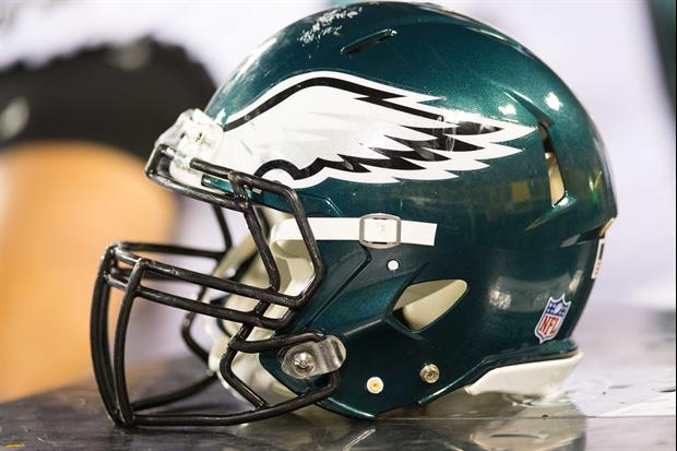
© Jeff Hanisch-USA TODAY Sports
The Philadelphia Eagles unveiled their new logo on Thursday...

Filed Under: NFL

Comments

25 Comments
user avatar
Old way looks more "eagle"-like. New font look "robotic".
Reply12 months
user avatar
Simple and plain looking, also kind of dull looking.
Reply12 months
user avatar
The new logo is much better than the late 90s / early 2000s logo they had. I think every SEC fan cringes their team's logo from that time period.
Reply12 months
user avatar
The new logo is much better than the late 90s / early 2000s logo they had. I think every SEC fan cringes their team's logo from that time period.
Reply12 months
user avatar
Big deal….
Reply12 months
user avatar
Just needs some bullet holes in it
Reply12 months
user avatar
1 minute on Word - that'll be 3.50 million thank you.Had to download a font pack - 5 million & seson tix.
Reply12 months
user avatar
Fans are bitching about it so much that there’s hope the organization changes it back. Haven’t seen anyone in support of it. Absolute trash.
Reply12 months
user avatar
THATS HORRIBLE!!!!!!!!!!
Reply12 months
user avatar
Frick the eagles
Reply12 months
user avatar
Crap. And by the way, is there a more delusional fan base? One Super Bowl victory ever and you would think they are the Yankees.
Reply12 months
user avatar
Anything's better than the old one. Plus, their colors just are horrible.
Reply12 months
user avatar
Cheeeeaaaaaap.....going from 2 color to 1 color.
Reply12 months
user avatar
Both are terrible.
Reply12 months
user avatar
Well, this is just what nobody needed.
Reply12 months
user avatar
That new text sucks ass.
Reply12 months
user avatar
I really prefer the old 1980s font that went with their Kelly green in the Randall Cunningham days
Reply12 months
user avatar
Exactly, I even like the 70's Harold Carmichael unis over these crappy ones.
12 months
user avatar
i guess putting a dickhead on it would have pissed people off
Reply12 months
user avatar
Looks like they just copied the jets
Reply12 months
user avatar
As usual, lame text sucks ass.
Reply12 months
user avatar
Wow. Those E’s look fierce
12 months
Popular Stories