





 0
0







- My Forums
- Tiger Rant
- LSU Recruiting
- SEC Rant
- Saints Talk
- Pelicans Talk
- More Sports Board
- Fantasy Sports
- Golf Board
- Soccer Board
- O-T Lounge
- Tech Board
- Home/Garden Board
- Outdoor Board
- Health/Fitness Board
- Movie/TV Board
- Book Board
- Music Board
- Political Talk
- Money Talk
- Fark Board
- Gaming Board
- Travel Board
- Food/Drink Board
- Ticket Exchange
- TD Help Board
Customize My Forums- View All Forums
- Show Left Links
- Topic Sort Options
- Trending Topics
- Recent Topics
- Active Topics
Started By
Message
re: Daily COVID Updated as of 11/2/20 8:00 PM
Posted on 5/12/20 at 4:53 pm to Jinglebob
Posted on 5/12/20 at 4:53 pm to Jinglebob
quote:
Eta: it looks like Chromodome's graphs update automatically even if he hasn't posted the latest link. Is that accurate?
Yes, that is why it sucks that the graphs are now 4 pages back due to a couple people discussing a totally unrelated graphic.
Posted on 5/12/20 at 5:06 pm to Jinglebob
quote:
The Tuesday bump is currently around 1500 deaths. Not sure what time they cut it off but anything below 2000 is significant. We haven't had a Tuesday bump below 2000 since first of April.
The cutoff is 0000 GMT, which is 7 pm Central. It usually resets for me closer to 8 though.
Posted on 5/12/20 at 5:48 pm to Sasquatch Smash
quote:
Let's look at that heat map and see how excluding those deaths from the numbers makes the death rate look to assess risk to the non-nursing home population.
Exactly.
Posted on 5/12/20 at 5:53 pm to Korkstand
quote:
The question we should ask is "are we trying to convey useful information, or are we trying to elicit a response or emotion?"
Why 3 regions, and why contiguous? Why are we trying to make a huge country with multiple hotspots appear to have only 1 hotspot? What is the purpose of presenting data in this way?
It's a very simple map that is conveying a very simple message.
There is a huge percentage of cases in a small amount of geography. I don't think the map is trying to indicate that the entire green area is identical with low rates. It's pointing out that our national stats are very largely skewed by two relatively small areas.
That's not misleading.
Misleading is that Georgia new case chart that has a delay in reporting that makes it look like the curve is significantly decreasing over the last 1-2 weeks.
This post was edited on 5/12/20 at 6:01 pm
Posted on 5/12/20 at 6:12 pm to moneyg
So back on topic. Today's numbers looking much more "new normal". This reporting is so suspect at this point.
Posted on 5/12/20 at 6:18 pm to TigerFanatic99
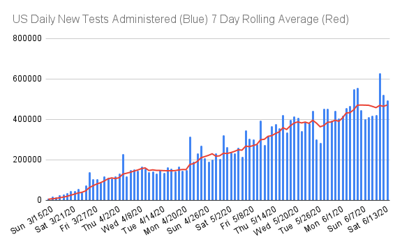
300,000 tests
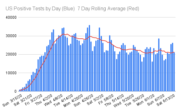
20,000 positive
20,000 positive
Posted on 5/12/20 at 6:43 pm to Jinglebob
That is correct. The data grid at the top of my posts is an image and therefore static. The graphs are all linked to my google sheet which I update throughout the day. Whenever I update, the graphs here automatically update, but I have to do a screencap of the data grid, save it to the web and then get the link to the image...so I don't go through that as often.
I'm pretty much only doing it once, maybe twice a day. I felt like the morning updates were a bit redundant given their proximity to the previous evening's numbers. I will still update mid-afternoon sometimes, I was just busy with work today and didn't have the time.
I'm pretty much only doing it once, maybe twice a day. I felt like the morning updates were a bit redundant given their proximity to the previous evening's numbers. I will still update mid-afternoon sometimes, I was just busy with work today and didn't have the time.
Posted on 5/12/20 at 6:45 pm to Korkstand
quote:
Korkstand
Can't you make a Fake News topic to post in?
Posted on 5/12/20 at 6:46 pm to Chromdome35
And given the length of the current spirited discussion, I would appreciate if you guys would maybe take that to a different thread. I've been really happy that this thread has stayed on topic for over 200 pages.
I appreciate everyone's efforts to keep it that way.
I appreciate everyone's efforts to keep it that way.
Posted on 5/12/20 at 6:52 pm to Chromdome35
This is the link to the US state-level tracker that I have shared via Google Drive. Chromdome's State Level COVID-19 Daily Tracker
This is the link to the COVID-19 Country tracker that I have shared on Google Drive. Chromdome's COVID-19 Daily Tracker
The source for the data is https://www.worldometers.info/coronavirus/
The source for the testing data is from https://covidtracking.com/data/
NOTE: I added a little section to show Week over Week comparables at the bottom of the data grid.

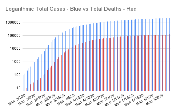
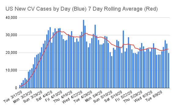

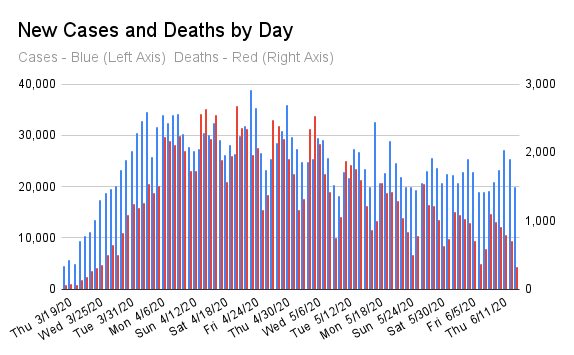
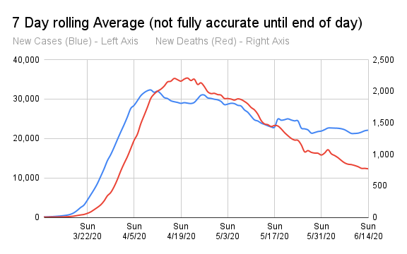

This is the link to the COVID-19 Country tracker that I have shared on Google Drive. Chromdome's COVID-19 Daily Tracker
The source for the data is https://www.worldometers.info/coronavirus/
The source for the testing data is from https://covidtracking.com/data/
NOTE: I added a little section to show Week over Week comparables at the bottom of the data grid.
Posted on 5/12/20 at 7:03 pm to Chromdome35
We’re still about two weeks behind Italy.
Posted on 5/12/20 at 7:08 pm to Chromdome35
Unless there is a last minute data dump, we are down some 750 deaths from last Tuesday. I expected some late weekend numbers to be added to get us to around 2,000 today, so this is certainly encouraging.
Posted on 5/12/20 at 7:33 pm to Volsfan82169
Overall, these are more like late March numbers than mid-April.
Not "good" news, but a positive development with the possibility of this downtrend being a permanent one.
Not "good" news, but a positive development with the possibility of this downtrend being a permanent one.
Posted on 5/12/20 at 7:39 pm to Volsfan82169
quote:
Unless there is a last minute data dump, we are down some 750 deaths from last Tuesday. I expected some late weekend numbers to be added to get us to around 2,000 today, so this is certainly encouraging.
The reduction is deaths today is great, as is the reduction in new cases.
2k fewer than 7 days ago
3k fewer than 14 days ago
4k fewer than 21 days ago
5k fewer than 28 days ago
11k fewer than 35 days ago
3k fewer than 42 days ago
With most of those Tuesdays having less than half the number of tests performed today. Even the most tests on a Tuesday (before today) was 48k fewer than today's testing total.
New cases are slowing nicely while new testing has increased greatly. Encouraging trend.
Posted on 5/12/20 at 8:11 pm to Chromdome35
This is the link to the US state-level tracker that I have shared via Google Drive. Chromdome's State Level COVID-19 Daily Tracker
This is the link to the COVID-19 Country tracker that I have shared on Google Drive. Chromdome's COVID-19 Daily Tracker
The source for the data is https://www.worldometers.info/coronavirus/
The source for the testing data is from https://covidtracking.com/data/
NOTE: I added a little section to show Week over Week comparables at the bottom of the data grid.

This is the link to the COVID-19 Country tracker that I have shared on Google Drive. Chromdome's COVID-19 Daily Tracker
The source for the data is https://www.worldometers.info/coronavirus/
The source for the testing data is from https://covidtracking.com/data/
NOTE: I added a little section to show Week over Week comparables at the bottom of the data grid.
Posted on 5/12/20 at 8:18 pm to Ace Midnight
quote:I mean the highest single day death total in March was 1085 and over the last 5 days in March, there were a combined 3209 deaths, compared to a combined 3,388 deaths over the last 3 days.
Overall, these are more like late March numbers than mid-April.
In addition, I think worldometer made an error subtracting 147 deaths from NYC when they added 122 deaths (202 additions if counting the ones where all demographic and residency was completed) which is why they are off by 308 deaths in NYC (293 if the 15 unknown residency deaths are included in the unassigned).
In other words, I think we had at least 3,681-3,696 deaths over the last 3 days, which would be about as many as the last 6 days in March.
In addition, while the 5 earliest and hardest hit states (NY, NJ, CT, MA, and LA) and Pennsylvania (who is in the northeast cluster, was down about 53.8% from last Tuesday (it looks like Pennsylvania’s had a data dump last week), the rest of the country was down about 6.8% so I think we’re seeing the differences in the decline based on where states are on the curve timeline.
This post was edited on 5/12/20 at 8:26 pm
Posted on 5/12/20 at 8:19 pm to Chromdome35
New cases expectedly spiked up as it's Tuesday; however, the spike was down by 1.9K from last week on 13K more tests. The 7 day rolling average for new cases is continuing downward.
Deaths spiked up as well but only to 1.6K, 720 below last Tuesday a 30% decline. The 7 day rolling average for deaths continues to show downward movement.
If you look at the graph showing the 7 day rolling average new cases and deaths, you'll see that we're close to a point where the deaths line crosses the new cases line.
Mortality remains at 5.9%
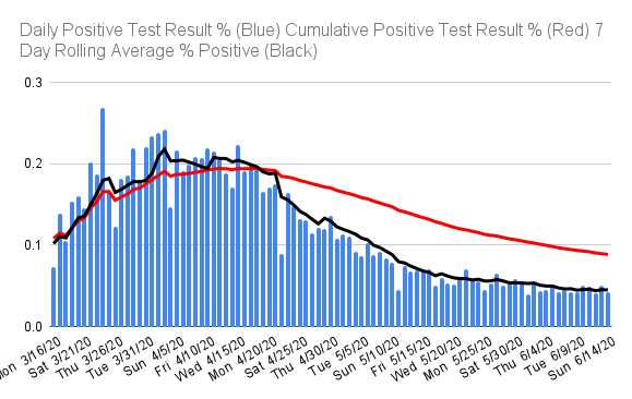
Testing was down 120K from yesterday's record high but 13K above last week. I suspect yesterday may have contained weekend leftovers. The % of positive tests was 7.5% yielding 20.2K positive tests, a decline of 2K ~9% from last week.
Deaths spiked up as well but only to 1.6K, 720 below last Tuesday a 30% decline. The 7 day rolling average for deaths continues to show downward movement.
If you look at the graph showing the 7 day rolling average new cases and deaths, you'll see that we're close to a point where the deaths line crosses the new cases line.
Mortality remains at 5.9%
Testing was down 120K from yesterday's record high but 13K above last week. I suspect yesterday may have contained weekend leftovers. The % of positive tests was 7.5% yielding 20.2K positive tests, a decline of 2K ~9% from last week.
Posted on 5/12/20 at 8:33 pm to Chromdome35
Very nice numbers on Tuesday
Posted on 5/12/20 at 9:00 pm to diddlydawg7
I know Jake misses going to class fa sho
Posted on 5/12/20 at 10:01 pm to Jrv2damac
quote:
I know Jake misses going to class fa sho
Ok, that one was pretty good


 Page 214 of 331



Popular

Back to top
 Follow TigerDroppings for LSU Football News