- My Forums
- Tiger Rant
- LSU Recruiting
- SEC Rant
- Saints Talk
- Pelicans Talk
- More Sports Board
- Fantasy Sports
- Golf Board
- Soccer Board
- O-T Lounge
- Tech Board
- Home/Garden Board
- Outdoor Board
- Health/Fitness Board
- Movie/TV Board
- Book Board
- Music Board
- Political Talk
- Money Talk
- Fark Board
- Gaming Board
- Travel Board
- Food/Drink Board
- Ticket Exchange
- TD Help Board
Customize My Forums- View All Forums
- Show Left Links
- Topic Sort Options
- Trending Topics
- Recent Topics
- Active Topics
Started By
Message
re: The top 5 worst logos in American sports are as follows:
Posted on 10/24/25 at 7:02 am to LSUBoo
Posted on 10/24/25 at 7:02 am to LSUBoo
Can't believe it's been 22 years since this classic was released! When it was first unveiled at the press conference you could hear a few people laughing in the audience.
I don't know what it is, but the tiger looks like he doesn't remember you while accepting a hug to avoid embarrassment.

I don't know what it is, but the tiger looks like he doesn't remember you while accepting a hug to avoid embarrassment.
 0
0


Posted on 10/24/25 at 8:04 am to Packer
I prefer the old Temple logo, but have grown to like this. It's not that bad

Posted on 10/24/25 at 8:22 am to HuskyPanda


Posted on 10/24/25 at 9:07 am to LanierSpots
quote:
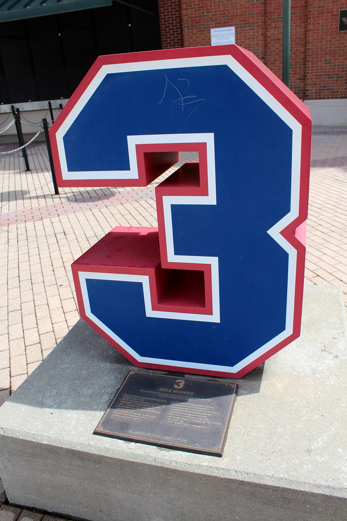
Its almost like none of you have ever been to a Atlanta Braves farm game
I give you the Gwinnett Stripers
When Shreveport tried to get spicy and mess with tGOAT Captains logo and rebrand to the Swamp Dragon.

Posted on 10/24/25 at 9:17 am to JerryTheKingBawler
1. Los Angeles Lakers
2. Los Angeles Clippers
3. Washington Commanders
4. Brooklyn Nets
5. Washington Wizards
2. Los Angeles Clippers
3. Washington Commanders
4. Brooklyn Nets
5. Washington Wizards

Posted on 10/24/25 at 9:45 am to JerryTheKingBawler
nice photos
Posted on 10/24/25 at 10:55 am to Tiger Ryno
quote:
#1 Houston texans
The Texans logo is average. The uniform and color changes are abysmal.


Posted on 10/24/25 at 10:58 am to Zendog
Do you not know ball? Can you not picture logos? Take a lap.
Posted on 10/24/25 at 11:01 am to lsupride87
I love the blue and yellow sabers unis with the swords.
This post was edited on 10/24/25 at 11:02 am
Posted on 10/24/25 at 11:18 am to iwyLSUiwy
You could have a thread solely devoted to minor league baseball, especially considering each team’s alternate identities.
Posted on 10/24/25 at 11:41 am to PeteRose
quote:I’m from Spartanburg, SC and married to a Wofford grad. They are Boston Terriers because during a baseball game early in the college’s history someone’s Boston Terrier escaped from the stands and stole the baseball.
Wofford has the least intimidation logo
This post was edited on 10/24/25 at 11:43 am
Posted on 10/24/25 at 4:15 pm to LanierSpots
quote:
Gwinnett Stripers
I think that is a great logo.
Posted on 10/24/25 at 4:48 pm to JerryTheKingBawler
While the Buffaslug is great every now and again, the current Sabres blues are some of the best uniforms in all of sports
Posted on 10/24/25 at 6:21 pm to JerryTheKingBawler
1. Houston Texans -
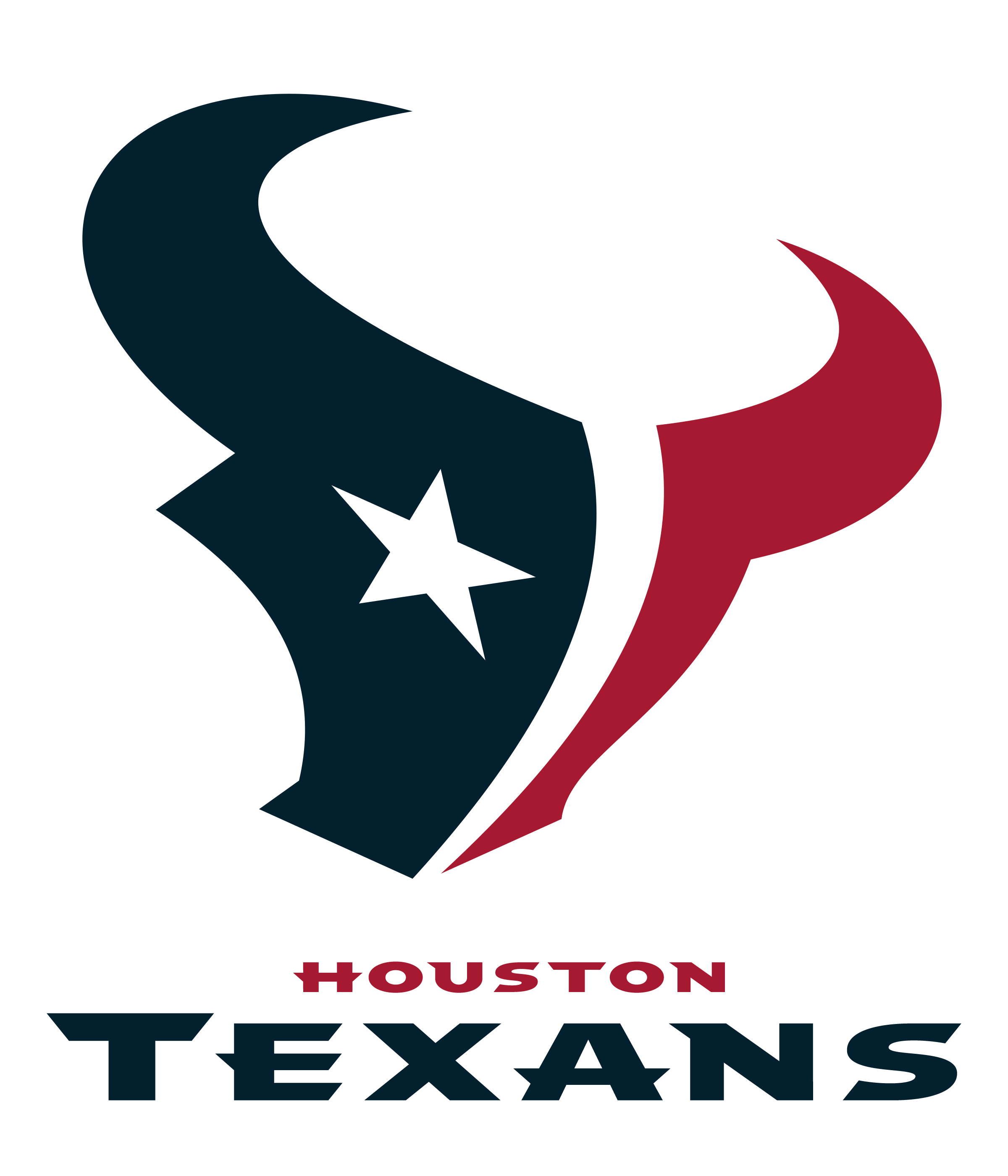
dumb name and dumb logo, but that's Bud Adams fault because he is a-hole. I loved the Oilers and hate that they decided to go with some dumbass regionalized name like that instead of what the XFL came up with: Roughnecks.
2. Washington Wizards -

as generic as it freakin gets now. Red white and blue basketball surrounded by the team name. Bring back the Bullets!
3. Golden State Warriors -
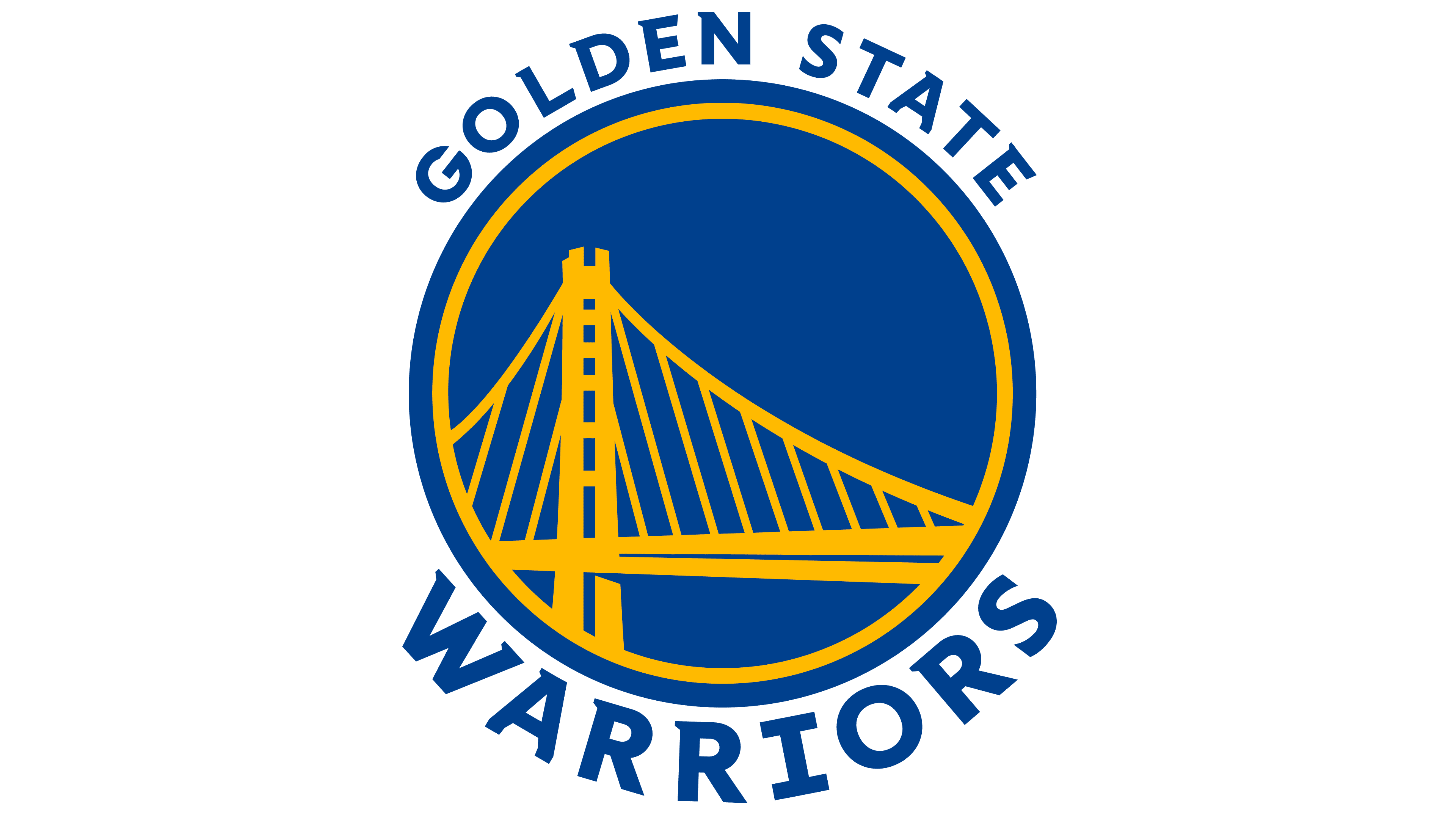
logo has absolutely nothing to do with being Warriors. It's the bridge. Yay.
4. Columbus Blue Jackets -
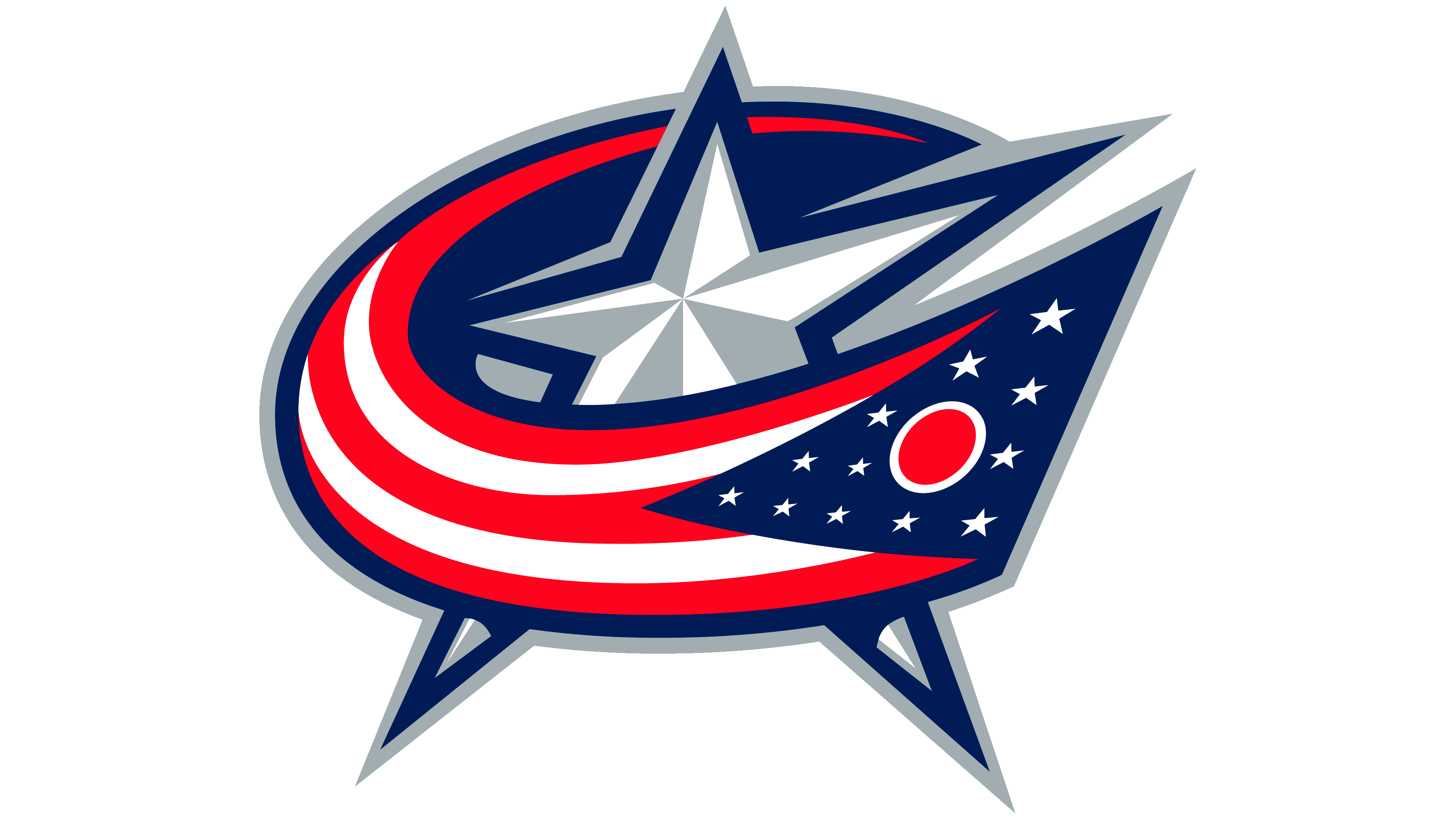
Are you the Stars? The Patriots? Nope. A jacket. Okay.
5. Brooklyn Nets -

A basketball with a B. Riveting.
dumb name and dumb logo, but that's Bud Adams fault because he is a-hole. I loved the Oilers and hate that they decided to go with some dumbass regionalized name like that instead of what the XFL came up with: Roughnecks.
2. Washington Wizards -
as generic as it freakin gets now. Red white and blue basketball surrounded by the team name. Bring back the Bullets!
3. Golden State Warriors -
logo has absolutely nothing to do with being Warriors. It's the bridge. Yay.
4. Columbus Blue Jackets -
Are you the Stars? The Patriots? Nope. A jacket. Okay.
5. Brooklyn Nets -
A basketball with a B. Riveting.
Posted on 10/24/25 at 7:58 pm to JerryTheKingBawler
I know this one 
Posted on 10/24/25 at 10:37 pm to JamalMurry27
Y’all seen the Titans logo? It’s the absolute worst!!
Posted on 10/24/25 at 11:36 pm to tWildcat
quote:
Guardians is just such a bad name.
On its own, Guardians is a good name. I’ve always liked the word. But changing the Indians to the Guardians was disgusting. People in Cleveland should’ve had the stones to boycott.
Posted on 10/24/25 at 11:41 pm to LanierSpots
Bro that fish looks awesome
I like the Corpus Christi Hooks


I like the Corpus Christi Hooks
Posted on 10/25/25 at 1:08 am to JerryTheKingBawler
Yes, the Browns should change to the bulldog or elf. I wish the Sabres kept the angry buffalo head too. Indians should have went back to Spiders.
Posted on 10/25/25 at 3:08 am to CRDNLSCHMCPSN11
quote:The Indians were never the Spiders.
Indians should have went back to Spiders.

 Page 4 of 5

Popular
Back to top