- My Forums
- Tiger Rant
- LSU Recruiting
- SEC Rant
- Saints Talk
- Pelicans Talk
- More Sports Board
- Fantasy Sports
- Golf Board
- Soccer Board
- O-T Lounge
- Tech Board
- Home/Garden Board
- Outdoor Board
- Health/Fitness Board
- Movie/TV Board
- Book Board
- Music Board
- Political Talk
- Money Talk
- Fark Board
- Gaming Board
- Travel Board
- Food/Drink Board
- Ticket Exchange
- TD Help Board
Customize My Forums- View All Forums
- Show Left Links
- Topic Sort Options
- Trending Topics
- Recent Topics
- Active Topics
Started By
Message
re: Super Bowl LIX logo designed by a local artist
Posted on 1/8/25 at 3:05 pm to Chucktown_Badger
Posted on 1/8/25 at 3:05 pm to Chucktown_Badger
There's something about the 1994 logo that just does it for me. 
 0
0


Posted on 1/8/25 at 3:08 pm to Major Dutch Schaefer
Anyone who doesn't verbally refer to this game as "Super Bowl Licks" in regular conversation is a simp and a cop.
Posted on 1/8/25 at 3:10 pm to Major Dutch Schaefer
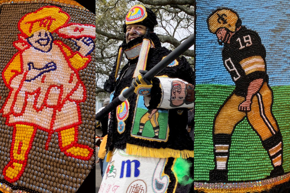
That wouldn’t have made me think of New Orleans. Maybe it’s supposed to look like plastic Mardi Gras beads if I had to draw a link with no info because to me it looks like it imitates Indian bead art
Posted on 1/8/25 at 3:12 pm to Chucktown_Badger
Of course the best logos are from the 90's to mid 2000's

Posted on 1/8/25 at 3:13 pm to Who_Dat_Tiger
quote:
because to me it looks like it imitates Indian bead art
quote:
The handsome design embodies an age-old masking custom — sometimes called Black Indian masking — that is rooted in the historical connections between African and Native American heritage in New Orleans.
Posted on 1/8/25 at 3:19 pm to Funky Tide 8
Guess it accomplished what it meant to then
Would’ve at least used Mardi Gras colors if it were me but I’m no artist
Would’ve at least used Mardi Gras colors if it were me but I’m no artist
Posted on 1/8/25 at 3:20 pm to Major Dutch Schaefer
The SB logos are always so stupid looking
Posted on 1/8/25 at 3:20 pm to Major Dutch Schaefer
Looks like a shag 70's orgy Porno logo done in Macrame as a High School art project.

Posted on 1/8/25 at 3:22 pm to Major Dutch Schaefer
Is that fabric from a 1960's era couch?


Posted on 1/8/25 at 3:24 pm to Who_Dat_Tiger
I agree.

Posted on 1/8/25 at 3:48 pm to SirWinston
quote:
Rolling Stones should have done halftime but thanks to George Floyd were guaranteed rap music until JayZ is behind bars. Sad!
Posted on 1/8/25 at 3:51 pm to Chucktown_Badger
That LIX logo actually has Mardi gras colours and the late, great Louis Armstrong, who many people are saying went by the name "Satchmo".
This post was edited on 1/8/25 at 3:51 pm
Posted on 1/8/25 at 3:54 pm to Who_Dat_Tiger
not the plastic beads they throw, they ones the Mardi Gras Indians use

Posted on 1/8/25 at 4:10 pm to Major Dutch Schaefer
Ugly, but every single thing Mardi Gras related is ugly and tacky as frick
This post was edited on 1/8/25 at 4:11 pm
Posted on 1/8/25 at 4:12 pm to Chucktown_Badger
I can tell you winner, loser, and location of every SB up to 2012 without thinking too hard. I also know 50 just because of it being a different type of logo.
The shitty logos don’t do anything to job my memory. I have to really think to figure out recent SB matchups and locations.
The shitty logos don’t do anything to job my memory. I have to really think to figure out recent SB matchups and locations.
Posted on 1/8/25 at 4:36 pm to Major Dutch Schaefer
That's an interesting design, but the one they will use for the graphics basically takes the "bead" portion out of it and makes it just a generic superbowl logo that almost no one can tie to the city.

Posted on 1/8/25 at 7:05 pm to Major Dutch Schaefer
Looks like it's another Chiefs vs Packers Super Bowl.

Posted on 1/8/25 at 7:48 pm to Bjorn Cyborg
quote:
With it being LIX, there should have been a tongue involved.
Somebody's already printing "This Super Bowl LIX" tshirts.
But you probably can't sell them online without getting sued for using The Big Game's trademark.
Posted on 1/8/25 at 7:50 pm to Major Dutch Schaefer
Don't care for the color scheme.
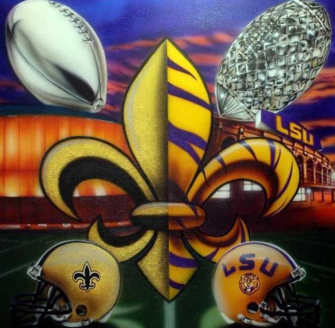
Still a million times better than the sterile corporate logos they've been using. There's also a fleur de lis in the X.
Still a million times better than the sterile corporate logos they've been using. There's also a fleur de lis in the X.
Posted on 1/8/25 at 9:50 pm to BigBinBR
I actually like that one even better.

 Page 2 of 3

Popular
Back to top