- My Forums
- Tiger Rant
- LSU Recruiting
- SEC Rant
- Saints Talk
- Pelicans Talk
- More Sports Board
- Fantasy Sports
- Golf Board
- Soccer Board
- O-T Lounge
- Tech Board
- Home/Garden Board
- Outdoor Board
- Health/Fitness Board
- Movie/TV Board
- Book Board
- Music Board
- Political Talk
- Money Talk
- Fark Board
- Gaming Board
- Travel Board
- Food/Drink Board
- Ticket Exchange
- TD Help Board
Customize My Forums- View All Forums
- Show Left Links
- Topic Sort Options
- Trending Topics
- Recent Topics
- Active Topics
Started By
Message
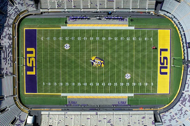
End zone and field markings.
Posted on 7/3/26 at 10:46 pm
Posted on 7/3/26 at 10:46 pm
For as long as I can remember (80s) we have seemed to change the field paintings with a change of the coach. If LSU powers that be see this, can we go back to the yard marker numbers pre Brian Kelly and remove the LSU geaux font and pull back the saban era end zones? Down vote away. But. I want rid all of that bad juju and get back to normality.
 12
12

Posted on 7/3/26 at 11:03 pm to coonass27
The endzones are 21 years running. Do better LSU.

Posted on 7/3/26 at 11:09 pm to coonass27
quote:
LSU geaux font
shite is so tired.
Posted on 7/3/26 at 11:22 pm to coonass27
I may be in the minority, but I love our current enzobes. And it was even better with the stadium arch “watermark” during the 100th year season.
Posted on 7/3/26 at 11:46 pm to Y.A. Tittle
Geaux font is awesome
Posted on 7/4/26 at 12:32 am to In The Know
quote:Agree. What's with the Geaux Font hate?
Geaux font is awesome
Posted on 7/4/26 at 4:58 am to coonass27
I am ok with the Geaux font but it wouldn't be my first choice. But they absolutely need to go back to the numbers before Brian Kelly.
Posted on 7/4/26 at 6:37 am to coonass27
Geaux font yourself!!!
Posted on 7/4/26 at 8:47 am to coonass27
We should go back to the endzones we had in 2003, where LSU takes up the entire endzone.
Posted on 7/4/26 at 9:41 am to coonass27
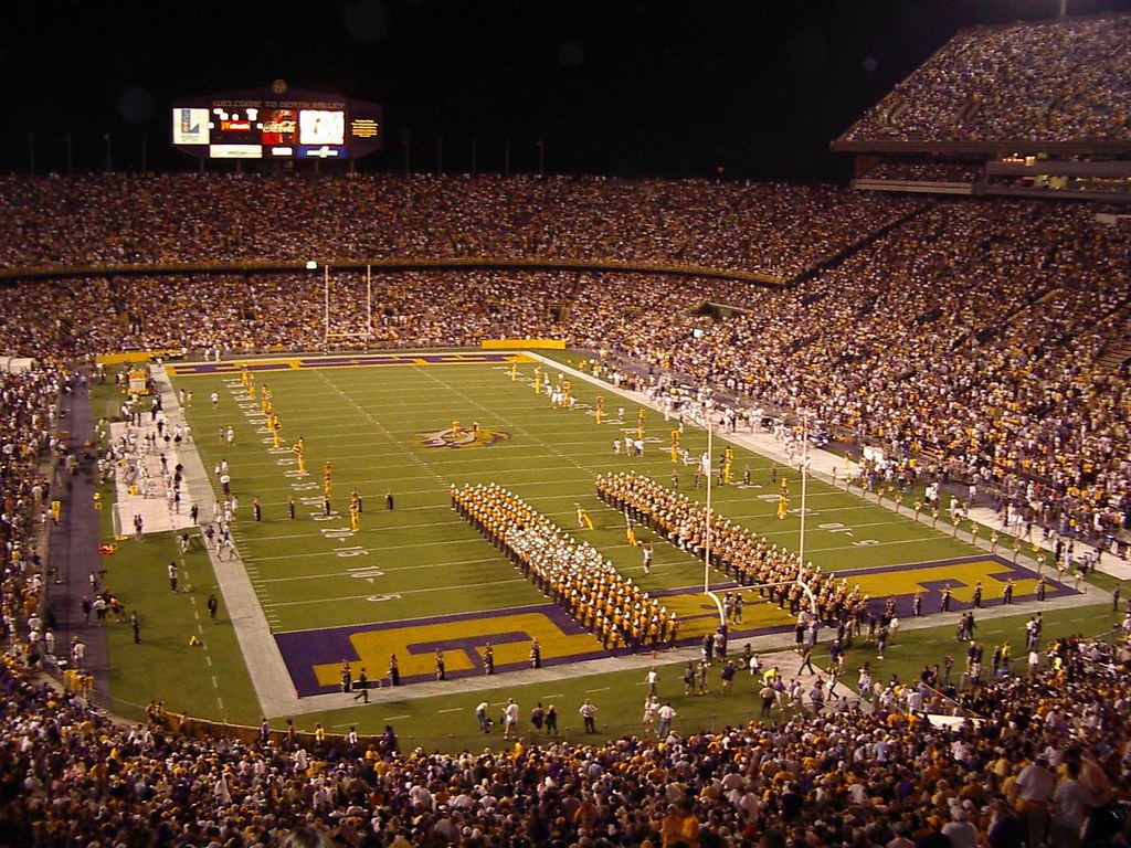
I remember when one end zone was LSU in p&g and the opponent's was painted and marked on the other...I liked that

Posted on 7/4/26 at 10:32 am to coonass27
Posted on 7/4/26 at 12:24 pm to coonass27
Hell, just bring back Toonces, the most loved Tiger image of all time.
Posted on 7/4/26 at 12:31 pm to GreenieTiger
quote:
What's with the Geaux Font hate?
A rantards need to hate something.
Posted on 7/4/26 at 12:38 pm to Hold That Tiger 10
I dot necessarily hate it. I was just watching some highlights from 03 and forgot how good those endzones looked. Just seems that we changed it up for each new admin, but stopped after Les. Guess that was just coincidence
I did like the end zones that had the Stadium arches watermarked in the back ground. Idk. Time to change it up. Last change they did was stopping the outline of the letters in white.
I did like the end zones that had the Stadium arches watermarked in the back ground. Idk. Time to change it up. Last change they did was stopping the outline of the letters in white.
Posted on 7/4/26 at 12:41 pm to coonass27
My favorite, but with the gold sidelines

Posted on 7/4/26 at 12:45 pm to coonass27
All markings and signage installed in Kelly era must be completely removed! 
Posted on 7/4/26 at 1:03 pm to Hold That Tiger 10
quote:
rantards need to hate something
True
For anyone who cares, this is the history of Geaux Font. The only thing that sucks is that LSU went out of state to have the logo designed. I'm sure there were some talented students or Louisiana based graphic designers/branding firms that could have done a great job.
LINK
Posted on 7/4/26 at 1:42 pm to GreenieTiger
Didnt the current endzone LSU letters change when NIKE became the uniforms company? They changed to their font right?
Posted on 7/4/26 at 1:50 pm to OU812
Am I the only one that doesn’t really pay attention to how the end zones and yard markers are painted?

Posted on 7/4/26 at 1:58 pm to Y.A. Tittle
quote:
shite is so tired.
It sucks. Nothing collegiate or sports about it.
I dont think ive purchased apparel with it in the last 10 years.

 Page 1 of 2

Popular
Back to top