- My Forums
- Tiger Rant
- LSU Recruiting
- SEC Rant
- Saints Talk
- Pelicans Talk
- More Sports Board
- Fantasy Sports
- Golf Board
- Soccer Board
- O-T Lounge
- Tech Board
- Home/Garden Board
- Outdoor Board
- Health/Fitness Board
- Movie/TV Board
- Book Board
- Music Board
- Political Talk
- Money Talk
- Fark Board
- Gaming Board
- Travel Board
- Food/Drink Board
- Ticket Exchange
- TD Help Board
Customize My Forums- View All Forums
- Show Left Links
- Topic Sort Options
- Trending Topics
- Recent Topics
- Active Topics
Started By
Message
Seattle Kraken Logo and Jersey
Posted on 7/22/21 at 9:49 am
Posted on 7/22/21 at 9:49 am
Generally, new expansion teams and their logos and jerseys have been blah - see Vegas Knights, Tampa Bay Rays, Houston Texans.
However, the Seattle Kraken crushed it imo. Both home and away looks great imo.
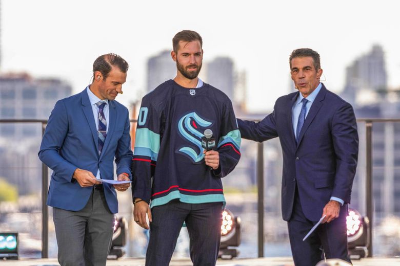


However, the Seattle Kraken crushed it imo. Both home and away looks great imo.
 22
22


Posted on 7/22/21 at 9:50 am to GentleJackJones
Nice.

Posted on 7/22/21 at 9:51 am to GentleJackJones
Seafoam Green for the win.

Posted on 7/22/21 at 9:51 am to GentleJackJones
Picking a good color combination is 90 percent of the battle
Posted on 7/22/21 at 9:57 am to GentleJackJones
That’s cool. But I don’t know why you are hating on Vegas. There’s is badass also.
Posted on 7/22/21 at 9:58 am to GentleJackJones
Love the logo and the anchors. I’d get rid of the light blue and stick with just seafoam green.

Posted on 7/22/21 at 9:59 am to GentleJackJones
The eye is a very nice touch
Posted on 7/22/21 at 10:06 am to GentleJackJones
Seattle is another city where the pro teams have similarish colors.
Love the Kraken jerseys but I’m also a fan of the Golden Knights jerseys. Are those not liked by many?
Love the Kraken jerseys but I’m also a fan of the Golden Knights jerseys. Are those not liked by many?
This post was edited on 7/22/21 at 10:11 am

Posted on 7/22/21 at 10:09 am to GentleJackJones
Looks clean
Posted on 7/22/21 at 10:13 am to GentleJackJones
I like the color scene but the logo is too contemporary to age well.
If they consistently rebrand they’ll be Ok but this logo will look dated in 6-7 years.
If they consistently rebrand they’ll be Ok but this logo will look dated in 6-7 years.

Posted on 7/22/21 at 10:24 am to GentleJackJones
I heard so many people hate on the name and I don’t understand why. It’s such a dope mascot.
This is what I wish New Orleans would’ve done when they rebranded the hornets. Go with something more unique like rougarou. I think it brings more flare when the mascots something more unique. I get there’s no other pelicans in pro sports but it doesn’t fit for basketball IMO and it had been done in New Orleans before.
This is what I wish New Orleans would’ve done when they rebranded the hornets. Go with something more unique like rougarou. I think it brings more flare when the mascots something more unique. I get there’s no other pelicans in pro sports but it doesn’t fit for basketball IMO and it had been done in New Orleans before.
Posted on 7/22/21 at 10:29 am to GentleJackJones
Anchors are badass, but they really should have used an kracken and not just some tentaciles.
Posted on 7/22/21 at 10:32 am to GentleJackJones
You don’t get many new logos/jerseys that look good these days. This is a huge win in that department.
Most of the best “new” jerseys that come out these days are just the old jerseys a team used to wear that got replaced by something far shittier for a few years so nike could sell New Jersey’s and then recycle old designs to sell more New Jersey’s. Rinse. Repeat.
Most of the best “new” jerseys that come out these days are just the old jerseys a team used to wear that got replaced by something far shittier for a few years so nike could sell New Jersey’s and then recycle old designs to sell more New Jersey’s. Rinse. Repeat.
Posted on 7/22/21 at 11:30 am to GentleJackJones
I usually hate logos with lame letters or text. But the sea creature in the shape of the 'S' looks nice. The anchors on the shoulders works too. And the various shades of blue blends well together. Well done Kraken.

Posted on 7/22/21 at 1:14 pm to GentleJackJones
Damn. That is super cool. I want one already!

Posted on 7/22/21 at 1:16 pm to GentleJackJones
I read this as Seattle Karen logo
Posted on 7/22/21 at 1:19 pm to GentleJackJones
Didn't Bezo's completely gut Key Arena and rebuild it for the Krakens?

Posted on 7/22/21 at 1:30 pm to GentleJackJones
They’re missing a huge opportunity if their team slogan isn’t “Let’s get it Kraken”
Posted on 7/22/21 at 2:19 pm to GentleJackJones
I’ve seen this somewhere before

Posted on 7/22/21 at 2:43 pm to GentleJackJones
I like!
And disagree on Vegas's logo. It's kick-arse.
And disagree on Vegas's logo. It's kick-arse.

 Page 1 of 2

Popular
Back to top