- My Forums
- Tiger Rant
- LSU Recruiting
- SEC Rant
- Saints Talk
- Pelicans Talk
- More Sports Board
- Fantasy Sports
- Golf Board
- Soccer Board
- O-T Lounge
- Tech Board
- Home/Garden Board
- Outdoor Board
- Health/Fitness Board
- Movie/TV Board
- Book Board
- Music Board
- Political Talk
- Money Talk
- Fark Board
- Gaming Board
- Travel Board
- Food/Drink Board
- Ticket Exchange
- TD Help Board
Customize My Forums- View All Forums
- Show Left Links
- Topic Sort Options
- Trending Topics
- Recent Topics
- Active Topics
Started By
Message
re: Tiger Logo in Tiger Stadium or Tiger Eye?
Posted on 8/5/17 at 5:46 pm to supersaints9

Posted on 8/5/17 at 5:46 pm to supersaints9
RIP LSU indoor light buzz 

@LSUIndoorLights
@LSUIndoorLights
 0
0

Posted on 8/5/17 at 5:48 pm to MarlinMan
quote:
Stallone (the singer)..
Frank?

Posted on 8/5/17 at 5:51 pm to supersaints9
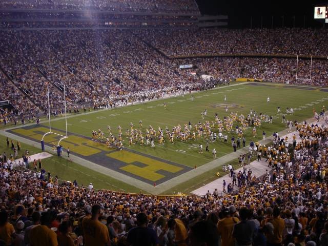
Tiger Eye with block endzones

Posted on 8/5/17 at 5:51 pm to lesgeaux
quote:This. I love the new tiger head logo, but the eye is absolutely iconic.
Eye is, hands down, the best midfield logo in all of football

Posted on 8/5/17 at 5:54 pm to supersaints9
Tiger logo in the end zones next to the block LSU letters would be a nice complement to the eye at midfield.

Posted on 8/5/17 at 6:20 pm to supersaints9
Eye of the Tiger
Posted on 8/5/17 at 6:21 pm to supersaints9
The Eye is the most distinct midfield logo in college football. Never change it.

Posted on 8/5/17 at 6:27 pm to supersaints9
Tiger Eye.
The thing I miss the most.
Bring the big block letters back to the End zones.

The thing I miss the most.
Bring the big block letters back to the End zones.

Posted on 8/5/17 at 6:27 pm to supersaints9
EYE 
Posted on 8/5/17 at 6:37 pm to TexTigah81
The eyes have it. This meeting is adjourned.
Posted on 8/5/17 at 6:56 pm to ctowntiger
quote:
I like the old block as well. But Geaux font isn't going anywhere.
I am not saying ditch the Geaux Font. Just bring the block letters back to the endzones

Posted on 8/5/17 at 7:06 pm to supersaints9
Gimme that logo over the eye all day, every day, and twice on Sunday.
Posted on 8/5/17 at 7:12 pm to supersaints9
That looks pretty sweet actually, but the eye looks great on the field, but really ONLY on the field. The way they fade the edges and it bleeds into the grass looks awesome, but they can't really replicate that by embroidering, which is why I don't really care for it on merchandise.
On a side note, and this is very nit picky, I wish they'd get rid of the white trim around the lettering in the end zones. It's probably easier on the paint crew to hide any imperfections by adding the white border, but having just p&g would look better imo
On a side note, and this is very nit picky, I wish they'd get rid of the white trim around the lettering in the end zones. It's probably easier on the paint crew to hide any imperfections by adding the white border, but having just p&g would look better imo
Posted on 8/5/17 at 7:15 pm to MarlinMan
The eye is associated with Stallone (the singer).... not a fan... logo all the way
That's not Frank Stallone. It's Survivor.
That's not Frank Stallone. It's Survivor.
Posted on 8/5/17 at 7:15 pm to TigerMeister
Tiger Eye and Turf. The Turf would look awesome!
Posted on 8/5/17 at 7:17 pm to lesgeaux
That Tiger logo looks old school. I have a tee shirt from back in the day with something extremely similar...
The eye is just beautiful. The Tiger logo is nice but it doesn't look unique. It could be any Tiger team and the eye is identifiable.
The eye is just beautiful. The Tiger logo is nice but it doesn't look unique. It could be any Tiger team and the eye is identifiable.
Posted on 8/5/17 at 7:18 pm to MichaelP DS80
quote:
I was never a fan of the eye, but I don't like that logo either.
Let me guess, you're a fan of being gay...

Posted on 8/5/17 at 7:19 pm to Ponchy Tiger
The block letters look like crap, and are only beloved for their nostalgic reminiscence.
The alternating light and dark would be cool, but our field is already so awesome and unique (h-style goalposts, every yardline is numbered, eye of the tiger) don't mess with it.
For the OP, I vote Eye of the Tiger because it's already one of the best centerfield logos in the entire game. Even opposing fan bases love it.
Posted on 8/5/17 at 7:19 pm to supersaints9
Eye!!!

 Page 2 of 6

Popular
Back to top