- My Forums
- Tiger Rant
- LSU Recruiting
- SEC Rant
- Saints Talk
- Pelicans Talk
- More Sports Board
- Fantasy Sports
- Golf Board
- Soccer Board
- O-T Lounge
- Tech Board
- Home/Garden Board
- Outdoor Board
- Health/Fitness Board
- Movie/TV Board
- Book Board
- Music Board
- Political Talk
- Money Talk
- Fark Board
- Gaming Board
- Travel Board
- Food/Drink Board
- Ticket Exchange
- TD Help Board
Customize My Forums- View All Forums
- Show Left Links
- Topic Sort Options
- Trending Topics
- Recent Topics
- Active Topics
Started By
Message
Atlanta Falcons release new uniforms
Posted on 4/2/26 at 9:52 am
Posted on 4/2/26 at 9:52 am

Pretty bland to be honest but better than the previous ATL ones.
 16
16


Posted on 4/2/26 at 9:55 am to red sox fan 13
I like them and it makes the throwback pop even more

Posted on 4/2/26 at 9:55 am to red sox fan 13
Reminds me of UGA.
Posted on 4/2/26 at 9:57 am to red sox fan 13
quote:
Pretty bland to be honest but better than the previous ATL ones.
Agreed.
Stop wasting time and just add some piping to the jersey and helmet, the change the helmet color back to red
Posted on 4/2/26 at 9:58 am to red sox fan 13
Their old red helmet/black jersey/white pants combo was way better than any of this. It’s a shame they don’t embrace that uniform instead.


Posted on 4/2/26 at 10:01 am to red sox fan 13
Garbage unis for a garbage franchise.
Posted on 4/2/26 at 10:06 am to red sox fan 13
quote:
better than the previous ATL ones
Very low bar to meet. Whoever green lit those uniforms should never work in the industry again. Those were absolutely heinous.
Posted on 4/2/26 at 10:06 am to red sox fan 13
Every time I read about a new uniform change, I can’t tell the difference.
Is it replacing one of the 5 different uniforms the team wears this season? Or a new 6th alternative.
Nevermind, I can now feel myself caring less.
Is it replacing one of the 5 different uniforms the team wears this season? Or a new 6th alternative.
Nevermind, I can now feel myself caring less.

Posted on 4/2/26 at 10:07 am to red sox fan 13
I will always hate matte helmets
Posted on 4/2/26 at 10:07 am to red sox fan 13
That being said, this old school style (including silver) is how the Falcons should look:


Posted on 4/2/26 at 10:09 am to BRich
That's just UGA with a bird.

Posted on 4/2/26 at 10:12 am to red sox fan 13
Writing the city or mascot on the jersey (especially that font) is so lame

Posted on 4/2/26 at 10:13 am to red sox fan 13
Credit to them for implementing a proper pant stripe. The unitard look in the NFL has become far too prevalent.
Posted on 4/2/26 at 10:21 am to red sox fan 13
I like the unis
frick the Falcons though
frick the Falcons though
Posted on 4/2/26 at 10:25 am to CatfishJohn
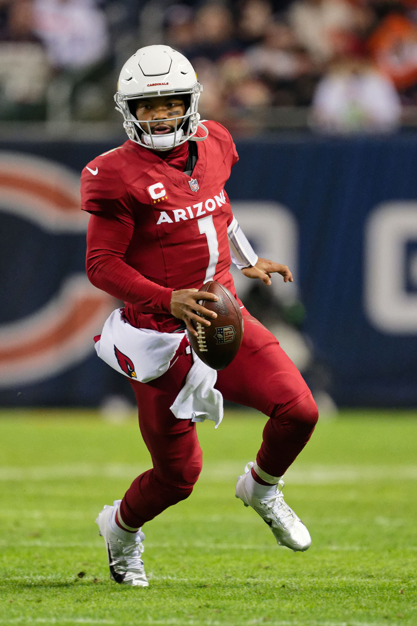
They look like the Cardinals
This post was edited on 4/2/26 at 10:26 am
Posted on 4/2/26 at 10:48 am to CP3forMVP
This short pants phase is the football equivalent of basketball's baggy shorts era.
Posted on 4/2/26 at 11:04 am to red sox fan 13
28-3
Posted on 4/2/26 at 11:40 am to red sox fan 13
Posted on 4/2/26 at 12:04 pm to Corso
quote:matte and chrome helmets are fugly
will always hate matte helmets
Nothing will ever beat a simplistic polished finish
Posted on 4/2/26 at 8:14 pm to red sox fan 13
No black jersey?

 Page 1 of 2

Popular
Back to top