- My Forums
- Tiger Rant
- LSU Recruiting
- SEC Rant
- Saints Talk
- Pelicans Talk
- More Sports Board
- Fantasy Sports
- Golf Board
- Soccer Board
- O-T Lounge
- Tech Board
- Home/Garden Board
- Outdoor Board
- Health/Fitness Board
- Movie/TV Board
- Book Board
- Music Board
- Political Talk
- Money Talk
- Fark Board
- Gaming Board
- Travel Board
- Food/Drink Board
- Ticket Exchange
- TD Help Board
Customize My Forums- View All Forums
- Show Left Links
- Topic Sort Options
- Trending Topics
- Recent Topics
- Active Topics
Started By
Message

The top 5 worst logos in American sports are as follows:
Posted on 10/23/25 at 1:54 pm

Posted on 10/23/25 at 1:54 pm
I’m talking about official team logos, so don’t “ackshually” me like some virgin on Reddit.
1. Oklahoma City Thunder
What even is that and what does it have to do with Thunder? Generic and boring, much like the state of Oklahoma.
2. Cleveland Browns
Really? An orange football helmet? You’ve been a team for how long and that’s the best you can do? Make the dog or the elf your logo you cowards.
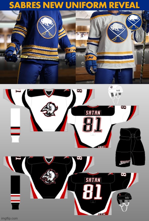
3. Buffalo Sabres
I honestly could’ve picked any “modernized” circle logo, but I picked the Sabres because of what they took from us. How did they think you could improve upon THIS:

Shoutout to the GOAT Dominik “THE DOMINATOR” Hasek. The Clippers put a badass warship in the middle of theirs, so they get a small pass.
4. Portland Trail Blazers
What even is that? A hurricane? A giant 69? The butthole that MJ destroyed? You’ve been a team since 1970. Do better.
5. Cleveland Guardians
Ok, you liberals want to rebrand and send Chief Wahoo down the Trail of Tears. Can you at least have a rebrand that doesn’t suck? You could’ve went so many cool directions with the name Guardians, and THAT’S what you come up with? The worst part is someone got paid a lot of money to make that. Sad.
What say tMSB? What are some of your least favorite logos in sports? I’ll hang up and listen.

1. Oklahoma City Thunder
What even is that and what does it have to do with Thunder? Generic and boring, much like the state of Oklahoma.
2. Cleveland Browns
Really? An orange football helmet? You’ve been a team for how long and that’s the best you can do? Make the dog or the elf your logo you cowards.
3. Buffalo Sabres
I honestly could’ve picked any “modernized” circle logo, but I picked the Sabres because of what they took from us. How did they think you could improve upon THIS:
Shoutout to the GOAT Dominik “THE DOMINATOR” Hasek. The Clippers put a badass warship in the middle of theirs, so they get a small pass.
4. Portland Trail Blazers
What even is that? A hurricane? A giant 69? The butthole that MJ destroyed? You’ve been a team since 1970. Do better.
5. Cleveland Guardians
Ok, you liberals want to rebrand and send Chief Wahoo down the Trail of Tears. Can you at least have a rebrand that doesn’t suck? You could’ve went so many cool directions with the name Guardians, and THAT’S what you come up with? The worst part is someone got paid a lot of money to make that. Sad.
What say tMSB? What are some of your least favorite logos in sports? I’ll hang up and listen.
 32
32

Posted on 10/23/25 at 1:57 pm to JerryTheKingBawler
quote:
The Clippers put a badass warship in the middle of theirs, so they get a small pass
It looks like a cruise ship and it’s terrible.
Posted on 10/23/25 at 1:58 pm to JerryTheKingBawler
#1 Houston texans

Posted on 10/23/25 at 2:01 pm to JerryTheKingBawler
Didn't specify professional or collegiate so, Temple, no explanation required

Posted on 10/23/25 at 2:02 pm to Tiger Ryno
Guardians
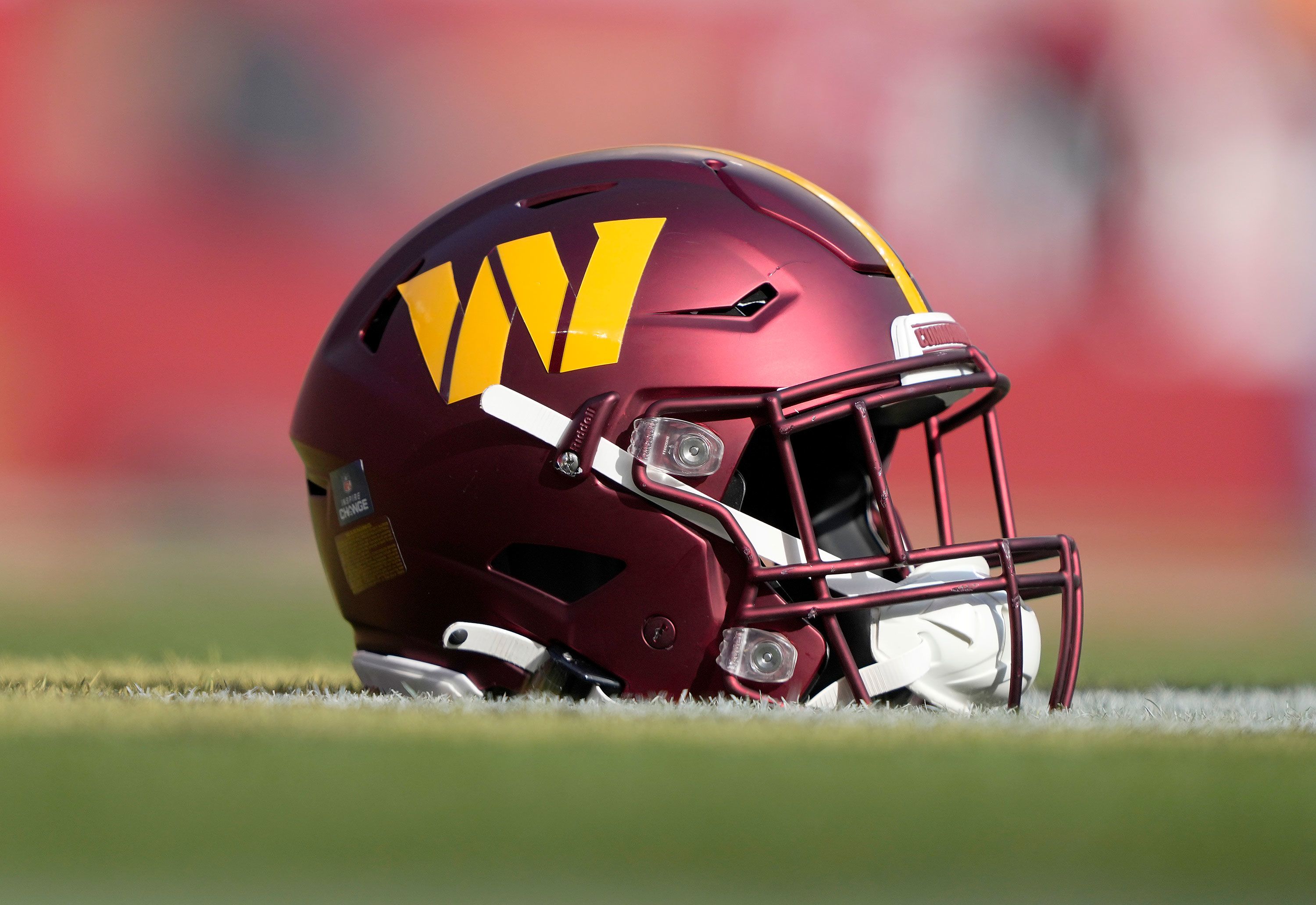
Commanders
Commanders
Posted on 10/23/25 at 2:08 pm to JerryTheKingBawler
Washington Commanders. Not even trying to make a political statement, a yellow W is just a shitty logo and I don’t like the font at all.
Utah Jazz. Just shitty branding and oversimplified logo

Utah Jazz. Just shitty branding and oversimplified logo

Posted on 10/23/25 at 2:10 pm to red sox fan 13
NOBODY SAY MY TENNESSEE TITANS

Posted on 10/23/25 at 2:12 pm to JerryTheKingBawler
Looks like the front of a cruise ship.

Wofford has the least intimidation logo

Wofford has the least intimidation logo
Posted on 10/23/25 at 2:13 pm to JerryTheKingBawler
I’m sorry RTR but I’m not wrong
fricking sucks compared to

Posted on 10/23/25 at 2:15 pm to JerryTheKingBawler
quote:
2. Cleveland Browns
Really? An orange football helmet? You’ve been a team for how long and that’s the best you can do? Make the dog or the elf your logo you cowards.
They could go super modern and appeal to Gen Z by using the poop emoji as their logo. Get it? The "Browns"?
Posted on 10/23/25 at 2:18 pm to JerryTheKingBawler
Hate what they did to the Commanders log. I think Washington State's is terrible too.

Posted on 10/23/25 at 2:20 pm to JerryTheKingBawler
The ones the Chargers trotted out with last week were all time bad.

Seahawks neon uniforms are butt too. Look like an Osha worksite.

Crazy they have these in their pocket but continue to trot out neon green variations.

Seahawks neon uniforms are butt too. Look like an Osha worksite.
Crazy they have these in their pocket but continue to trot out neon green variations.
This post was edited on 10/23/25 at 2:20 pm
Posted on 10/23/25 at 2:21 pm to iwyLSUiwy
quote:
Look like an Osha worksite.
Posted on 10/23/25 at 2:22 pm to iwyLSUiwy
quote:
The ones the Chargers trotted out with last week were all time bad.
Those aren't logos
Posted on 10/23/25 at 2:22 pm to JerryTheKingBawler
The old Sabres logo and color combo is so so much worse than now. You are insane  The 90s logo was absolutely 90s generic toonces like trash

Posted on 10/23/25 at 2:22 pm to JerryTheKingBawler
Why did you stop doing top 5 college teams every week?
Posted on 10/23/25 at 2:23 pm to Ostrich
quote:
Those aren't logos
You are correct
I'm not editing the post because those uniforms deserve all the hate.
But just logos, it has to be the Rams. This is as bad as it gets.
This post was edited on 10/23/25 at 2:27 pm
Posted on 10/23/25 at 2:23 pm to JerryTheKingBawler
The blazies logo is an interesting one. Its actually a saw that represented the thriving timbre industry.
For reasons of political correctness (since logging is now "bad") they've decided to spin this folksy tale that its a "pinwheel" representing 5 in 5 basketball, but originallt it was a saw used to blaze trails through forests
For reasons of political correctness (since logging is now "bad") they've decided to spin this folksy tale that its a "pinwheel" representing 5 in 5 basketball, but originallt it was a saw used to blaze trails through forests
This post was edited on 10/23/25 at 2:25 pm
Posted on 10/23/25 at 2:26 pm to lsupride87
quote:
The old Sabres logo and color combo is so so much worse than now. You are insane The 90s logo was absolutely 90s generic toonces like trash
Agreed. I was sure I must've read the OP wrong. Their current logo is both classic and not boring.
Posted on 10/23/25 at 2:32 pm to JerryTheKingBawler
I actually think all of these Patriots logos are terrible. I know people love the hiking patriot, but that is nostalgia clouding people's judgement. The helmet with just the hat and number is better than all of these. I still think there could be a better logo without having to use an actual person or clothing

 Page 1 of 5

Popular
Back to top