- My Forums
- Tiger Rant
- LSU Recruiting
- SEC Rant
- Saints Talk
- Pelicans Talk
- More Sports Board
- Fantasy Sports
- Golf Board
- Soccer Board
- O-T Lounge
- Tech Board
- Home/Garden Board
- Outdoor Board
- Health/Fitness Board
- Movie/TV Board
- Book Board
- Music Board
- Political Talk
- Money Talk
- Fark Board
- Gaming Board
- Travel Board
- Food/Drink Board
- Ticket Exchange
- TD Help Board
Customize My Forums- View All Forums
- Show Left Links
- Topic Sort Options
- Trending Topics
- Recent Topics
- Active Topics
Started By
Message

Apparently the Pels are teaming up with RARE Design for future Uniform updates
Posted on 10/3/22 at 11:24 am
Posted on 10/3/22 at 11:24 am
quote:
The NBA jersey-reveal season is almost over, and the New Orleans Pelicans have yet to issue an official release. However, the team is starting to embrace its history since the Hornets' days. It would not be surprising to see more localized touches on future jerseys.
The Pelicans again have partnered with RARE Design, the studio that brought the original Pelicans rebrand to life.
Designer Harry Richardson of Hattiesburg's RARE Design explained the process of weaving a brand into a community and its culture.
RARE Design was founded by one of the industry's most respected artists, and the team carries Rodney Richardson's legacy today.
Rodney is Harry's father and opened RARE Design in Hattiesburg in 1999 after several years at Nike. Since then, his client list includes the Atlanta Hawks, New Orleans Pelicans, Houston Texans, Charlotte Hornets, Sacramento Kings, NASCAR, Minnesota Timberwolves, Milwaukee Brewers, and Southern Miss Golden Eagles.
Just an fyi, this is not a well done article in my opinion and is basically just a puff piece for the owner of RARE to spout long word salads with corporate lingo. And it really doesn't mention anything on what they are working on etc. But here it is.
LINK
 7
7


Posted on 10/3/22 at 11:27 am to Fun Bunch
quote:
The Pelicans again have partnered with RARE Design, the studio that brought the original Pelicans rebrand to life.
Posted on 10/3/22 at 11:28 am to Jwho77
Yeah that is certainly disturbing 

Posted on 10/3/22 at 11:30 am to Fun Bunch
Their website
The Timberwolves "city" jerseys are awful. Their work with the Brewers and Kings are much, much better imo. Better than anything we've put out, outside of our city editions last year.
The Timberwolves "city" jerseys are awful. Their work with the Brewers and Kings are much, much better imo. Better than anything we've put out, outside of our city editions last year.

Posted on 10/3/22 at 11:47 am to PP7 for heisman
All they did for the Brewers and the Kings is update an older logo ... we don't have an older logo to update, so it will probably be shite.

Posted on 10/3/22 at 11:54 am to saints5021
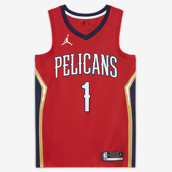
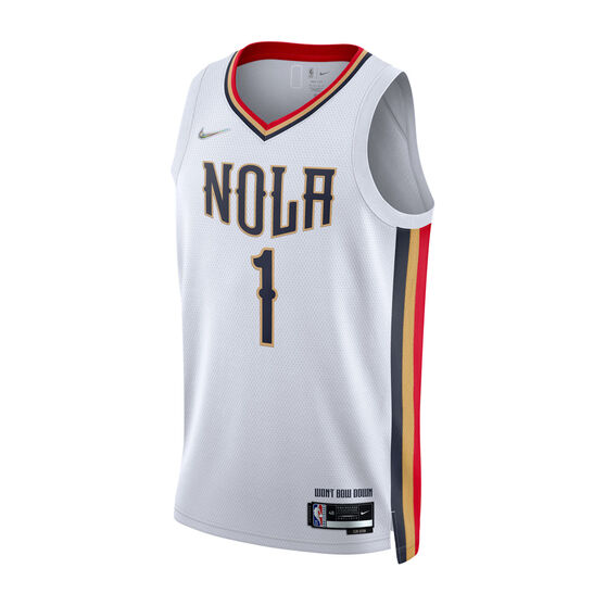
Anything we do needs to either lose the dark blue or significantly spice it up. Needs to feature the metallic gold that we used as the trim in the white NOLA ones from last season.
Might be impossible, but I'd love to see them incorporate the background lighting they are using in these media day photoshoots into an actual jersey. Some type of blue and red fading into each other with a stylized NOLA on the chest.
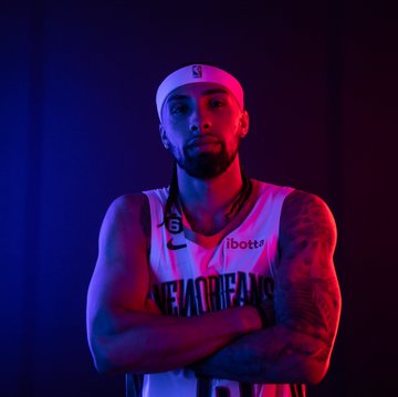
Might be impossible, but I'd love to see them incorporate the background lighting they are using in these media day photoshoots into an actual jersey. Some type of blue and red fading into each other with a stylized NOLA on the chest.
Posted on 10/3/22 at 12:08 pm to Fun Bunch
Those original rebrand jerseys with that tiny arse font are the most pathetic jerseys i've ever seen.
The first(and only) thing Nike did when they took over was triple that font size.
I don't know if we have the worst jerseys in the league, but they're definitely the most boring.
The first(and only) thing Nike did when they took over was triple that font size.
I don't know if we have the worst jerseys in the league, but they're definitely the most boring.
Posted on 10/3/22 at 12:37 pm to eyeran
We have had them for almost 10 years now. It’s time for a refresh. They are just boring.
Last year’s cities are awesome.
Last year’s cities are awesome.
Posted on 10/3/22 at 12:49 pm to Fun Bunch
Full time Mardi Gras on white please.

Posted on 10/3/22 at 1:14 pm to Fun Bunch
PLEASE GOD RARE JUST LEARN TO USE GOOGLE. IT'LL MAKE YOUR JOB EASY...

Posted on 10/3/22 at 1:25 pm to Fun Bunch
Everything about the rebrand was a dud. The name, the jerseys, the colors. Remember that disgusting beige court that they immediately got rid of? Somebody was actually paid US dollars to botch that whole thing.
I will say, to bounce back with the Pelican in the woodgrain was very solid. Although, thats kind of stale at this point too.
I will say, to bounce back with the Pelican in the woodgrain was very solid. Although, thats kind of stale at this point too.
Posted on 10/3/22 at 1:37 pm to eyeran
They completely overthought everything to try and be as broadly and regionally appealing as possible and as tends to happen, ended up with the most generic shite that no one loves(literally the most overused color scheme in all of sports: red and blue).
New Orleans is a city of less than half a million people, and several iconic color schemes already established( black and gold, purple and green), and several iconic touchstones to pull a name from. We did none of that lol.
I can live with Pels at this point, but gotta get some better jerseys/colors going.
This post was edited on 10/3/22 at 1:38 pm

Posted on 10/3/22 at 1:37 pm to eyeran
quote:
The name,
Posted on 10/3/22 at 1:43 pm to rondo
If you are from Louisiana and you don't like the names Pelicans, then get fricked

Posted on 10/3/22 at 1:48 pm to Fun Bunch
Just make the NOLA ones from last year our White Jersey, Keep the Reds, and figure out something for Blue.
It really aint that complicated.
It really aint that complicated.
This post was edited on 10/3/22 at 1:49 pm
Posted on 10/3/22 at 1:54 pm to saints5021
Every single alternate jersey we have had since the rebrand is infinitely better than the standard blue or white we currently have. Literally, just pick any of these jerseys and make it the standard.


Posted on 10/3/22 at 2:06 pm to saints5021
Red ones aside, all those jerseys have an artistic flair and "soul" to their design.
The shite we got as everyday wear looks exactly like the shite you would get out of some cookie cutter national design house that has no roots or connection with the actual city/team and just spits out the least offensive designs to the most people....and that is exactly how the regular jerseys come across, which is boring and completely uninspired, like the jersey equivalent of a Toyota Camry.
The shite we got as everyday wear looks exactly like the shite you would get out of some cookie cutter national design house that has no roots or connection with the actual city/team and just spits out the least offensive designs to the most people....and that is exactly how the regular jerseys come across, which is boring and completely uninspired, like the jersey equivalent of a Toyota Camry.
This post was edited on 10/3/22 at 2:08 pm
Posted on 10/3/22 at 2:09 pm to Bronc
They look like a generic uniform on 2k or something.
Posted on 10/3/22 at 2:12 pm to Fun Bunch
Yeah, looking across their portfolio, the name "RARE Designs" comes across like unintentional irony lol
Posted on 10/3/22 at 2:19 pm to saints5021
Man I didn’t realize what all the complaining was about until you actually see it 1st hand. Pels have some awesome uniforms that stay on the side lines.

 Page 1 of 3

Popular
Back to top