- My Forums
- Tiger Rant
- LSU Recruiting
- SEC Rant
- Saints Talk
- Pelicans Talk
- More Sports Board
- Fantasy Sports
- Golf Board
- Soccer Board
- O-T Lounge
- Tech Board
- Home/Garden Board
- Outdoor Board
- Health/Fitness Board
- Movie/TV Board
- Book Board
- Music Board
- Political Talk
- Money Talk
- Fark Board
- Gaming Board
- Travel Board
- Food/Drink Board
- Ticket Exchange
- TD Help Board
Customize My Forums- View All Forums
- Show Left Links
- Topic Sort Options
- Trending Topics
- Recent Topics
- Active Topics
Started By
Message
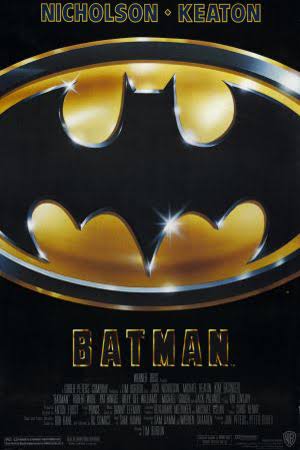
Evolution of the Batman logo
Posted on 8/8/18 at 8:44 am

Posted on 8/8/18 at 8:44 am
They subbed it ouit to an elementary school in '83.
Apologies for the text being hard to read underneath them, but got the pic off twitter. Not much I can do.

Apologies for the text being hard to read underneath them, but got the pic off twitter. Not much I can do.
 15
15

Posted on 8/8/18 at 8:57 am to sicboy
Posted on 8/8/18 at 9:01 am to Master of Sinanju
I was recently thinking how much he's changed. How much blue used to be in the original compared to pretty much all black all the time now.

Posted on 8/8/18 at 9:07 am to sicboy
Batman Returns is probably my favorite logo.

Posted on 8/8/18 at 9:10 am to sicboy

My favorite one.

Posted on 8/8/18 at 9:11 am to sicboy
1992 logo is GOAT

Posted on 8/8/18 at 9:13 am to JBeam
quote:
My favorite one
Goat. They just nailed that show in every way possible.

Posted on 8/8/18 at 9:17 am to sicboy
My favorite:


Posted on 8/8/18 at 9:22 am to sicboy
Batman Returns is the GOAT
TDKR was such garbage lmao, even the logo sucked
TDKR was such garbage lmao, even the logo sucked

Posted on 8/8/18 at 9:37 am to sicboy
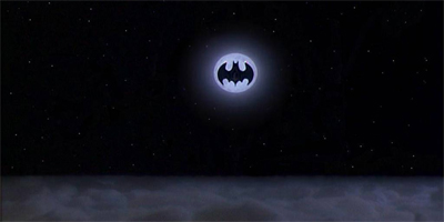
thats wrong. '89 is this.
Posted on 8/8/18 at 9:42 am to CarRamrod
Didn't look right to me either.
Posted on 8/8/18 at 9:46 am to sicboy
i was coming in the thread to say 89 or returns was the best logo and both are off from what they should be....and they both are still the best.
This post was edited on 8/8/18 at 9:46 am
Posted on 8/8/18 at 9:47 am to sicboy
The Batman Beyond logo has always been 

Posted on 8/8/18 at 10:15 am to CarRamrod
quote:
thats wrong. '89 is this.
It looks like they used the chest logo for the '89 one:
Posted on 8/8/18 at 10:18 am to VinegarStrokes
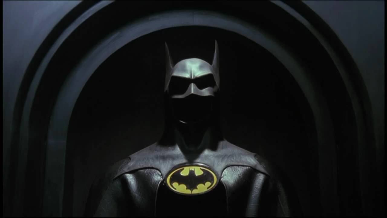
it is still wrong. Look at the tail. ETA: ok maybe those are the same. from the angle. But i wonder what they used a differnt logo on the chest than everything else in the movie, posters, Batwing. the iconic shot with the moon
and hell this iconic photo on TD.

and hell this iconic photo on TD.
This post was edited on 8/8/18 at 10:22 am
Posted on 8/8/18 at 10:19 am to VinegarStrokes
Tim Burton was all kinds of confused.

Posted on 8/8/18 at 10:25 am to CarRamrod
quote:
thats wrong. '89 is this.
I thought the same thing. I get they used the one from the suit but the movie poster logo is a classic and my favorite.
Posted on 8/8/18 at 10:26 am to sicboy
quote:
Tim Burton was all kinds of confused.
lol yep.
The one thing that Burton absolutely nailed was the gothic style design and atmosphere of gotham. The environment he created was incredible, and it translated over into the animated series. He then went and screwed it up into some cartoony winter fantasyland for Returns.

Posted on 8/8/18 at 10:29 am to sicboy
92
98
05
08
In no particular order these are my favorites. '08 may be my tops though. I love the boldness and simplicity of it
98
05
08
In no particular order these are my favorites. '08 may be my tops though. I love the boldness and simplicity of it

Posted on 8/8/18 at 11:33 am to sicboy
I was in the fifth grade in '89 when the Keaton Batman came out. I doodled the Batman logo all over my schoolwork that year. My teacher hated it.

 Page 1 of 2

Popular
Back to top