- My Forums
- Tiger Rant
- LSU Recruiting
- SEC Rant
- Saints Talk
- Pelicans Talk
- More Sports Board
- Fantasy Sports
- Golf Board
- Soccer Board
- O-T Lounge
- Tech Board
- Home/Garden Board
- Outdoor Board
- Health/Fitness Board
- Movie/TV Board
- Book Board
- Music Board
- Political Talk
- Money Talk
- Fark Board
- Gaming Board
- Travel Board
- Food/Drink Board
- Ticket Exchange
- TD Help Board
Customize My Forums- View All Forums
- Show Left Links
- Topic Sort Options
- Trending Topics
- Recent Topics
- Active Topics
Started By
Message
World Cup Kits
Posted on 9/15/22 at 9:15 am
Posted on 9/15/22 at 9:15 am
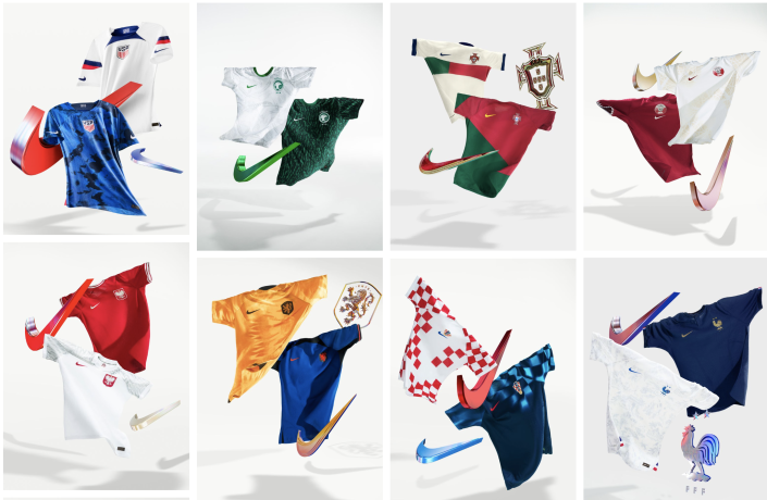
Don't follow soccer much, but how long has Netherlands abandoned the color Orange? (second from left on bottom)
LINK
LINK
 18
18


Posted on 9/15/22 at 9:17 am to BornKjun
Do you not see the orange jersey?
This post was edited on 9/15/22 at 9:18 am

Posted on 9/15/22 at 9:19 am to BornKjun
USA’s are complete dogshit. Thanks Nike
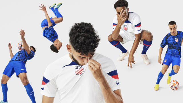
It’s sad how some dickhead with photoshop can do a better job than these people
:format(jpeg)/cdn.vox-cdn.com/uploads/chorus_image/image/49108625/CdxeYkdUAAAZQ0s.0.0.jpg)
It’s sad how some dickhead with photoshop can do a better job than these people
This post was edited on 9/15/22 at 9:22 am

Posted on 9/15/22 at 9:19 am to BornKjun
speak english dammit.
Posted on 9/15/22 at 9:20 am to lsupride87
Looks gold
This is Orange

This is Orange
Posted on 9/15/22 at 9:22 am to Glorious
They are far from dogshit


Posted on 9/15/22 at 9:23 am to lsupride87
Also, compare the orange logo in the blue jersey with the "gold" jersey.
It's not an orange jersey
It's not an orange jersey
Posted on 9/15/22 at 9:23 am to lsupride87
Hard disagree. Among other things, the center crest just looks clunky
This post was edited on 9/15/22 at 9:24 am
Posted on 9/15/22 at 9:24 am to BornKjun

Posted on 9/15/22 at 9:25 am to Glorious
quote:
Among other things, the center crest just looks clunky
What? Which of these would you prefer?
This post was edited on 9/15/22 at 9:27 am
Posted on 9/15/22 at 9:25 am to Glorious
quote:
the center crest just looks clunky
The center crest trend needs to die.
Same goes for making jerseys look like warm-up shirts.
Posted on 9/15/22 at 9:27 am to KosmoCramer
No I love the logo just not the placement
Posted on 9/15/22 at 9:27 am to Glorious
Got it
Posted on 9/15/22 at 9:29 am to KosmoCramer
Over 100 years later and the 1916 crest is still the best one in my opinion.
Posted on 9/15/22 at 9:31 am to BlackCoffeeKid
quote:
Over 100 years later and the 1916 crest is still the best one in my opinion.
I somewhat agree. However, maybe the number of stars is the issue?
This post was edited on 9/15/22 at 9:32 am

Posted on 9/15/22 at 9:31 am to lsupride87
quote:
They are far from dogshit
Nah, they’re dogshit. Is that blue camo? It actually looks better than the white, too.
Posted on 9/15/22 at 9:31 am to KosmoCramer
1916 logo is the GOAT
I have the shirt the team wore in (i think) 2013 with that logo. Looks damn good
I have the shirt the team wore in (i think) 2013 with that logo. Looks damn good
Posted on 9/15/22 at 9:33 am to lsupride87
Good Lord, I can NOT stand Nike. I try hard to be an optimist and find something to like about almost anything. However. That IS complete dogshit.
I get why the do it, because so many morons will go out and buy nearly every iteration of football shirts just to have them and not look "dated" (there's a word I wish would die.)
The 2010 or so kits, with the sash, looked great, as did the 1995 kit with the large hoop.
As for the badge, I prefer the older ones, 1916, 1950, the 1995 is pretty solid, as well.
Posted on 9/15/22 at 9:35 am to lsupride87
quote:
They are far from dogshit
They are atrocious dude. They are getting universally roasted.
This post was edited on 9/15/22 at 9:36 am
Posted on 9/15/22 at 9:37 am to BornKjun
quote:
The Americans’ home white jerseys “draw inspiration from the United States’ diversity and storied legacy across a variety of sports, leagues and associations,” Nike said in a release. It has red, white and blue stripes on the sleeves and socks, swooshes on the sleeves reminiscent of American football jerseys, an enlarged center crest intended to look like basketball jerseys, a construction and pattern similar to a hockey jersey and block lettering for players’ names and numbers.
quote:
Nike said that the away jersey “celebrates diversity, youth, and unity” and was inspired by “design techniques found throughout the American fashion and streetwear industry.” Nike designers used an ice-dying technique to create the jersey’s blue and black design. It has bright red accents on the sides and a subtle textured pattern behind the dyed colors.

 Page 1 of 5

Popular
Back to top