- My Forums
- Tiger Rant
- LSU Recruiting
- SEC Rant
- Saints Talk
- Pelicans Talk
- More Sports Board
- Fantasy Sports
- Golf Board
- Soccer Board
- O-T Lounge
- Tech Board
- Home/Garden Board
- Outdoor Board
- Health/Fitness Board
- Movie/TV Board
- Book Board
- Music Board
- Political Talk
- Money Talk
- Fark Board
- Gaming Board
- Travel Board
- Food/Drink Board
- Ticket Exchange
- TD Help Board
Customize My Forums- View All Forums
- Show Left Links
- Topic Sort Options
- Trending Topics
- Recent Topics
- Active Topics
Started By
Message
re: UNLV releases new logo
Posted on 6/28/17 at 10:52 pm to tiggerthetooth

Posted on 6/28/17 at 10:52 pm to tiggerthetooth
Yep
 0
0

Posted on 6/29/17 at 1:42 am to Broski
You can't even tell WTF it is.
It's just a distorted blob of red, black, and gray.
It's just a distorted blob of red, black, and gray.

Posted on 6/29/17 at 8:23 am to pkloa
It doesn't look that bad to me
Posted on 6/29/17 at 8:57 am to BearsFan
At least they aren't having to change the Rebels name...

Posted on 6/29/17 at 9:01 am to The Cool No 9
quote:
It doesn't look that bad to me
I mean I guess... it simply doesn't look like anything in particular.
Posted on 6/29/17 at 9:06 am to Broski
If you have to explain it, it's probably no good

Posted on 6/29/17 at 9:07 am to Broski
could have gotten something better of fiverr for.. $5

Posted on 6/29/17 at 9:43 am to Broski
That looks weird. I would get a refund.
Posted on 6/29/17 at 9:53 am to Broski
What the hell is it?
Posted on 6/29/17 at 9:55 am to Broski
It looks a little better from the distance. Certainly not good though.

Posted on 6/29/17 at 9:58 am to Broski
The bandana part is throwing off the whole logo for me. But I think the hat and the red star look good.

Posted on 6/29/17 at 10:39 am to Broski
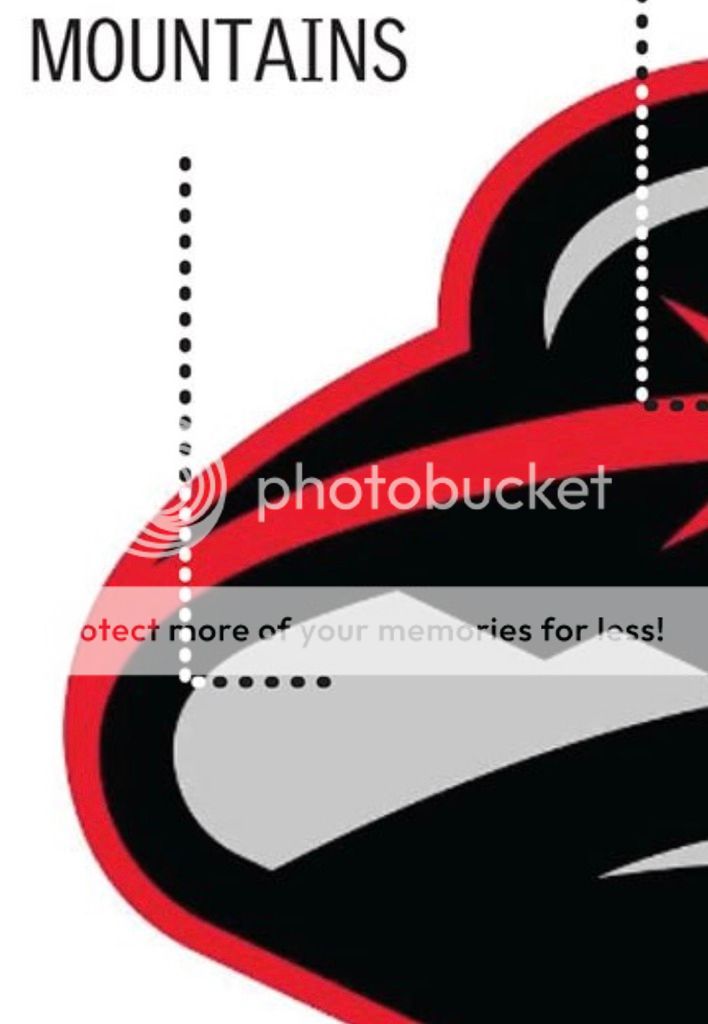
This is mountains?
Posted on 6/29/17 at 10:42 am to StrongBackWeakMind
What is with teams creating such complex logos? Some of the most legendary logos are simple. The way I think about it is, how will it look on a hat? Simple, clean? If so, that's a first step.
It seems like college logos are falling into the same trend that the NBA did back in the 90s. NBA has come full circle to more clean logos (new bucks logo, brooklyn logo, Warriors logo, etc).


(eff Notre Dame)

It seems like college logos are falling into the same trend that the NBA did back in the 90s. NBA has come full circle to more clean logos (new bucks logo, brooklyn logo, Warriors logo, etc).
(eff Notre Dame)
This post was edited on 6/29/17 at 10:44 am
Posted on 6/29/17 at 11:11 am to Broski
I don't think they "needed" to change it, but I don't hate it at all. Smaller schools gotta keep the branding fresh for them croots
Posted on 6/29/17 at 11:29 am to The Cool No 9
Yea I'm not getting the hate..
Looks good, the only thing that confuses me is the 'mountains'
Everytime there is something new (logo, uniform, etc) 75% of this board talks about how terrible it is and most of the time, I don't see how it's so awful
Looks good, the only thing that confuses me is the 'mountains'
Everytime there is something new (logo, uniform, etc) 75% of this board talks about how terrible it is and most of the time, I don't see how it's so awful
Posted on 6/29/17 at 11:35 am to Broski
They should have saved a ton of money and just used a stripper pole as the logo.....oh...and I guess a couple of mountains

Posted on 6/29/17 at 11:51 am to Broski
quote:
cost about $50,000
Posted on 6/29/17 at 11:58 am to SPEEDY
To follow up on my earlier post, the problem is that so often, organizations try to overburden the logo. It doesn't need to represent everything that is "unique" about where you are...in this case a sign, the nickname, mountains, a random red star that looks exactly like the Chicago city flag star, etc
Keep it simple.
Keep it simple.

Posted on 6/29/17 at 12:01 pm to Broski
Looks like something for an XFL team.

 Page 2 of 4

Popular
Back to top