- My Forums
- Tiger Rant
- LSU Recruiting
- SEC Rant
- Saints Talk
- Pelicans Talk
- More Sports Board
- Fantasy Sports
- Golf Board
- Soccer Board
- O-T Lounge
- Tech Board
- Home/Garden Board
- Outdoor Board
- Health/Fitness Board
- Movie/TV Board
- Book Board
- Music Board
- Political Talk
- Money Talk
- Fark Board
- Gaming Board
- Travel Board
- Food/Drink Board
- Ticket Exchange
- TD Help Board
Customize My Forums- View All Forums
- Show Left Links
- Topic Sort Options
- Trending Topics
- Recent Topics
- Active Topics
Started By
Message
re: Sports Organizations that need to rebrand
Posted on 7/10/15 at 7:11 pm to Grit-Eating Shin
Posted on 7/10/15 at 7:11 pm to Grit-Eating Shin
Love the old Saints helmets with the large Fleur de Lis.
Dolphin uniforms from the early 70s were great.
I am partial to the Astros rainbow jerseys but think their look today is one of the better looks in sports..a modern look with a classic feel.
Dolphin uniforms from the early 70s were great.
I am partial to the Astros rainbow jerseys but think their look today is one of the better looks in sports..a modern look with a classic feel.
 1
1

Posted on 7/10/15 at 7:30 pm to Warheel
quote:
Dolphin uniforms from the early 70s were great.
Seems like there has been an uneven quality to the Dolphins aqua color. Sometimes it's bluer, sometimes greener.
Pirates should go back to the 70s/80s scheme with black, yellow and pinstripe combos, and bring back that 1890s cap.

Posted on 7/10/15 at 8:33 pm to WeeWee
the nostalgia in this thread is awful.
moving a team to Montreal and rebranding them "Expos" wouldn't make any sense. Nobody has given a shite about the World's Fair in like 50 years. Don't name a fricking team after an event that nobody cares about.
Pat the Patriot is a terrible logo. It has too many lines and it just looks dirty. While the Patriot throwback reds are great unis, it's in spite of Pat, not because of him.
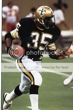
New Orleans' mustard throwbacks are awful. Those pants do not match any of the gold on the uniforms and they just look terrible. Nostalgia is the only reason anyone likes them... and I don't even understand the nostalgia for back in the day when the Saints were botttom feeders.
moving a team to Montreal and rebranding them "Expos" wouldn't make any sense. Nobody has given a shite about the World's Fair in like 50 years. Don't name a fricking team after an event that nobody cares about.
Pat the Patriot is a terrible logo. It has too many lines and it just looks dirty. While the Patriot throwback reds are great unis, it's in spite of Pat, not because of him.
New Orleans' mustard throwbacks are awful. Those pants do not match any of the gold on the uniforms and they just look terrible. Nostalgia is the only reason anyone likes them... and I don't even understand the nostalgia for back in the day when the Saints were botttom feeders.

Posted on 7/10/15 at 9:32 pm to baytiger
Has anyone mentioned the Memphis Grizzlies yet? How dumb were they not to change the name?
Since we are bitching about uniform trends, I hate the trend of going to matte helmets.
Since we are bitching about uniform trends, I hate the trend of going to matte helmets.
Posted on 7/10/15 at 9:34 pm to baytiger
I agree.
People dote on the Astros rainbow jerseys from the '80s, but if they had never existed and were just introduced yesterday, they'd be the joke of the sports world today.
People dote on the Astros rainbow jerseys from the '80s, but if they had never existed and were just introduced yesterday, they'd be the joke of the sports world today.

Posted on 7/10/15 at 9:38 pm to 91TIGER
even though its the falcons, i think when they wear the red helmet with the black jerseys and white pants it looks better than the black helmet with the red jerseys
Posted on 7/10/15 at 9:39 pm to Dire Wolf
That's one thing we can all agree on... frick Bud Adams... and his fat, useless offspring.
Posted on 7/10/15 at 10:58 pm to Forkbeard3777
The Texans should be the Oilers again.
Posted on 7/11/15 at 8:23 am to Forkbeard3777

Looks like poop
Posted on 7/11/15 at 9:04 am to arcalades
quote:
But "knickers" was a common term that is still used in one or two communities up north.
They really say "knickers?" Are you sure it wasn't a black guy you heard saying "my knickers?" This all sounds very Monica.

Posted on 7/11/15 at 2:30 pm to baytiger
quote:
New Orleans' mustard throwbacks are awful. Those pants do not match any of the gold on the uniforms and they just look terrible.


Neither do the Cowboys, doesn't mean they aren't great.
I guess they should wear pajamas like this

With 5! logos showing on the uni, yeah that's great.

quote:
Nostalgia is the only reason anyone likes them...


So much for nostalgia.
quote:
and I don't even understand the nostalgia for back in the day when the Saints were botttom feeders.

Don't think too many people care for these that much.
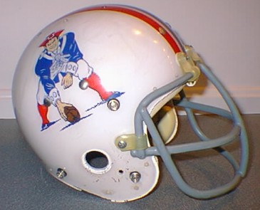
Pat the Patriot was the best logo the Pats had.
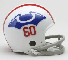
This is nostalgia too, it sucks. I will give flying Elvis the nod over it.
Posted on 7/11/15 at 5:12 pm to Purple Lion
This is one of my favorite logos in all of sports. I went to a Cleveland game and had a blast.
Posted on 7/12/15 at 1:32 am to Volmanac
quote:
Titans is an awesome name considering the Greek themes traditionally associated with Nashville.
frick Nashville's fake-arse themes and their irrelevant, anonymous NFL team.
They look like a bunch of guys wearing PJ pants out there.
Posted on 7/12/15 at 1:35 am to alajones
quote:
Has anyone mentioned the Memphis Grizzlies yet? How dumb were they not to change the name?
Because the name has history here. It was the name of our WFL team (who coincidentally transferred from Toronto before playing a game there).
The Grizz moved to Memphis summer of 2001. Do you have ANY faith in whatever stupid arse replacement name would have actually been better than Grizzlies?
Does anybody care about the thirty other major pro sports teams with 'nonsensical' names? It's a nickname. You're probably one of those tards that freaks out when Italy's national team wears blue because blue isn't on their flag.
Posted on 7/12/15 at 5:56 am to Forkbeard3777
All these NFL teams, save maybe the Saints, who changed in the last 30 years or so should go back to their old unis.
Not for nostalgia's sake. They just looked better and less like a video game.
Not for nostalgia's sake. They just looked better and less like a video game.
Posted on 7/12/15 at 7:29 am to Forkbeard3777
I don't know about rebrand, but the Rockies need a new stadium. They should play in a climate controlled dome where they can control the humidity and have normal dimensions.
Posted on 7/12/15 at 10:38 am to 91TIGER
quote:yes it does
Neither do the Cowboys, doesn't mean they aren't great.
I shake my head every time I see those Cowboys pants in a "top uniform" thread. It's not that hard to match the colors; you're a billion dollar NFL team.
Posted on 7/12/15 at 10:49 am to 91TIGER
Those Saints throwbacks... 
The helmet logo is infinitely better looking than the current one. The current one is too compact.

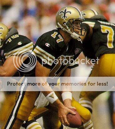
The helmet logo is infinitely better looking than the current one. The current one is too compact.
Posted on 7/12/15 at 11:06 am to RTR America
For the Saints I like their current look except for the black pants and black jersey combo. It used to really irritate me when they had all those mismatched "golds".
Same for the Cowboys. You can be the most valuable team in the NFL, but when your clothes don't match you still look dumb.
Same for the Cowboys. You can be the most valuable team in the NFL, but when your clothes don't match you still look dumb.

Posted on 7/12/15 at 11:15 am to GumBro Jackson
Saints need to drop the black pants and add white. Gold helmet, black jersey, white pants.

 Page 4 of 5

Popular
Back to top