- My Forums
- Tiger Rant
- LSU Recruiting
- SEC Rant
- Saints Talk
- Pelicans Talk
- More Sports Board
- Fantasy Sports
- Golf Board
- Soccer Board
- O-T Lounge
- Tech Board
- Home/Garden Board
- Outdoor Board
- Health/Fitness Board
- Movie/TV Board
- Book Board
- Music Board
- Political Talk
- Money Talk
- Fark Board
- Gaming Board
- Travel Board
- Food/Drink Board
- Ticket Exchange
- TD Help Board
Customize My Forums- View All Forums
- Show Left Links
- Topic Sort Options
- Trending Topics
- Recent Topics
- Active Topics
Started By
Message
re: Sports Organizations that need to rebrand
Posted on 7/10/15 at 1:01 pm to Forkbeard3777
Posted on 7/10/15 at 1:01 pm to Forkbeard3777
Technically not an "Organization," but I'll submit UCLA football. Go back to your classic, near perfect look. Adidas has ruined almost everything about their unis.
From the shoulder stripes, jersey patterns, silly alternate uniforms, and now the number font, it is all a mess. Scrap it and return to the timeless look.
From the shoulder stripes, jersey patterns, silly alternate uniforms, and now the number font, it is all a mess. Scrap it and return to the timeless look.
This post was edited on 7/10/15 at 1:03 pm
 0
0


Posted on 7/10/15 at 1:10 pm to msudawg1200
quote:
Things I've seen on this thread I agree with:
-Rams need to go back to blue and yellow
-Falcons need to go back to red helmets
-Patriots need to go back to the "Snapping Minuteman" and ditch Elvis the Pat(some will disagree because of the success of the franchise since Elvis has been around)
-Cardinals should drop the black accent
-Padres should go back to brown and orange or yellow or both and make the "Swinging Friar" the official logo
Other changes I'd make:
-Lions drop the black accent
-Eagles go back to Kelly green
-Braves should bring back the "Screaming Brave"aka Noc-A-Homa as the official logo
-Reds should bring back "Running Mr. Red" from the 70's and 80's as the official logo
Damn, it's like looking in a mirror. Spot on.
I would add;
Vikings go back to the UCLA/LSU stripes

Tampa back to originals
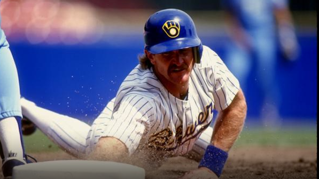
Brewers back to these
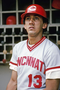
Reds back to this font
Angels add back in the navy

Mariners return to these

Move Tampa to Montreal and bring 'em back

that's off the top of my head for now.
This post was edited on 7/10/15 at 1:12 pm
Posted on 7/10/15 at 1:22 pm to 91TIGER
We must have the same taste. Those are all things I am in favor of also. Love the Vikings "UCLA stripes", the old Bucs unis, the old Reds font, the old Brewers(classic) MB glove logo and unis, and the Navy Angels(almost listed this one on my OP), and the old blue and yellow Mariners. While mowing or jogging I think about which unis, logos, helmets, or hats I'd like to see teams use(I know I'm a nerd) and I've thought of everyone of these. I'm a huge Reds fan and that font needs to come back now.
Posted on 7/10/15 at 2:49 pm to msudawg1200
Bring back the best angels unis
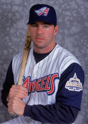
This post was edited on 7/10/15 at 2:50 pm
Posted on 7/10/15 at 3:17 pm to Wally Sparks
As a Saints fan those were the falcons helmets I grew up on. The "Hey, we've got Jerry Glanville so we have to go all black" was stupid. Just as all of those streamlined logo changes during the 1990's like the patriots and Broncos. And, get rid of the bullshite black outlining of logos except on the Cardinals. I also liked the Orange for the Bucs and their first version of the pewter.

Posted on 7/10/15 at 3:24 pm to cjared036
quote:
I wishhe Texans would change the font on their team name. looks so stupid and generic. I think a cool helmet ide would be t mimic the helmet of the Dallas Texans(Old AFC team that became the Chiefs). The state outline with Houston being highlighted as a star. but all of that in current Texans colors.

if only they could go back to that.
screw bud adams
Posted on 7/10/15 at 5:01 pm to Dire Wolf
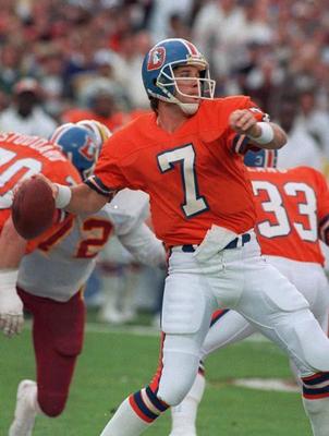
Denver back to these
Saints

with these unis

Saints
with these unis
Posted on 7/10/15 at 5:25 pm to Forkbeard3777
This is about as good as a Clay Travis article.
Posted on 7/10/15 at 5:29 pm to 91TIGER
Is it just me or did they design uniforms better back in the day. LSU, Bama, UGA, etc and all the throwback uniforms are just down right better than this modern crap. F**k Oregon and Nike and whomever else started this crap trend.
Posted on 7/10/15 at 5:37 pm to Grit-Eating Shin
quote:
The Texans. That is the laziest, most insignificant mascot name in existence. And I can't decide whether or not the logo looks more like a one piece swimsuit, a bottle opener, or some sort of fricked-up crab claw.
Agreed. The Oilers used to be my 2nd favorite team behind the Saints. Rooted for them pretty hard. I'm an Astros die-hard. I like the Rockets...
Just can NOT get excited whatsoever for the Texans. I'm pretry sure it has everything to do with the nickname and the logo. I'm not a fricking Texan.
This post was edited on 7/10/15 at 5:38 pm
Posted on 7/10/15 at 5:38 pm to Forkbeard3777
Titans is an awesome name considering the Greek themes traditionally associated with Nashville.
Do a little research.
Do a little research.
Posted on 7/10/15 at 5:39 pm to WeeWee
quote:you can think that
just down right better than this modern crap
Posted on 7/10/15 at 5:40 pm to Rickety Cricket
The Titans name is one of the least generic in sports.
It's so not generic that most non-Nashvillians don't get it because it's such a nuanced reference.
It's so not generic that most non-Nashvillians don't get it because it's such a nuanced reference.

Posted on 7/10/15 at 5:44 pm to DestrehanTiger
Yea the Thunder logo and colors are fricking terrible. Anytime you have orange and yellow as part of your colors, you fricked up.
Orange, yellow, light blue, & navy blue.
What the hell is the logo even suppose to be?
Orange, yellow, light blue, & navy blue.
What the hell is the logo even suppose to be?
Posted on 7/10/15 at 5:56 pm to Prominentwon
Yep. Also a big Astros fan & pulled for the Oilers back in the day. I just feel like the name "Texans" is just reflects sheer arrogance, as if there's something special about being from one of the most populated states in the nation.
I also just realized that the Texans logo bites the Longhorns logo pretty blatantly.
I also just realized that the Texans logo bites the Longhorns logo pretty blatantly.
Posted on 7/10/15 at 5:57 pm to 91TIGER
Agree. Denver and Saints should go back to those.
Posted on 7/10/15 at 6:03 pm to WeeWee
quote:
F**k Oregon and Nike and whomever else started this crap trend.
It started in mid 90's. NBA went multi color pastel, while the NFL went with the rollerball look. MLB also had their share of minor league unis in the bigs, and vests were the fashion. The Pirates (IMO) are the only team that look right in vests. We're getting back to the old unis but not quite there yet.

Posted on 7/10/15 at 6:26 pm to Volmanac
quote:
Titans is an awesome name considering the Greek themes traditionally associated with Nashville.
Why? Because of a replica of the Parthenon in a shitty park that only tourists visit? Or because you are known as the "Athens of the South" when the vast majority of universities are shitty, unaccredited ones that no one outside (frick, maybe inside the city as well) could name?
The name fricking sucks. So does the franchise. Nashville is associated with music, hot chicken + meat and 3s, The Bible belt, Civil War history, and Vanderbilt. Not a longstanding, deep routed "Greek tradition". There are more Greeks on a fricking block in Greektown, Chicago than the entire state of Tennessee.
This post was edited on 7/10/15 at 6:34 pm
Posted on 7/10/15 at 6:53 pm to Forkbeard3777
3s?

Posted on 7/10/15 at 6:57 pm to Grit-Eating Shin


 Page 3 of 5

Popular
Back to top