- My Forums
- Tiger Rant
- LSU Recruiting
- SEC Rant
- Saints Talk
- Pelicans Talk
- More Sports Board
- Fantasy Sports
- Golf Board
- Soccer Board
- O-T Lounge
- Tech Board
- Home/Garden Board
- Outdoor Board
- Health/Fitness Board
- Movie/TV Board
- Book Board
- Music Board
- Political Talk
- Money Talk
- Fark Board
- Gaming Board
- Travel Board
- Food/Drink Board
- Ticket Exchange
- TD Help Board
Customize My Forums- View All Forums
- Show Left Links
- Topic Sort Options
- Trending Topics
- Recent Topics
- Active Topics
Started By
Message
re: Denver Broncos...Why the frick did they change their uniforms.
Posted on 11/7/25 at 7:39 pm to SaintLSU

Posted on 11/7/25 at 7:39 pm to SaintLSU
quote:
Denver Broncos...Why the frick did they change their uniforms.
quote:Agreed.
Those orange crush uniforms look so nice on my TV. They should bring it back for good.
To be fair, though, Denver won back-to-back Super Bowls in 1997 and 1998 when they did change.
 1
1

Posted on 11/7/25 at 7:45 pm to Alt26
Lump the Seahawks into that group of awful futuristic designs. Their throwbacks the other week were a reminder of how bad a decision they made.
The eagles too. The Kelly green so much cooler than this turd scheme they rock.
Amazing none of these have reverted back.
The eagles too. The Kelly green so much cooler than this turd scheme they rock.
Amazing none of these have reverted back.
This post was edited on 11/7/25 at 7:47 pm
Posted on 11/7/25 at 7:48 pm to TTsTowel
It wasn't the uniforms.
Posted on 11/7/25 at 8:13 pm to The Third Leg
the nfl and nike have colluded to make everything suck
Posted on 11/7/25 at 8:46 pm to DoctorWorm
NFL should tighten uniform rules.
Modern players look like they’re wearing track suits. They need to bring back the horizontal strikes on the socks and the 3 vertical stripes on the pants
Modern players look like they’re wearing track suits. They need to bring back the horizontal strikes on the socks and the 3 vertical stripes on the pants
Posted on 11/7/25 at 9:10 pm to MorgusTheMagnificent
this is the way.

Posted on 11/7/25 at 10:42 pm to VolsOut4Harambe
falcons uniforms from the 80s were nice.
oilers an dolphins had the best though.
oilers an dolphins had the best though.

Posted on 11/7/25 at 10:53 pm to Glorious
those looks like uniforms in madden when you relocate a team in franchise mode and can pick from like 5 team names and color schemes
Posted on 11/8/25 at 7:45 am to VolsOut4Harambe
quote:
Call me tacky but I like the Falcons' 00's-2010's logo and uni's better than the current ones.
The Reebok era is so much better than the Nike era, for all teams.
Posted on 11/8/25 at 8:04 am to Alt26
I wonder how much of this is our nostalgia kicking in?
I feel like you can have this same conversation for baseball and basketball. How many rebrands are actually better? They obviously sell more merch, especially with those hideous city edition jerseys.
My favorite is when they give some lame arse description as for why they added some random color to the piping, like it’s an homage to the city’s rich history of ____.
I honestly can’t think of any major uni change in my lifetime that has been for the better. I feel like at the time, fans may have liked the new Bucs and Patriots unis? I think the Seahawks are the only others that found a niche, but it’s because they weren’t afraid to go with some highlighter accents.
Posted on 11/8/25 at 11:21 am to Alt26
quote:
They were able to sell franchise on the need for sleek, modern, "in-motion" looks/logos
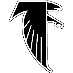
They also went with the trend of "hiding" something in the logo. The Falcons logo is a tilted F. The Eagles logo has the E in the feathers. It ceases to be unique when lots of folks are doing it
Posted on 11/8/25 at 11:51 am to ImJustaBoy
quote:
The Reebok era is so much better than the Nike era, for all teams.
I disagree - the Bills Cardinals Falcons Vikings were all nightmares with Reebok.
Worst uniform era of any sport was Reebok making the shoulder pads and nameplates some weird boxy look with alternate colours
This post was edited on 11/8/25 at 11:55 am

Posted on 11/8/25 at 12:40 pm to PJinAtl
The Falcons logo has always been an F.
This post was edited on 11/8/25 at 12:41 pm
Posted on 11/9/25 at 11:34 am to wareaglepete
quote:
The Falcons logo has always been an F
I'm almost 50 years old and born/raised in Atlanta and I never realized the old logo was an F too.
Never too old to learn I guess.
Posted on 11/9/25 at 12:18 pm to Alt26
This. At the time I lived in Colorado. It was also a case of not knowing what you got until it’s gone. It was all people knew, it wasn’t considered “cool” anymore.
Posted on 11/9/25 at 7:10 pm to SaintLSU
The old Broncos uniforms are maybe the GOAT, but the modern ghost horse logo might be the best in sports.

 Page 2 of 2


Popular
Back to top