- My Forums
- Tiger Rant
- LSU Recruiting
- SEC Rant
- Saints Talk
- Pelicans Talk
- More Sports Board
- Fantasy Sports
- Golf Board
- Soccer Board
- O-T Lounge
- Tech Board
- Home/Garden Board
- Outdoor Board
- Health/Fitness Board
- Movie/TV Board
- Book Board
- Music Board
- Political Talk
- Money Talk
- Fark Board
- Gaming Board
- Travel Board
- Food/Drink Board
- Ticket Exchange
- TD Help Board
Customize My Forums- View All Forums
- Show Left Links
- Topic Sort Options
- Trending Topics
- Recent Topics
- Active Topics
Started By
Message
SirWinston’s Saints uniform and field redesign
Posted on 9/30/21 at 7:33 pm

Posted on 9/30/21 at 7:33 pm
Mates, as you know I’m passionate about fashion and marketing, and I think the Saints have some of the strongest colours, logos, and option of any professional sports franchise on the planet.
Please someone get these images to the Lady Gayle and have her reps PM me on here so we can get this resolved once and for all.
UNIFORM MODIFICATIONS

The all white “practise” uniforms that we wore last week are a fricking abomination, especially considering that the alternative (our current colour rush uniforms) are the best in the entire league.
I actually rather like the current “mustardy” gold that we have exclusively on the colour rush uniforms and I’d default to this unique shade of mustard gold on all Saints merchandise, uniforms, etc. In much the same way that the Lions have a signature “Honalulu blue”, I’d work to name this shade “Fleur De Lis Gold” and make it a thing. I put my authentic game-used Brees colour rush kit here for you to view.
The home uniforms would be black and gold with the stripes and thick gold numbers. Everything would feel like colour rush. The only different would be that home and away mains would both have the beautiful “shadow” effect like the 49ers throwbacks had this last Sunday night. When the NFL again allows alternate helmets, I’d have a black helmet with a gold state of LA logo to pair with the white kits / black trousers look. MOAR STRIPES - more stripes on the socks, the sleeves, the trousers. Stripes are a tradition in football and no stripes look too leotardy.
Caesar’s Palace Superdome Field Modifications

For the Caesar’s Superdome field, it’s pretty self explanatory. I strongly prefer a looking “cartoon” Saints helmet at midfield (like the Colts currently have, only with retro face mask like what San Francisco had this last Sunday night) and solid endzones (ideally one black, one gold) with “SAINTS” spelled out in great existing font.

One small change Id make to the font is that I’d add a small halo over the “i” to evoke a literal Saintly image. The endzone corners would have the retro shield (as pictured on my flat bill cap in the field picture).
I encourage each of you who are equally passionate about field and uniform aesthetics to design your own so that we can get some momentum.
Cheers, mates
Please someone get these images to the Lady Gayle and have her reps PM me on here so we can get this resolved once and for all.
UNIFORM MODIFICATIONS
The all white “practise” uniforms that we wore last week are a fricking abomination, especially considering that the alternative (our current colour rush uniforms) are the best in the entire league.
I actually rather like the current “mustardy” gold that we have exclusively on the colour rush uniforms and I’d default to this unique shade of mustard gold on all Saints merchandise, uniforms, etc. In much the same way that the Lions have a signature “Honalulu blue”, I’d work to name this shade “Fleur De Lis Gold” and make it a thing. I put my authentic game-used Brees colour rush kit here for you to view.
The home uniforms would be black and gold with the stripes and thick gold numbers. Everything would feel like colour rush. The only different would be that home and away mains would both have the beautiful “shadow” effect like the 49ers throwbacks had this last Sunday night. When the NFL again allows alternate helmets, I’d have a black helmet with a gold state of LA logo to pair with the white kits / black trousers look. MOAR STRIPES - more stripes on the socks, the sleeves, the trousers. Stripes are a tradition in football and no stripes look too leotardy.
Caesar’s Palace Superdome Field Modifications
For the Caesar’s Superdome field, it’s pretty self explanatory. I strongly prefer a looking “cartoon” Saints helmet at midfield (like the Colts currently have, only with retro face mask like what San Francisco had this last Sunday night) and solid endzones (ideally one black, one gold) with “SAINTS” spelled out in great existing font.
One small change Id make to the font is that I’d add a small halo over the “i” to evoke a literal Saintly image. The endzone corners would have the retro shield (as pictured on my flat bill cap in the field picture).
I encourage each of you who are equally passionate about field and uniform aesthetics to design your own so that we can get some momentum.
Cheers, mates
This post was edited on 9/30/21 at 9:51 pm
 26
26

Posted on 9/30/21 at 7:57 pm to SirWinston
Posted on 9/30/21 at 8:00 pm to SirWinston
Here’s my spitballing on the halo idea. I’m more of a visionary when it comes to imagery, colours, and clothes / fashion. Typography is not my strong suit, but the general IDEA is sound IMO. Would just want an expert to perfect this as I did the uniforms above.
It’s unfathomable to me that we have a team nicknamed the “Saints” since 1967 and we haven’t yet had a halo incorporated into any design I’ve ever seen. Would be like Notre Dame never using a green clover.
Maybe you make the halo a little thicker and then on some of the higher res versions of the graphic you could subtly have some FDLs “engraved” into the near side of the halo (almost as it’s a Mignon Faget wedding band).
This post was edited on 9/30/21 at 8:10 pm

Posted on 9/30/21 at 8:07 pm to SirWinston
quote:
colours
quote:
practise
Wow dude, are you British?!

Posted on 9/30/21 at 8:08 pm to SirWinston
1,3
I like the black pants better solid like I first in 2001 in the opener vs. Buffalo??
I like the black pants better solid like I first in 2001 in the opener vs. Buffalo??
Posted on 9/30/21 at 8:08 pm to Ed Osteen
What a fricking lame shtick. Imagine being a grown arse man and thinking that’s funny.
Posted on 9/30/21 at 8:12 pm to LooseCannon22282
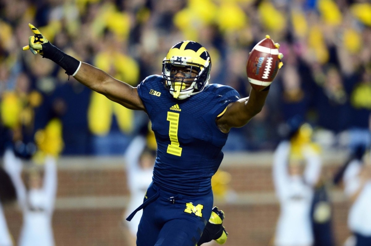
You know - I could see that. What about if we made the FDL larger and outlined in white as well as gold, and put it on one of the upper legs like how Michigan does? Would give the clean lines that you like but also a little pizzazz.
So it would kind of look like this…
So it would kind of look like this…
This post was edited on 9/30/21 at 8:13 pm

Posted on 9/30/21 at 8:46 pm to SirWinston
quote:
The all white “practise” uniforms that we wore last week are a fricking abomination
I strongly disagree with this statement, but I don’t hate your other ideas. Not bad.

Posted on 9/30/21 at 9:29 pm to MrJimBeam
quote:
Please just stop posting
Cry about it
Posted on 9/30/21 at 9:44 pm to SirWinston
Do you dispose of the victims under your grandmothers home like Gacy, or maybe you have an old shed out back with a secret underground cellar? It puts the lotion on it's skin or it gets the mask again.....

Posted on 9/30/21 at 10:19 pm to SirWinston
Actually not that bad. I like them.
Posted on 9/30/21 at 10:58 pm to SirWinston
I know this is a bit but I would love it if we went with those designs as our main uniform combos. Need to keep a gold-white-gold combo though.
Posted on 9/30/21 at 11:07 pm to unctiger4
Thanks mate - not many people know that the Saints used to have very unique endzone designs in the Superdome during the late 70’s and early 80’s. They never got the gold right, but in 2021 it wouldn’t be a problem.

This post was edited on 9/30/21 at 11:08 pm
Posted on 9/30/21 at 11:11 pm to SirWinston
In favor of using the color rush unis as a template for a black and gold unis.
Drop shadows are too 80s and unless your going for that like you were historically good in the 80s don’t do a drop shadow.
Drop shadows are too 80s and unless your going for that like you were historically good in the 80s don’t do a drop shadow.
Posted on 9/30/21 at 11:50 pm to SirWinston
you need a second home version, but definitely like all 3 you have thus far. classic.
Posted on 10/1/21 at 12:09 am to tibebecolston

First home uni gold-black-gold. Second home uni ^^^ *chef’s kiss*
Posted on 10/1/21 at 12:10 am to unctiger4
I can dig it those are purty
Posted on 10/1/21 at 3:02 am to SirWinston
quote:
SirWinston
I enjoyed your post.
I do have one question for you. Did you send a painting to a certain Barstool Radio show signed “Alejandro in Houston”?
Posted on 10/1/21 at 7:03 am to SirWinston
quote:
I encourage each of you who are equally passionate about field and uniform aesthetics to design your own so that we can get some momentum.
Literally you’re the only one who cares about this.

 Page 1 of 3

Popular
Back to top