- My Forums
- Tiger Rant
- LSU Recruiting
- SEC Rant
- Saints Talk
- Pelicans Talk
- More Sports Board
- Fantasy Sports
- Golf Board
- Soccer Board
- O-T Lounge
- Tech Board
- Home/Garden Board
- Outdoor Board
- Health/Fitness Board
- Movie/TV Board
- Book Board
- Music Board
- Political Talk
- Money Talk
- Fark Board
- Gaming Board
- Travel Board
- Food/Drink Board
- Ticket Exchange
- TD Help Board
Customize My Forums- View All Forums
- Show Left Links
- Topic Sort Options
- Trending Topics
- Recent Topics
- Active Topics
Started By
Message
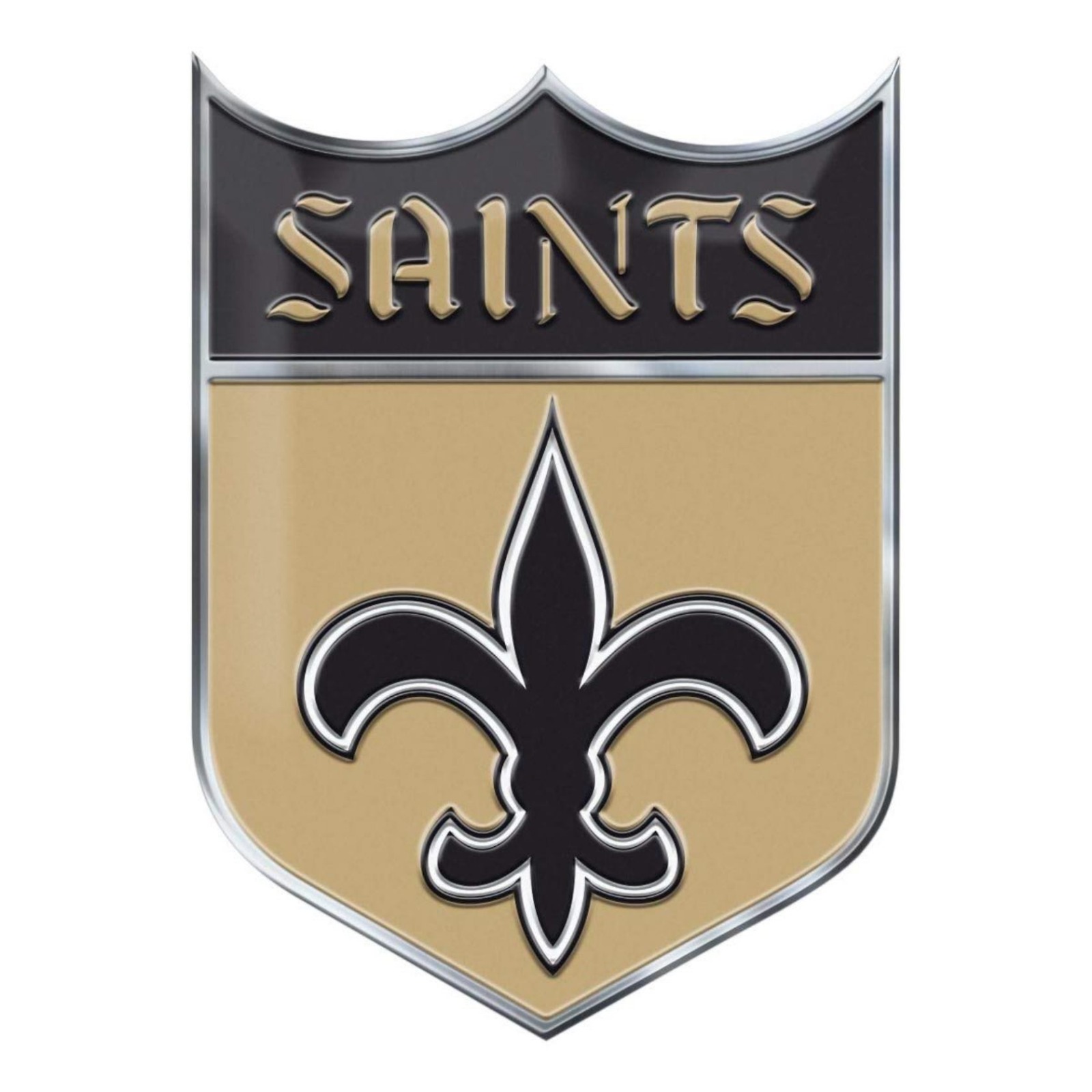
re: Is it time for a logo update?
Posted on 11/12/18 at 7:23 pm to Houma Sapien

Posted on 11/12/18 at 7:23 pm to Houma Sapien
All of these suck.
 0
0

Posted on 11/12/18 at 7:45 pm to Houma Sapien
I wish they would go back to the original fleur-de-lis on the helmet. Also put Sir Saints at mid field or maybe in the endzones.
Posted on 11/12/18 at 7:47 pm to Houma Sapien
Holy shite.
It’s near impossible to get this many downvotes without outright soliciting them like my “Dak-should we?” thread.
Bravo, sir
It’s near impossible to get this many downvotes without outright soliciting them like my “Dak-should we?” thread.
Bravo, sir

Posted on 11/12/18 at 7:50 pm to Houma Sapien
No, no and on top of that, no

Posted on 11/12/18 at 7:50 pm to Ponchy Tiger
quote:
I wish they would go back to the original fleur-de-lis on the helmet. Also put Sir Saints at mid field or maybe in the endzones.
Modern fleur de lis is much more appropriate for today's NFL and looks better in general. Save the old one for when we wear throwbacks.
Also, Sir Saint is def too hokey to be used in any regular capacity nowadays.
However, I do wish we'd put the Saints shield as the new midfield logo. I think that would look badass, along with filled-in end zones.
I wonder if the shied would look good on a helmet too...
Posted on 11/12/18 at 7:57 pm to Houma Sapien
Please stop wasting internet bandwidth.

Posted on 11/13/18 at 6:10 am to Houma Sapien
Idiotic post
Posted on 11/13/18 at 8:06 am to LSUSkip
Some designs are timeless. The trouble with attempts to be "modern" is the inevitability of being outdated rather quickly (e.g., bell-bottoms, parachute pants, leisure suits, Members Only jackets). Stay with timeless.
Posted on 11/13/18 at 8:24 am to CnAzInCA

This pant color is usually referred to as "Old Gold," which is the same color of the Saints' helmet. Looks sharp IMO.
This post was edited on 11/13/18 at 8:26 am

Posted on 11/13/18 at 8:50 am to Houma Sapien
Blashpeme
Posted on 11/13/18 at 9:12 am to Houma Sapien
See I’ve already downvoted this stupid thread.
Posted on 11/13/18 at 9:32 am to bonethug0108
quote:
As a fellow graphic designer I see among my fellows the need to sometimes (okay way more than sometimes) do too much when simple is the better option.
No offense, but I think A LOT of graphic designers argue for change to simply justify their existence. Over the last 20 years or so we've seen most sports uniforms trend back to classic, simple designs. The reason is because they look good and have ALWAYS looked good.
The Vikings recently went back to a more traditional design. Same for the 49ers. People love the Rams old yellow/blue combos. All though brown and orange isn't exactly the best combo, Cleveland changed their uniforms to something that a HS team would wear and the fans HATE them. So much so that they are set to be redesigned. Just a few years after they were changed.
The NFL team that generally gets voted as having the best uniforms is the Raiders. They may have the most simple uniforms in the league, but they have a great color scheme and are all time classics.
The Saints also have a GREAT color scheme (very from teams have black and old gold) and a unique logo that is easily identifiable with New Orleans. Hell, I wish they would tweek the uniforms to a more retro look and go back to the last generation Fluer-de-lis from 80's

Posted on 11/13/18 at 9:34 am to Alt26
quote:
No offense, but I think A LOT of graphic designers argue for change to simply justify their existence.


Posted on 11/13/18 at 11:57 am to 3HourTour
quote:
Damn man you should chop your dick off for starting this thread.
Posted on 11/13/18 at 11:59 am to Houma Sapien
just chiming in to say I don't hate the second one. But I don't think it would good on a helmet.
Posted on 11/13/18 at 12:15 pm to Houma Sapien
No.
Posted on 11/13/18 at 12:15 pm to Houma Sapien
i feel great contributing DV 360 to you OP.
Posted on 11/13/18 at 12:18 pm to Houma Sapien
Have the Saints ever done a black helmet with a gold fleur-de-lis??
Posted on 11/13/18 at 2:43 pm to Houma Sapien
how about a picture of Drew Brees on one side of the helmet, and a picture of...Drew Brees on the other.
Posted on 11/13/18 at 10:54 pm to Houma Sapien
We hit the jackpot with the White Color Rush and we should quit while we are ahead!

 Page 5 of 6

Popular
Back to top