- My Forums
- Tiger Rant
- LSU Recruiting
- SEC Rant
- Saints Talk
- Pelicans Talk
- More Sports Board
- Fantasy Sports
- Golf Board
- Soccer Board
- O-T Lounge
- Tech Board
- Home/Garden Board
- Outdoor Board
- Health/Fitness Board
- Movie/TV Board
- Book Board
- Music Board
- Political Talk
- Money Talk
- Fark Board
- Gaming Board
- Travel Board
- Food/Drink Board
- Ticket Exchange
- TD Help Board
Customize My Forums- View All Forums
- Show Left Links
- Topic Sort Options
- Trending Topics
- Recent Topics
- Active Topics
Started By
Message

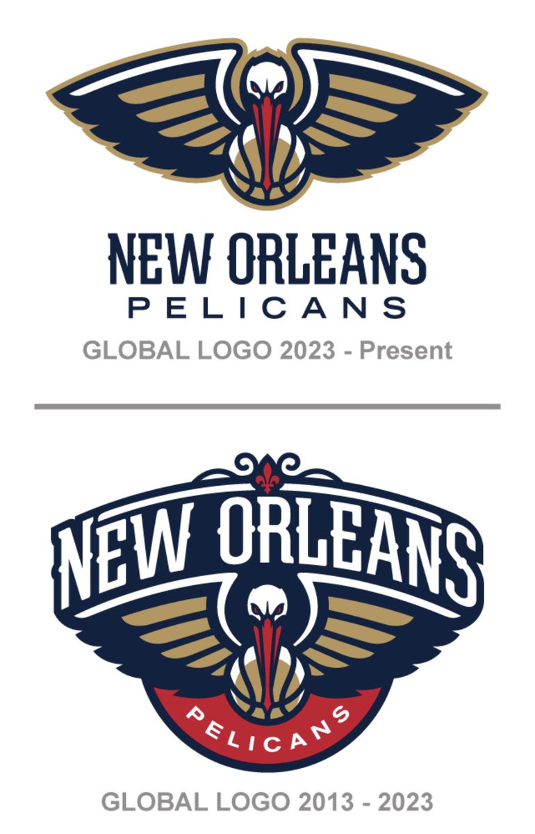
New Team Logo
Posted on 6/25/23 at 9:52 pm

Posted on 6/25/23 at 9:52 pm
Just saw this on Twitter. Did they just remove New Orleans from our logo?
Should we be concerned? How are those ASM Global negotiations going?
Should we be concerned? How are those ASM Global negotiations going?
 15
15


Posted on 6/25/23 at 10:12 pm to WaltWhite504
quote:
Did they just remove New Orleans from our logo?
It’s still in the logo you posted, I think they are just going for a cleaner look. Will that cause people to use just the pelican part of the logo more often rather than this full logo? We’ll see, but I don’t think it’s as drastic of a difference as you’re thinking.
Posted on 6/25/23 at 10:18 pm to WaltWhite504
The New Orleans street sign text should just be its own logo imo. Maybe dress it up a bit. But could be a cool alternate logo

Posted on 6/26/23 at 12:07 am to WaltWhite504
quote:New Orleans is literally in bigger font than Pelicans
Did they just remove New Orleans from our logo?
This post was edited on 6/26/23 at 12:43 pm
Posted on 6/26/23 at 12:20 am to WaltWhite504
the pelican alone with no wording around it has been a secondary logo since the rebrand in 2013
Posted on 6/26/23 at 9:06 am to WaltWhite504
The fleur de lis has been removed.
Posted on 6/26/23 at 10:49 am to WaltWhite504
The new logo should be Zion spitting in a Pelicans’ mouth
Posted on 6/26/23 at 12:28 pm to SportsGuyNOLA
quote:
The new logo should be Zion spitting in a Pelicans’ mouth
If tshirt vendors do not seize on this idea, it's money left on a table.
Posted on 6/26/23 at 12:46 pm to WaltWhite504
They try too hard to create a timeless design and it fails miserably and it ends up looking really bland and soulless.
Posted on 6/26/23 at 2:27 pm to WaltWhite504
I guess they just assume everyone knows the logo is for NOLA now so streamline it.

Posted on 6/26/23 at 11:03 pm to WaltWhite504
Crescent city basketball logo ftmfw
Posted on 6/27/23 at 11:27 am to WaltWhite504
I dont mind Pelicans, but God our logo and colours suck so bad. It's like Wizards circa Jordan bad.
I still get sad when I see Charlotte playing and how their colours just pop off the screen.
I still get sad when I see Charlotte playing and how their colours just pop off the screen.
This post was edited on 6/27/23 at 11:30 am

Posted on 6/27/23 at 12:59 pm to SportsGuyNOLA
quote:
The new logo should be Zion spitting in a Pelicans’ mouth

Posted on 6/27/23 at 1:32 pm to WaltWhite504
It's cleaner and not as busy. Not bad. Maybe this means we get some jersey changes soon too
Posted on 6/28/23 at 11:51 am to WaltWhite504
Just getting a head start on the relocation.
Posted on 6/28/23 at 11:57 am to WicKed WayZ
quote:This, I prefer it.
It's cleaner and not as busy
Especially if I'm buying hats or shirts, I like just a logo or as little "stuff" all over the shirt as possible. A hat or shirt with just the new logo without the wording below is perfect for my sensibilities.
Posted on 6/28/23 at 10:13 pm to supe12sta12z
Just wait until you see the new red uniforms. They belong in a AAU tournament.

Posted on 6/28/23 at 10:21 pm to The Hurricane
Details?
Posted on 6/28/23 at 10:38 pm to saints5021

Think this but in red, but it will say Crescent City with same number font as now. Three vertical stripes on side panels. Navy collar and sleeve piping.

 Page 1 of 2

Popular
Back to top