- My Forums
- Tiger Rant
- LSU Recruiting
- SEC Rant
- Saints Talk
- Pelicans Talk
- More Sports Board
- Fantasy Sports
- Golf Board
- Soccer Board
- O-T Lounge
- Tech Board
- Home/Garden Board
- Outdoor Board
- Health/Fitness Board
- Movie/TV Board
- Book Board
- Music Board
- Political Talk
- Money Talk
- Fark Board
- Gaming Board
- Travel Board
- Food/Drink Board
- Ticket Exchange
- TD Help Board
Customize My Forums- View All Forums
- Show Left Links
- Topic Sort Options
- Trending Topics
- Recent Topics
- Active Topics
Started By
Message
re: I wish Norte Dame went back to the other helmets
Posted on 11/8/20 at 12:47 am to Byrdybyrd05

Posted on 11/8/20 at 12:47 am to Byrdybyrd05
I love those late 90s early 2000s uniforms. These things they wear now look too gimmicky
 0
0

Posted on 11/8/20 at 1:27 am to Byrdybyrd05
quote:
Maybe because I’m used to what they wore in the 90s and 2000s but I always preferred that color of gold
I sort of feel this way, but sort of prefer the new look.
I don't know if it was a Gameday feature, but I remember Kelly saying several years ago they tried to get the new helmet paint to reflect exactly like the Golden Dome. Can't say if they achieved that, but it looks good on tv.
Posted on 11/8/20 at 3:41 am to Byrdybyrd05
When CFB was CFB.
Nice and nasty and honored traditions.
Nobody was changing uniforms left and right to be avante-garde.
Posted on 11/8/20 at 6:39 am to Byrdybyrd05
Agree these are to bright

Posted on 11/8/20 at 9:39 am to hendersonshands
quote:
No way. These uniforms and pants look much better.
Posted on 11/8/20 at 2:46 pm to Simplemaaan
quote:
The students used to paint helmets every week with real 24k flake paint.
So did the kid from Holy Cross that wanted to transfer to Notre Dame to walk on the football team.
Posted on 11/8/20 at 3:24 pm to KosmoCramer
I just wish they’d go back to putting the golden dome on their collar. That was a great look that tied it all together imo.


Posted on 11/8/20 at 3:25 pm to Byrdybyrd05
The helmets are better but the pants are worse
The pants look like fricking baby puke

The pants look like fricking baby puke
Posted on 11/8/20 at 4:24 pm to The Boat
quote:
The pants look like fricking baby puke
And the jerseys look like some weird neon blue not navy.
Posted on 11/8/20 at 5:16 pm to mizzoubuckeyeiowa
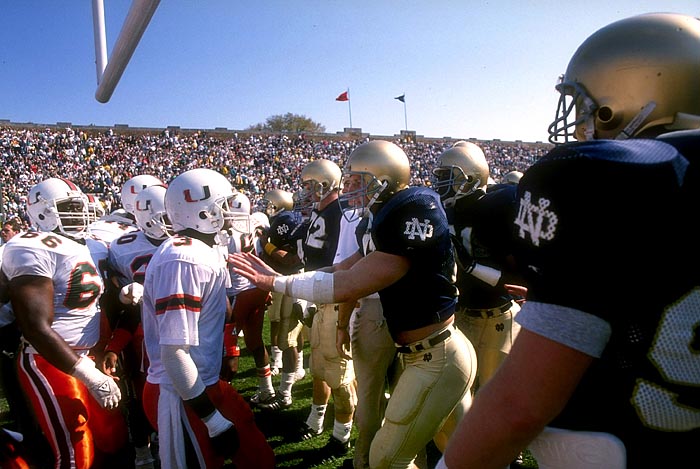
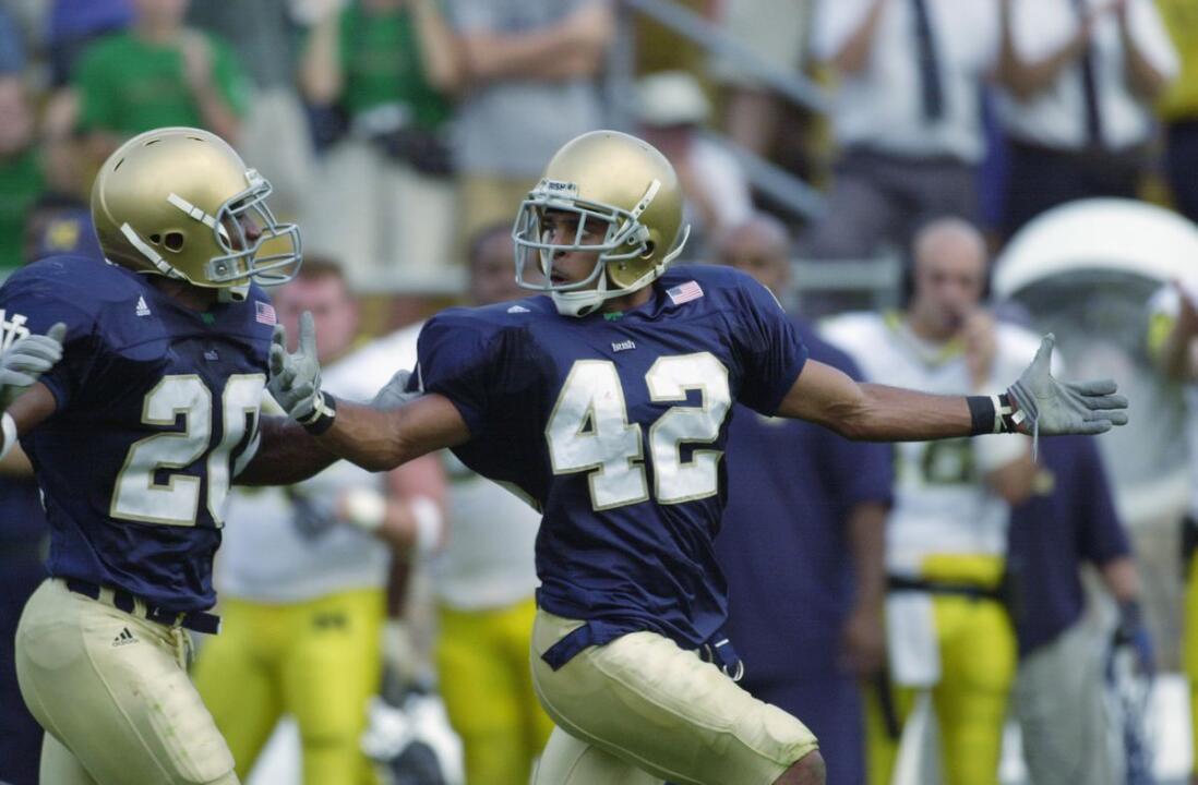
I just realized how much taller the Norte Dame players were compared to the Miami players in that picture. I wish everybody on LSU’s offensive line was from big 10 country.
Posted on 11/8/20 at 5:43 pm to Byrdybyrd05
That's not gold, that's brown.
Posted on 11/8/20 at 8:22 pm to GentleJackJones
I also like the stripes on the sleeves and collar. When were those removed?
This post was edited on 11/8/20 at 8:24 pm
Posted on 11/8/20 at 8:24 pm to CRDNLSCHMCPSN11
That was a Bob Davis only thing
Faust has wide striped.
Everyone else has had no stripes or collar
Faust has wide striped.
Everyone else has had no stripes or collar
Posted on 11/8/20 at 8:28 pm to hendersonshands
quote:
pants look much better.
The pants are similar in color to baby poop.
Posted on 11/8/20 at 8:30 pm to sms151t
Davie was there from...1997-2001? Weren't there also names briefly on the back of the jersey with Faust? Or am I wrong?
Posted on 11/8/20 at 8:32 pm to CRDNLSCHMCPSN11
Faust had them for a couple years I remember but not every year.
The tradition is
Names for bowls
Green for huge games
White with green because why not (Sugar Bowl with Mirer)
The tradition is
Names for bowls
Green for huge games
White with green because why not (Sugar Bowl with Mirer)
Posted on 11/8/20 at 8:34 pm to CRDNLSCHMCPSN11
I can’t believe people like this
Better than this
One looks like Notre Dame. The others looks like a XFL team trying to pimp out Notre dame
Better than this
One looks like Notre Dame. The others looks like a XFL team trying to pimp out Notre dame
Posted on 11/8/20 at 8:36 pm to lsupride87
It’s the quality in pictures the adding of the Dome Gold to it some
I like the look as they’re being throwbacks and using same paint as dome. It’s not just something random they’re meant to represent things.
I like the look as they’re being throwbacks and using same paint as dome. It’s not just something random they’re meant to represent things.
This post was edited on 11/8/20 at 8:37 pm
Posted on 11/8/20 at 8:41 pm to sms151t
I don't ever remember names on the back anytime recently. I never like no names on the back. It makes it easier to see who was on the field or involved in the play if the play by play person doesn't tell you if names are on the back. I remember dark green worn rarely (specifically in the USC game in 2005). When Willingham was coach, I remember an awesome bright shade of green worn if I remember correctly. I thought Mirer was going to be a terrific NFL QB. But I was way off.
This post was edited on 11/8/20 at 8:43 pm
Posted on 11/8/20 at 8:46 pm to lsupride87
I usually like brighter colors over duller/lighter colors. But I'm not a traditionalist either.
On the other hand, I do like the darker shade of gold the Saints have on the stripes and numbers tonight. But hate the light shade of gold on the helmet. Just make it match. It shouldn't be that hard.
On the other hand, I do like the darker shade of gold the Saints have on the stripes and numbers tonight. But hate the light shade of gold on the helmet. Just make it match. It shouldn't be that hard.

 Page 2 of 3

Popular
Back to top