- My Forums
- Tiger Rant
- LSU Recruiting
- SEC Rant
- Saints Talk
- Pelicans Talk
- More Sports Board
- Fantasy Sports
- Golf Board
- Soccer Board
- O-T Lounge
- Tech Board
- Home/Garden Board
- Outdoor Board
- Health/Fitness Board
- Movie/TV Board
- Book Board
- Music Board
- Political Talk
- Money Talk
- Fark Board
- Gaming Board
- Travel Board
- Food/Drink Board
- Ticket Exchange
- TD Help Board
Customize My Forums- View All Forums
- Show Left Links
- Topic Sort Options
- Trending Topics
- Recent Topics
- Active Topics
Started By
Message

Any updated pics of back of NEZ?
Posted on 9/4/24 at 7:43 am
Posted on 9/4/24 at 7:43 am
(no message)
 2
2

Posted on 9/4/24 at 8:05 am to DennisQuaid
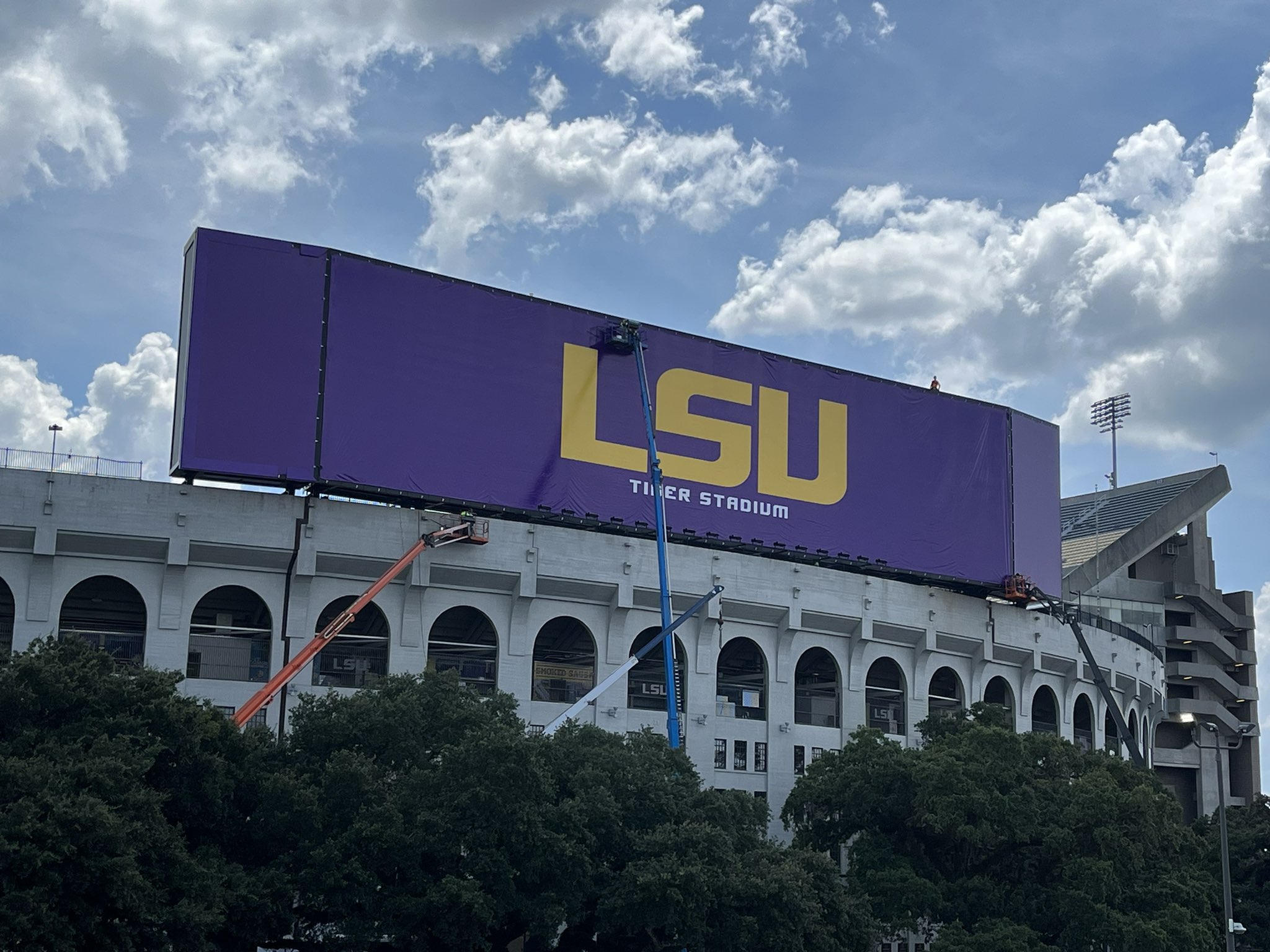
bunch of pics on twitter. it is the same purple background with Big LSU

Posted on 9/4/24 at 8:15 am to DennisQuaid
Posted on 9/4/24 at 8:20 am to rmnldr
Another cheap looking canvas cover?
Posted on 9/4/24 at 8:23 am to OU812
That does look cheap.
Posted on 9/4/24 at 8:26 am to jp4lsu
quote:
That does look cheap.
I think its like a billboard and once they pull it tight and secure it then it won't look so cheap. At least I hope so.
Posted on 9/4/24 at 8:33 am to rmnldr
There is too much purple empty canvas. They should have made the LSU larger if this was the look they wanted.
Posted on 9/4/24 at 8:36 am to NOBigEZ
Should have moved the LSU to the right and put the tiger emblem on the left or on either side.
Posted on 9/4/24 at 9:38 am to rmnldr
That's too bad. Wish they would have done something new.
Posted on 9/4/24 at 9:50 am to rmnldr
Damn that looks like complete shite

Posted on 9/4/24 at 9:56 am to DennisQuaid
Are they planning on putting full time Coca Cola and Raising Canes ads on either side of LSU on that canvas?  Looks terrible.
Posted on 9/4/24 at 9:58 am to FATBOY TIGER
quote:
Should have moved the LSU to the right and put the tiger emblem on the left or on either side.
I was thinking about that weeks ago, not knowing what they would put. I wanted them to move LSU to the left and put the Tiger emblem on the helmet to the right. Now, since this tarp is up and LSU is quite small, maybe a Tiger emblem on each side for now
Posted on 9/4/24 at 9:59 am to rmnldr
Graphically we can do much better than LSU in the geaux font smh
Posted on 9/4/24 at 10:01 am to FATBOY TIGER
quote:
Should have moved the LSU to the right and put the tiger emblem on the left or on either side.
Agree. The new tiger head on either side would look cool.
Posted on 9/4/24 at 10:14 am to rmnldr
That is a bit cheesy…
Posted on 9/4/24 at 10:32 am to rmnldr
It’s the same size font as it was on the old board.

Posted on 9/4/24 at 10:33 am to rmnldr
the font is too small

Posted on 9/4/24 at 10:35 am to NOBigEZ
quote:
There is too much purple empty canvas. They should have made the LSU larger if this was the look they wanted.
The LSU can only be so big. There is not much room above or below to allow for it to be larger.
Posted on 9/4/24 at 11:13 am to SUB
They need to put something on the south endzone white building that holds stairs or elevators?

Posted on 9/4/24 at 11:25 am to OU812
What was the rumor about some new Mike the Tiger logo?

 Page 1 of 1


Popular
Back to top