- My Forums
- Tiger Rant
- LSU Recruiting
- SEC Rant
- Saints Talk
- Pelicans Talk
- More Sports Board
- Fantasy Sports
- Golf Board
- Soccer Board
- O-T Lounge
- Tech Board
- Home/Garden Board
- Outdoor Board
- Health/Fitness Board
- Movie/TV Board
- Book Board
- Music Board
- Political Talk
- Money Talk
- Fark Board
- Gaming Board
- Travel Board
- Food/Drink Board
- Ticket Exchange
- TD Help Board
Customize My Forums- View All Forums
- Show Left Links
- Topic Sort Options
- Trending Topics
- Recent Topics
- Active Topics
Started By
Message
 0
0

Posted on 1/8/21 at 12:43 pm to S
Make Tiger stadium 92,000 capacity again.

Posted on 1/8/21 at 12:46 pm to Leon Spinks
quote:
Make Tiger stadium 92,000 capacity again.
That really was sort of a wonderful sweet spot.
Posted on 1/8/21 at 12:47 pm to Y.A. Tittle
It was better back then. Maybe because everyone was in to every game not just the big game of the year
Posted on 1/8/21 at 12:56 pm to Leon Spinks
THIS
gray facemasks. alternating light/dark grass every 5 yards.
AND Charles Alexander's afro !

gray facemasks. alternating light/dark grass every 5 yards.
AND Charles Alexander's afro !
Posted on 1/8/21 at 1:11 pm to Picayuner
ABSOLUTELY!!!
End zones are OK now with me.
End zones are OK now with me.

Posted on 1/8/21 at 1:12 pm to S
Hell no, that's ad space we can sell
Posted on 1/8/21 at 1:13 pm to S
They’re glorious
I’ve never been a fan of the geaux font
As someone said, it was always something destined to look “early 2000s”
I’ve never been a fan of the geaux font
As someone said, it was always something destined to look “early 2000s”
This post was edited on 1/8/21 at 1:20 pm

Posted on 1/8/21 at 1:16 pm to S
I know this is hard for a lot of people on here to grasp, but what’s attractive to old alum and boosters isn’t what’s necessarily attractive to young people and recruits.
Younger generations and recruits like “clean,” modern, “tight” looking things. Old block serifs fonts are not that. That’s why San-serif fonts like the Geaux font are more commonly used in branding and merchandise targeted for younger consumers. Let the branding and marketing people worry about those things.
Younger generations and recruits like “clean,” modern, “tight” looking things. Old block serifs fonts are not that. That’s why San-serif fonts like the Geaux font are more commonly used in branding and merchandise targeted for younger consumers. Let the branding and marketing people worry about those things.

Posted on 1/8/21 at 1:18 pm to Hester Carries
quote:
Its why i love that we are pushing the updated Tiger Head more and more.
This. I don't care so much about the font on the endzones but they need to push the new tiger head as the primary logo on TV graphics and such.
Posted on 1/8/21 at 1:25 pm to Hester Carries
quote:I think the Geaux font looks fine, but admit it doesn't look good in the end zones.
Geaux font has not aged as good as people pretend. and it will continue to date more and more.
Posted on 1/8/21 at 1:27 pm to S
I like the Geaux Font 
Posted on 1/8/21 at 1:31 pm to S
Those are hideous. You make fun of the Geaux font but those are dated as hell and just scream something that came out of 60's/70's. Special Ed Bonanza font looking trash

Posted on 1/8/21 at 1:41 pm to S
They just need to make the font bigger on the ones we got. Too much dead space on the sides.
Or they could add some of the tiger heads to them.
Or they could add some of the tiger heads to them.
Posted on 1/8/21 at 2:57 pm to S
I remember when I was a kid I had to ask my dad wtf that letter "s" was
Posted on 1/8/21 at 3:12 pm to T
quote:
That marketing company Skip Bertman hired to redo the LSU brand was horrible. They have ruined too many school logos to even count.
Serious question...can you name a few..kinda curious. Surely toonces had to be the worst of the worst
This post was edited on 1/8/21 at 3:15 pm

Posted on 1/8/21 at 3:19 pm to waiting4saturday
I couldnt tell you what the endzones look like now. Someone refresh my memory.
E
E

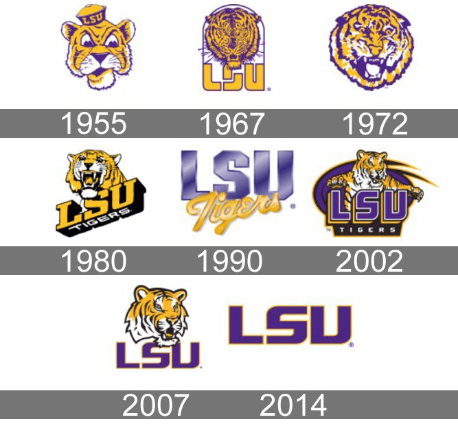
Posted on 1/8/21 at 3:32 pm to BrohemAlem11
These are all acceptable except for the ones with toonces. Removing the body didn't do anything for the retard tiger face. I think Skip gets the blame for that garbage. The geaux font looks a lot like the lettering from '67. And it's a pretty iconic font when it's presented in the current format; wide and without the shadow.
Posted on 1/8/21 at 3:34 pm to S

Diamonds
Posted on 1/8/21 at 3:49 pm to mostbesttigerfanever
I would put tounces at midfield

 Page 2 of 4

Popular
Back to top