- My Forums
- Tiger Rant
- LSU Recruiting
- SEC Rant
- Saints Talk
- Pelicans Talk
- More Sports Board
- Fantasy Sports
- Golf Board
- Soccer Board
- O-T Lounge
- Tech Board
- Home/Garden Board
- Outdoor Board
- Health/Fitness Board
- Movie/TV Board
- Book Board
- Music Board
- Political Talk
- Money Talk
- Fark Board
- Gaming Board
- Travel Board
- Food/Drink Board
- Ticket Exchange
- TD Help Board
Customize My Forums- View All Forums
- Show Left Links
- Topic Sort Options
- Trending Topics
- Recent Topics
- Active Topics
Started By
Message
re: Daily COVID Updated as of 11/2/20 8:00 PM
Posted on 5/21/20 at 9:30 pm to the808bass
Posted on 5/21/20 at 9:30 pm to the808bass
Correct, but half of that would still be more new cases in a day than we've seen in the general population of the state. We had a higher day back on 4/22 however that was primarily centered in the Cummins Prison Unit.
 2
2

Posted on 5/21/20 at 9:33 pm to Chromdome35
Looks like the Arkansas number is a bit of an anamoly.
While still concerning, I’ll be interested to track their numbers the next 3-4 days to see if it’s a pattern or one time deal.
quote:
Dr. Nate Smith, Secretary of the Arkansas Department of Health, said that’s almost 10 times as many as a lower day in past weeks. According to Dr. Smith, 229 are from correctional facilities and are cases that were already known about but weren’t entered into the system yet because they were from different testing sites. Dr. Smith said the correctional facilities additional cases are from last week.
While still concerning, I’ll be interested to track their numbers the next 3-4 days to see if it’s a pattern or one time deal.
This post was edited on 5/21/20 at 9:37 pm

Posted on 5/21/20 at 9:39 pm to Chromdome35
Eh. They’re committing to testing every nursing home resident and worker by the end of the month. They’re going to pop some positive tests.
Your hospital beds only have a little over 100 Covid patients. Only 110 patients have ever been on a vent.
Your hospital beds only have a little over 100 Covid patients. Only 110 patients have ever been on a vent.
Posted on 5/22/20 at 6:31 am to the808bass
I am not sure what to make of the flat or very slow decrease in number of cases. It is easy to attribute it to the fact we are testing 250K more people than a month ago and I hope that is what it is. However, the extra 250K may be Largely a pseudo-random sample of people with a small probability of having the virus, rather than symptomatic people who would not have been tested at the old testing numbers.
Posted on 5/22/20 at 6:39 am to Chromdome35
I would like to hear opinions on the graphic below. This is based on the # of new cases per day. I built this as a mock up sheet in the new tracker I'm working on. If enough people find this valuable I will implement it.

This post was edited on 5/22/20 at 6:45 am
Posted on 5/22/20 at 6:53 am to Chromdome35
I really like that plot.
1.add a color bar to indicate the scale of the colors
2. Add time on the x-axis
3. Consider normalizing each state by the population, or making a second plot with normalized numbers.
1.add a color bar to indicate the scale of the colors
2. Add time on the x-axis
3. Consider normalizing each state by the population, or making a second plot with normalized numbers.
Posted on 5/22/20 at 7:59 am to lsumatt
Thanks, Matt!
1) Google sheets have a conditional formating option for showing a color scale based on the range of numbers. Since this color scale is based on a state's numbers, what looks bright red for Alaska might be only 20 cases while for NY bright red might represent 1900 cases. The way to address this would be in your 3rd bullet point, normalize it by population.
2) There is actually a date header row; however, to format the sheet to look like this you have to narrow down each column which causes the headers to disappear because the column width is so narrow. In the displayed graphic everything starts on March 15th.
You can see this full graphic in my US tracker, it's the very last tab in the workbook. This one is static as it's just a mock-up for me to use to work out the issues. I won't be updating it in this tracker as it's a manual build process and takes about 30 minutes to do this one tab. Once I get a script-driven tracker implemented, I will be able to write the code to generate this automatically. I was thinking I would offer this view for 1) New Cases 2) Deaths 3) Total Tests for both the raw numbers and the normalized numbers.
I was also thinking it would be interesting to show this plot for each state where the 1st row would show the number of new cases and the 2nd row would show deaths. That would allow you to see the relationship between new cases and deaths...or it might be a lot of effort and be worthless.
This post was edited on 5/22/20 at 8:04 am
Posted on 5/22/20 at 8:00 am to Chromdome35
quote:
I was thinking I would offer this view for 1) New Cases 2) Deaths 3) Total Tests for both the raw numbers and the normalized numbers.
You’re doing the Lord’s work here.
Posted on 5/22/20 at 9:11 am to the808bass
quote:
There have been 1,247 coronavirus deaths in Ohio's nursing homes and other long-term care facilities, which is 70% of the state's 1,781 confirmed and probable coronavirus deaths, according to new data from the state health department.
LINK
Just highlighting the insanity.

Posted on 5/22/20 at 9:43 am to Chromdome35
Strange that IDs and LAs curves are almost identical

Posted on 5/22/20 at 9:49 am to the808bass
quote:Part of the spike were nursing home workers as well.
Eh. They’re committing to testing every nursing home resident and worker by the end of the month. They’re going to pop some positive tests.
Posted on 5/22/20 at 9:50 am to Chromdome35
quote:It's badass. You're doing better work, and doing better informing than anyone in the media.
I would like to hear opinions on the graphic below.
This post was edited on 5/22/20 at 9:52 am

Posted on 5/22/20 at 9:51 am to the808bass
quote:
Just highlighting the insanity.
This guy has been all over the nursing home stuff since the beginning.
The seven states that had policies of shipping infected patients back to nursing homes have 65% of the country's death total.
Give John Bel Edwards some praise for not having that sort of policy while being a Democrat, but LA's nursing home deaths still account for nearly 40% of the state's total.
Posted on 5/22/20 at 10:58 am to the808bass
quote:
There have been 1,247 coronavirus deaths in Ohio's nursing homes and other long-term care facilities, which is 70% of the state's 1,781 confirmed and probable coronavirus deaths, according to new data from the state health department.
"Probable"? This guarantees inflated numbers.
Posted on 5/22/20 at 11:01 am to Taxing Authority
Thanks Taxing!
I get really frustrated by the lack of nonhysterical reporting on the numbers. It is almost impossible to get a feel for what's actually happening solely by relying on the media.
And no one has time to dig into every state's web sites to get a better feel for the numbers.
I get really frustrated by the lack of nonhysterical reporting on the numbers. It is almost impossible to get a feel for what's actually happening solely by relying on the media.
And no one has time to dig into every state's web sites to get a better feel for the numbers.
This post was edited on 5/22/20 at 11:02 am
Posted on 5/22/20 at 11:28 am to Sasquatch Smash
The home where I consult only admitted back those who were already ours who were sent out. We just got our first NEW admit yesterday since March; the facility was "clinically cleared" but I'm not sure by who? LDH??
That said, we had a resident test positive on 4/19 -- he was noted to be medically cleared after 10 days of no fever, symptoms, etc (CMS guidelines?? IDK as that's not what LDH is using for their recovered stats and I'm quite sure that the facility didn't make up their own guidelines). NOW he's in the hospital with a dx of hypoxia and covid per the hospital call to the facility. I'm wondering if a) they reswabbed him or b) if they are assuming he's still positive?
I'm thinking that admits may not be a great idea at the moment.
Posted on 5/22/20 at 1:25 pm to Chromdome35
quote:
I would like to hear opinions on the graphic below
Damn my Hog Brother
Posted on 5/22/20 at 8:40 pm to Chromdome35
This is the link to the US state-level tracker that I have shared via Google Drive. Chromdome's State Level COVID-19 Daily Tracker
This is the link to the COVID-19 Country tracker that I have shared on Google Drive. Chromdome's COVID-19 Daily Tracker
The source for the data is https://www.worldometers.info/coronavirus/
The source for the testing data is from https://covidtracking.com/data/


This is the link to the COVID-19 Country tracker that I have shared on Google Drive. Chromdome's COVID-19 Daily Tracker
The source for the data is https://www.worldometers.info/coronavirus/
The source for the testing data is from https://covidtracking.com/data/
Posted on 5/22/20 at 8:47 pm to Chromdome35
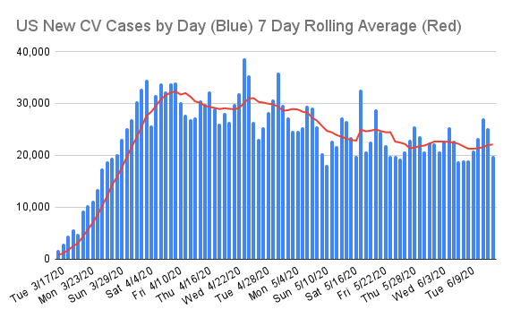
A nice drop in new cases today which were down 14% from yesterday and 9.4% from last week; however, it was most likely a result of the reduced testing numbers @ 342K with 7% positive. The 7 day rolling average for new cases has been hanging around 23K a day for 5 days in a row.
Deaths were down 125 from yesterday and 309 from last week a 19% decline. The 7 day rolling average for deaths is dropping sharply.
Mortality remains at 5.9x%
Deaths were down 125 from yesterday and 309 from last week a 19% decline. The 7 day rolling average for deaths is dropping sharply.
Mortality remains at 5.9x%

Posted on 5/22/20 at 8:49 pm to Chromdome35
Deaths are going down pretty sharply, 1300s only one day, now in 1200s and not gonna be there long. (7 day average)

 Page 220 of 331

Popular
Back to top