- My Forums
- Tiger Rant
- LSU Recruiting
- SEC Rant
- Saints Talk
- Pelicans Talk
- More Sports Board
- Fantasy Sports
- Golf Board
- Soccer Board
- O-T Lounge
- Tech Board
- Home/Garden Board
- Outdoor Board
- Health/Fitness Board
- Movie/TV Board
- Book Board
- Music Board
- Political Talk
- Money Talk
- Fark Board
- Gaming Board
- Travel Board
- Food/Drink Board
- Ticket Exchange
- TD Help Board
Customize My Forums- View All Forums
- Show Left Links
- Topic Sort Options
- Trending Topics
- Recent Topics
- Active Topics
Started By
Message
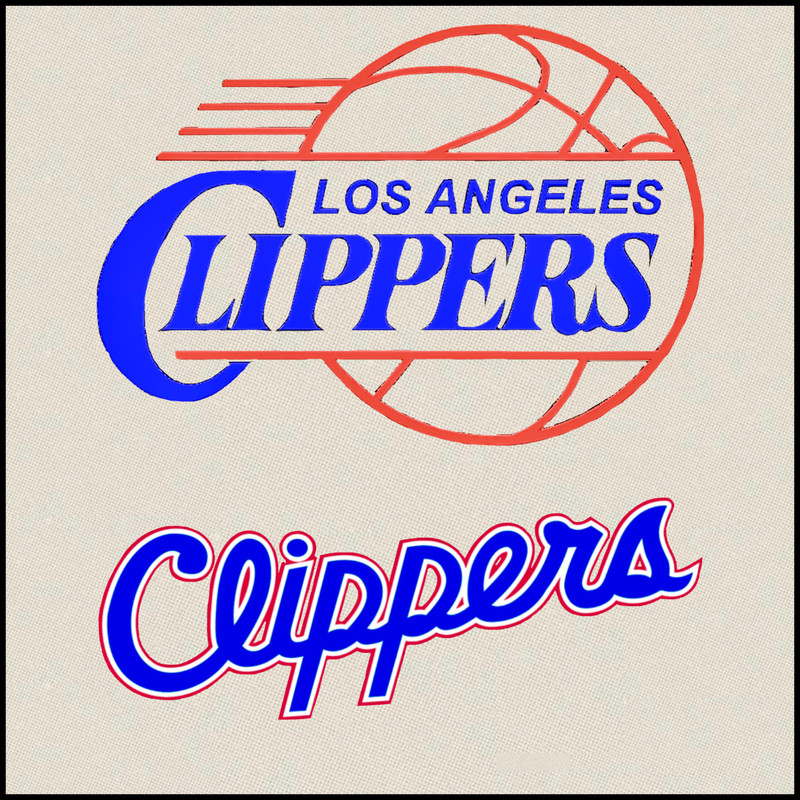
re: Clippers unveil new logo
Posted on 2/26/24 at 9:23 pm to tigerfan84
Posted on 2/26/24 at 9:23 pm to tigerfan84
That logo looks like what a U-Boat captain would see before commanding “rohr eins - los!”
 0
0

Posted on 2/26/24 at 11:23 pm to tigerfan84
In the sports lite section, I gave the change praise as it is way better than the current crap. But I realize more, the new change is more meh than anything. I’ve been a Clippers fan since the mid nineties. To me, this is their logo, and one I most associate with.

Posted on 2/27/24 at 9:05 am to BranchDawg
quote:
Uniforms are good. Logo sucks.
Immediately my first thought
Posted on 2/27/24 at 4:38 pm to LarryCLE
quote:
Apparently no one in the organization knows what a clipper ship actually looked like.
Seriously, that logo doesn’t remotely resemble a clipper ship.
Posted on 2/27/24 at 5:38 pm to High C
The lettering is too high although i like them overall

Posted on 2/27/24 at 7:42 pm to tigerfan84
Should have done something like this:


Posted on 2/27/24 at 8:14 pm to tigerfan84
When a problem comes along, you must whip it
Posted on 2/27/24 at 8:52 pm to BranchDawg
quote:
Uniforms are good.
Like them but it doesn't matter. They will wear some yellow on yellow with brighter yellow city connect shite 10 times a year anyway.
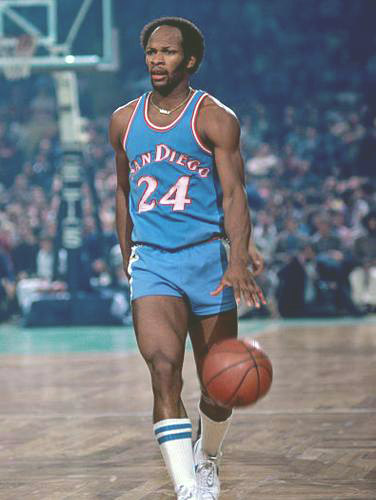
And while the new ones are pretty cool, they don't top these. Or the greatness that was World B. Free.
Posted on 2/27/24 at 9:38 pm to tigerfan84
The team considered switching to these logos in 1998. If you don't follow Uni Watch, I highly recommend it.

Posted on 2/27/24 at 9:46 pm to tigerfan84
Much better than the last logo.

Posted on 2/28/24 at 12:03 am to BranchDawg
quote:
Uniforms are good.
Logo sucks.
yep... that logo is terrible

 Page 4 of 4


Popular
Back to top