- My Forums
- Tiger Rant
- LSU Recruiting
- SEC Rant
- Saints Talk
- Pelicans Talk
- More Sports Board
- Coaching Changes
- Fantasy Sports
- Golf Board
- Soccer Board
- O-T Lounge
- Tech Board
- Home/Garden Board
- Outdoor Board
- Health/Fitness Board
- Movie/TV Board
- Book Board
- Music Board
- Political Talk
- Money Talk
- Fark Board
- Gaming Board
- Travel Board
- Food/Drink Board
- Ticket Exchange
- TD Help Board
Customize My Forums- View All Forums
- Show Left Links
- Topic Sort Options
- Trending Topics
- Recent Topics
- Active Topics
Started By
Message
 1
1

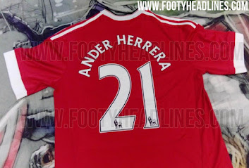
Posted on 7/13/15 at 10:17 am to StraightCashHomey21
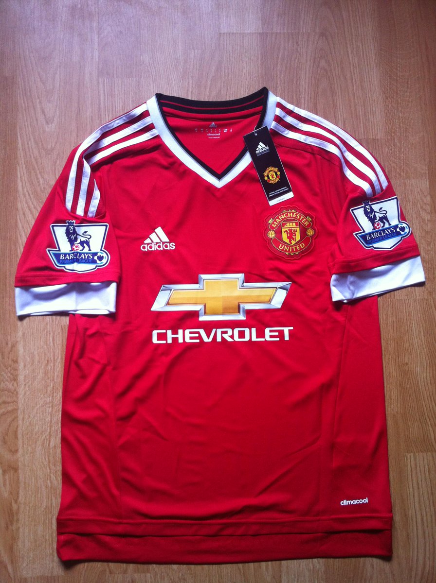
thats an adidas shirt, but MU wears Nike
Posted on 7/13/15 at 10:18 am to LSUMJ
quote:
thats an adidas shirt, but MU wears Nike
As of 1 August we will be Adidas
so stupid we have to use last years kits on the preseason tour.

Posted on 7/13/15 at 10:19 am to StraightCashHomey21
Everton 2nd kit:


Posted on 7/13/15 at 10:21 am to GeauxColonels
awful
Posted on 7/13/15 at 10:22 am to StraightCashHomey21
ahhh weird
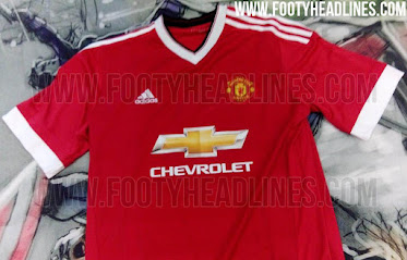
the chevy logo i think would look better with no gold in middle, just an outline of the logo and the interior red
the chevy logo i think would look better with no gold in middle, just an outline of the logo and the interior red
Posted on 7/13/15 at 10:30 am to LSUMJ
quote:
the chevy logo i think would look better with no gold in middle, just an outline of the logo and the interior red
thats what everyone has been saying
dont they have focus groups for this kind of shite

Posted on 7/13/15 at 10:38 am to StraightCashHomey21
quote:
the chevy logo i think would look better with no gold in middle, just an outline of the logo and the interior red
Never thought about that, but that would have looked super sharp.
Posted on 7/13/15 at 10:44 am to McCaigBro69
There was some fan mock ups with just the outline and name that looked great
Posted on 7/13/15 at 11:23 am to StraightCashHomey21
quote:
the chevy logo i think would look better with no gold in middle, just an outline of the logo and the interior red
quote:
thats what everyone has been saying
dont they have focus groups for this kind of shite
But if a white outline of the bowtie isn't in Chvey's corporate branding guidelines, they wouldn't use it. Just like colleges and sports teams, corporations have brand guidelines that need to be followed as well. Chevy refreshed their brand just a few years back. My guess is that the gold, 3Dish bowtie logo is the only one allowed for use in the corporate branding.

Posted on 7/13/15 at 11:43 am to LSUMJ
quote:
awful
I like it TBH
Posted on 7/13/15 at 1:20 pm to LSUMJ
quote:
awful
I'm with Pettifoger. I think that Everton away jersey is nice.
Posted on 7/13/15 at 2:42 pm to DestrehanTiger
Aside from the booty stripes on the back of the jersey, I also like it.

Posted on 7/13/15 at 2:45 pm to GeauxColonels
Is that silver on white like Sporting Kansas City? It's going to look like just a white shirt on TV.
Posted on 7/13/15 at 2:52 pm to Mr Personality
quote:
Is that silver on white like Sporting Kansas City? It's going to look like just a white shirt on TV.
Yeah or light gray. Fine by me if it looks like a white shirt. I just wish this collar was on the home shirt, I'd be all over it.
Looks like our alternate might be hunter green...
Posted on 7/13/15 at 3:05 pm to Pettifogger
i hate the lack of blue in the crest (or anywhere for that matter)
Posted on 7/13/15 at 4:23 pm to LSUMJ
quote:
i hate the lack of blue in the crest (or anywhere for that matter)
Last year's away had only a small touch of blue. I really wish I could combine this plain collar with the home shirt. It'd be perfect.
Posted on 7/14/15 at 4:58 am to Pettifogger

Posted on 7/14/15 at 6:10 am to StraightCashHomey21
Two reasons it's awful:
1- Gold chevy logo in the middle.
2- It's ManU
1- Gold chevy logo in the middle.
2- It's ManU

Posted on 7/14/15 at 7:36 am to StraightCashHomey21
Looks terrible.

 Page 19 of 28

Popular
Back to top