- My Forums
- Tiger Rant
- LSU Recruiting
- SEC Rant
- Saints Talk
- Pelicans Talk
- More Sports Board
- Fantasy Sports
- Golf Board
- Soccer Board
- O-T Lounge
- Tech Board
- Home/Garden Board
- Outdoor Board
- Health/Fitness Board
- Movie/TV Board
- Book Board
- Music Board
- Political Talk
- Money Talk
- Fark Board
- Gaming Board
- Travel Board
- Food/Drink Board
- Ticket Exchange
- TD Help Board
Customize My Forums- View All Forums
- Show Left Links
- Topic Sort Options
- Trending Topics
- Recent Topics
- Active Topics
Started By
Message

 1
1

Posted on 1/13/25 at 3:48 pm to MrLSU
Looks to be from the creative genius of Vanilla Ice.

Posted on 1/13/25 at 3:54 pm to Willie Stroker
What's the difference between PacMan and Mrs PacMan, really..
Well, she has a bow on her head.
Get out!
Well, she has a bow on her head.
Get out!
Posted on 1/13/25 at 3:59 pm to Sam Quint
Somebody pressed the bold button in Canva and called it a day

Posted on 1/13/25 at 4:00 pm to IAmNERD
quote:
This kind of "rebranding" happens all the time. I think these companies, especially giants like walmart, are terrified of massive changes and want to ease people into their branding changes.
Starbucks, Coca-Cola, Taco Bell and many others have done the same before. It is funny thinking about the amount of money they probably paid to barely change their logos though.
Think about what McDonalds in the 80s/90s looked like and what it looks like today, and think about how we didn't realize what was happening along the way

Posted on 1/13/25 at 4:01 pm to Hangover Haven
quote:
Someone signed off on that....
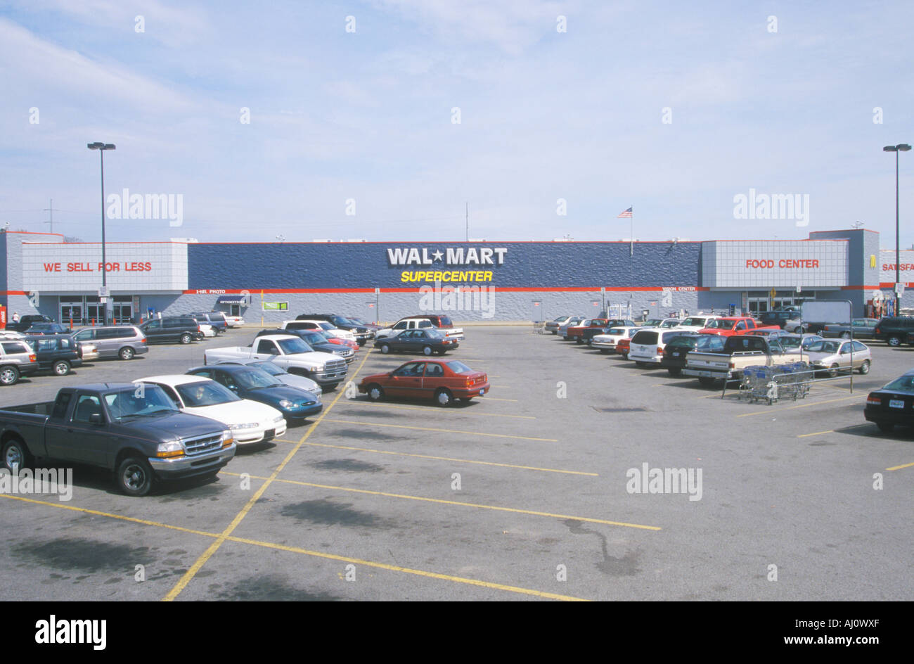
What gets me is that someone gets paid, probably metric frick ton, to have to actually sign off on shite like this for Wal-Mart.

Posted on 1/13/25 at 4:05 pm to MrLSU

Posted on 1/13/25 at 4:08 pm to Cheese Grits
Mr Sam
Bought his merchandise in USA and made by USA workers
Store colors were Red / White / Blue
Clean bathrooms
Clean stores
Helpful employees
Kids took over and it has all gone to hell
Bought his merchandise in USA and made by USA workers
Store colors were Red / White / Blue
Clean bathrooms
Clean stores
Helpful employees
Kids took over and it has all gone to hell
Posted on 1/13/25 at 4:11 pm to MrLSU
They made the sign more yellow because all their stuff comes from China
Posted on 1/13/25 at 4:18 pm to Cheese Grits
quote:
Well if you look at both logos from the modern era, they both look like an arse hole. The new one just enhances the look of raised stretch marks coming from the center of that area for being taken from behind so many times.
Either that or the new app logo looks like it has a bad case of hemorrhoids.

This post was edited on 1/13/25 at 4:29 pm
Posted on 1/13/25 at 4:30 pm to Tarps99
I’ve never notice the op’s before logo.
Posted on 1/13/25 at 4:31 pm to MrLSU
Sign needs to find the pharmacy and get a few shots of ozympic

Posted on 1/13/25 at 4:31 pm to MrLSU
Still looks like a yellow a-hole on a blue background.
Posted on 1/13/25 at 4:35 pm to MrLSU
I would have done that for a $25 gift card.
Posted on 1/13/25 at 4:44 pm to OU Guy
Biggest flop on branding was NBC in the mid 1970’s they spent millions on a new stylized N that was already in use by Nebraska ETV, the colors were just a little different.

NPB sued and settled. NBC kept the stylized N and added a color peacock before dropping the N for just the peacock.
NPB sued and settled. NBC kept the stylized N and added a color peacock before dropping the N for just the peacock.
Posted on 1/13/25 at 4:50 pm to MrLSU
They went with the Great Value Logo designer apparently
Posted on 1/13/25 at 4:54 pm to Cage Fighter Trainee
quote:
As a DEI Executive, I feel the new logo is much more inclusive and well worth the millions spent updating it
You gotta figure they have to replace every truck logo decal, store logo, all the stuff around the store with the logo, etc.
No telling the cost of it
Posted on 1/13/25 at 4:57 pm to MrLSU
Getting fatter just like their customers
Posted on 1/13/25 at 5:07 pm to HenryParsons
Man 90s cars were such ugly pieces of cheap shite

Posted on 1/13/25 at 5:09 pm to MrLSU
Wow. So fresh and creative.
Bravo.
Bravo.

 Page 2 of 4

Popular
Back to top