- My Forums
- Tiger Rant
- LSU Recruiting
- SEC Rant
- Saints Talk
- Pelicans Talk
- More Sports Board
- Fantasy Sports
- Golf Board
- Soccer Board
- O-T Lounge
- Tech Board
- Home/Garden Board
- Outdoor Board
- Health/Fitness Board
- Movie/TV Board
- Book Board
- Music Board
- Political Talk
- Money Talk
- Fark Board
- Gaming Board
- Travel Board
- Food/Drink Board
- Ticket Exchange
- TD Help Board
Customize My Forums- View All Forums
- Show Left Links
- Topic Sort Options
- Trending Topics
- Recent Topics
- Active Topics
Started By
Message
Worst MLB logos in the last 30 years
Posted on 6/21/21 at 8:20 pm

Posted on 6/21/21 at 8:20 pm

My vote is the 1997 Angels. What were they thinking with this one?
 16
16


Posted on 6/21/21 at 8:29 pm to Paul Allen
Brewers 1994-1999
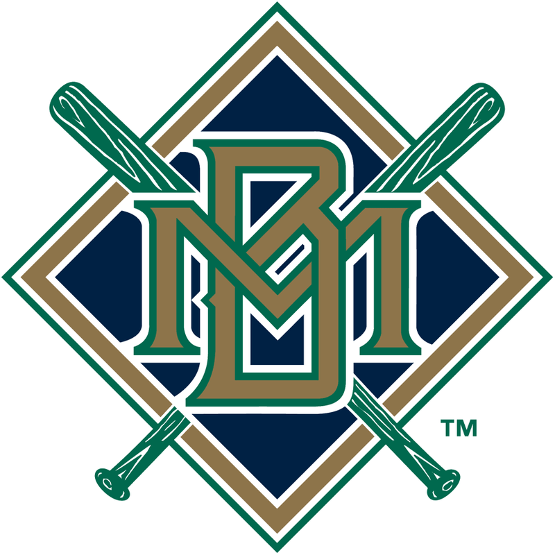

Posted on 6/21/21 at 8:35 pm to Paul Allen
Late 1920's Detroit Tigers

Posted on 6/21/21 at 8:35 pm to Paul Allen
 [/url] [url=https://postimg.cc/Xph1hmn0]
  [/url][/img]
Posted on 6/21/21 at 8:35 pm to Paul Allen
The Marlins post-2011.

2012-2018 looks like the logo for an airport.
2012-2018 looks like the logo for an airport.
This post was edited on 6/21/21 at 8:37 pm
Posted on 6/21/21 at 8:36 pm to Paul Allen
Marlins went from one of the best logos to the worst


Posted on 6/21/21 at 8:36 pm to Paul Allen
Come on, Nationals. We all know you stole your logo from Walgreens


Posted on 6/21/21 at 8:43 pm to Paul Allen
In the last 30 years, creepy Toronto guy.
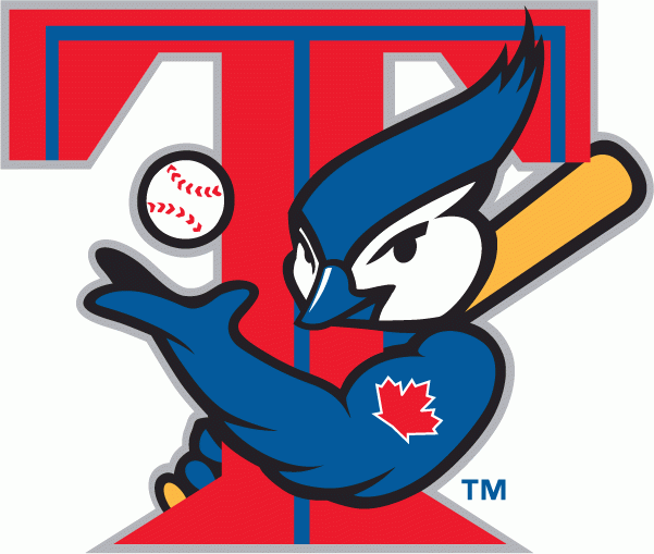
Posted on 6/21/21 at 8:46 pm to Scruffy
quote:
The Marlins post-2011.
Agreed. Miss their old logo.

Posted on 6/21/21 at 9:05 pm to SCLibertarian
quote:
Brewers 1994-1999
This
Posted on 6/21/21 at 9:07 pm to Scruffy
Damn Miami got a jump start on this gay pride shite
Posted on 6/21/21 at 9:21 pm to Scruffy
The 2012-2016 Marlins logo would look so much better without that “sail” marlin on top of it.
Posted on 6/21/21 at 9:23 pm to Paul Allen
Milwaukee Brwers dropping the ball and glove in 1994 and going with the Notre Dame logo
Posted on 6/21/21 at 9:24 pm to Paul Allen
Remember the phase a lot of teams went with when they tried to make black a color?
Mets, Royals, Blue Jays, A's all had black uniforms
Mets, Royals, Blue Jays, A's all had black uniforms
Posted on 6/21/21 at 9:33 pm to goldennugget
quote:
Blue Jays
Another terrible logo

Posted on 6/21/21 at 9:39 pm to SCLibertarian
(no message)
This post was edited on 7/25/22 at 5:13 pm
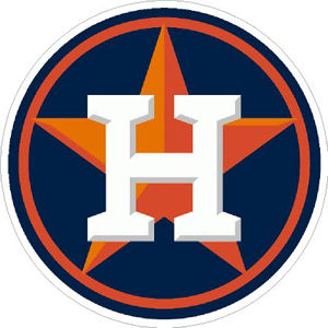
Posted on 6/21/21 at 10:05 pm to WestCoastAg
quote:
WestCoastAg
Why do you hate the Stros?
Posted on 6/21/21 at 10:08 pm to Paul Allen
Diamondbacks A
Posted on 6/21/21 at 10:19 pm to Paul Allen
Looks like they waited a few years to try to capitalize off of the Angels in the Outfield movie

 Page 1 of 3

Popular
Back to top