- My Forums
- Tiger Rant
- LSU Recruiting
- SEC Rant
- Saints Talk
- Pelicans Talk
- More Sports Board
- Fantasy Sports
- Golf Board
- Soccer Board
- O-T Lounge
- Tech Board
- Home/Garden Board
- Outdoor Board
- Health/Fitness Board
- Movie/TV Board
- Book Board
- Music Board
- Political Talk
- Money Talk
- Fark Board
- Gaming Board
- Travel Board
- Food/Drink Board
- Ticket Exchange
- TD Help Board
Customize My Forums- View All Forums
- Show Left Links
- Topic Sort Options
- Trending Topics
- Recent Topics
- Active Topics
Started By
Message

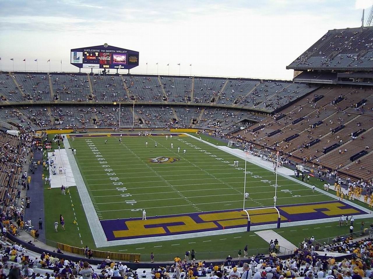
Annual “Bring back the old end zones” Thread
Posted on 1/8/21 at 11:59 am

Posted on 1/8/21 at 11:59 am
Joe “For branding purposes” Alleva is long gone. Come on Scotland Jedediah Woodward, make it happen.
 33
33


Posted on 1/8/21 at 12:00 pm to S
1000% agree.......
Posted on 1/8/21 at 12:03 pm to dukke v
Thanks dukke

Posted on 1/8/21 at 12:04 pm to S
I'm indifferent. I think it'd be cool to bring them back for a couple games a year, or homecoming.

Posted on 1/8/21 at 12:05 pm to S
Posted on 1/8/21 at 12:06 pm to SUB
Bring them back for homecoming with numbered helmets like Billy Cannon game. They won’t do it for every game because it’s not part of the brand.

Posted on 1/8/21 at 12:06 pm to S
That stupid Geaux Font they insist on sticking with is so '90s looking. It's beyond tired.

Posted on 1/8/21 at 12:07 pm to S

Posted on 1/8/21 at 12:11 pm to dukke v
quote:
1000% agree
Now IT'S not GONNA happen
Posted on 1/8/21 at 12:11 pm to S
I forget how old all of you are. Dems be trash.
Posted on 1/8/21 at 12:12 pm to S
so fricking in! hate "geaux font"
Posted on 1/8/21 at 12:21 pm to S
also, the dark grass every 5 yards

Posted on 1/8/21 at 12:22 pm to S
Hard pass, and that is not meant to be disrespectful. I am a big fan of the new end zones.
I remember for the 2011 SECCG they used some random arse LSU don’t and I was pissed.
I remember for the 2011 SECCG they used some random arse LSU don’t and I was pissed.
Posted on 1/8/21 at 12:25 pm to Y.A. Tittle
quote:
That stupid Geaux Font they insist on sticking with is so '90s looking. It's beyond tired.
The font in the OP is very dated looking. I don’t think the geaux font will last, but no reason to go back to an uglier font.

Posted on 1/8/21 at 12:26 pm to S
Agreed.

Posted on 1/8/21 at 12:31 pm to Y.A. Tittle
quote:So let's go to a font from the 60s?
That stupid Geaux Font they insist on sticking with is so '90s looking. It's beyond tired.
Posted on 1/8/21 at 12:33 pm to S
The geaux font endzones have always looked terrible. That marketing company Skip Bertman hired to redo the LSU brand was horrible. They have ruined too many school logos to even count.
LSu acts like its some unique font, but It’s pretty much the same as oregon’s and is very similar to other schools.
LSu acts like its some unique font, but It’s pretty much the same as oregon’s and is very similar to other schools.
Posted on 1/8/21 at 12:35 pm to Salviati
quote:
quote:
That stupid Geaux Font they insist on sticking with is so '90s looking. It's beyond tired.
So let's go to a font from the 60s?
I’d rather anything that doesn’t just scream ‘of the moment’ from 20 or so years ago. It was obvious that’s what that Geaux Font was destined to do.

Posted on 1/8/21 at 12:38 pm to S
Somebody get in touch with Freeman’s agent and have them make it a contract demand before he signs

Posted on 1/8/21 at 12:40 pm to Y.A. Tittle
quote:
That stupid Geaux Font
Geaux font has not aged as good as people pretend. and it will continue to date more and more.
Its why i love that we are pushing the updated Tiger Head more and more.
I think we need to make a transition to a new font but the wont.

 Page 1 of 4

Popular
Back to top